Opioid Overdoses: An Epidemic Grows Up and Out of Control
May 4, 2018 - All
Opioid overdoses have steadily risen in the United States over the past 20 years. Different states are achieving different success rates in managing the epidemic. The relationship between professionally dispensed prescriptions and overdose deaths has been scrutinized, yet even as these prescriptions are curtailed, the death toll increases. While the correlation between the two metrics is uncertain, the data indicate that opioids are sourced through multiple channels, and not only via a doctor’s written directive. There is documented evidence that many addictions begin with a doctor’s pain prescription, but eventually, the addict may seek “street” sources to continue their habit, either because these options are cheaper or more available.
What Are Opioids?
Opioids are a class of drugs that can be legally prescribed as painkillers, such as Oxycodone or morphine (to name just two of many medications). Opioid substances also include illegal, synthetic drugs such as heroin and fentanyl. The word opioid comes from “opium” and this poppy-derived substance has been used by humans for thousands of years. As a neurotransmitter, opioids mimic humans’ natural brain chemicals that can suppress pain and trigger pleasure. However, unlike the natural biological endorphins people experience from falling in love or laughing with a friend, opioids are far stronger. This means they are highly effective in eliminating pain after surgery or injury, and may also activate much more intense pleasure for the user. (Brookshire, 2018)
Side effects of taking opioids in legal or illegal forms include tolerance and physical dependence. Tolerance occurs as the person needs increasingly greater, and more frequent, doses of a medication to experience the same level of pain relief. The high tolerance can lead to addiction as the body faces uncomfortable withdrawal symptoms which drive the user to keep seeking more of the drug. This cycle becomes very difficult to break. Simply stopping the drugs can be physically unbearable for the addict. If a patient cannot obtain a prescription from their doctor, or perhaps a refill when the original has been exhausted, they may turn to illegal sources to fuel their dependency. Opioids can also easily cause an overdose death, as the substance’s interaction with the brain slows breathing, particularly with larger or stronger doses. (Science Daily, 2015)
A Growing Crisis
The initial trend in the epidemic of opioid overdose deaths began in the 1990s as the result of prescription pain medication for long-term, chronic pain issues. High doses of prescription meds, prescribed over long durations, created a greater incidence of future opioid use. “A prescription of 31 days or more increased chances of long-term opioid use to 29.9%.” (Kounang, 2017). The second wave began to emerge in 2010 and was seen with deadly overdoses of heroin throughout the U.S. (Glatter, 2018) Opioid habits can begin with pain treatment through doctor-prescribed medications, which then lead to heroin abuse.
“Increasing heroin dependence is closely tied to prescription pain reliever abuse.” (Guardian, 2015) With heroin available on the street, a decrease in prescriptions has not managed to curb the opioid epidemic. Two-thirds of all drug-overdose deaths in 2016 (the most recent year for comprehensive data) involved opioids, some prescribed and some obtained illicitly. While every demographic category saw increases in these overdoses, different states have experienced different growth rates of the crisis. (CDC, 2018)
A Political Call to Action
The financial costs of the opioid epidemic can be measured in terms of lost productivity, lost earnings for employers, and lost tax revenue due to premature deaths. That combined toll, since 2001, tops 1 trillion dollars in addition to healthcare-related costs of over 200 billion for the same time period (Allen, 2018). President Trump has vowed to take on the opioid epidemic since taking office in 2017 and even stumped on the issue while campaigning in 2016. His strategy focuses on punishing the drug dealers, possibly with the death penalty (Merica, 2018) Many pieces of legislation await review, but without dampening the huge demand by addicts, the supply side is likely to continue thriving. As seen in this data, limiting supply from doctors has not managed to cripple the problem. Lowering demand through a focus on health and care may be the only way to ultimately turn the tide.
Looking forward
The use of medication-assisted treatment (MAT) prescribed by many healthcare providers is considered the most effective and promising treatment for those who suffer from opioid use disorder (OUD). The treatment combines medication with behavioral therapy and counseling. (Substance Abuse and Mental Health Services Administration, 2016) This approach is also the most expensive, although the current cost in deaths, overdoses, lost revenue, and lost earnings outpaces this treatment cost. (Mohlman, 2016)
In March 2016, The Center for Disease Control (CDC) released recommendations to providers on the prescribing of opioid pain medication for patients in primary care settings. The guideline for prescribing opioids for chronic pain include supporting research on pain and addiction, and advancing better practices for pain management. (CDC, 2018)
Visualizing a U.S. Crisis over Time
Data reporting opioid overdose deaths from 1999-2014 show a disturbing trend. The opioid crisis has been identified as an “emergency” in the United States. Visualizing the epidemic in Tableau can help us understand how opioid-related deaths have risen over time and which states have shown particular vulnerability. Combining the data on the number of overdose deaths alongside dispensed prescriptions numbers can begin to define the trajectory of this problem along two of its metrics.
Data for this project may be found here.
A Tableau Dashboard Visualization
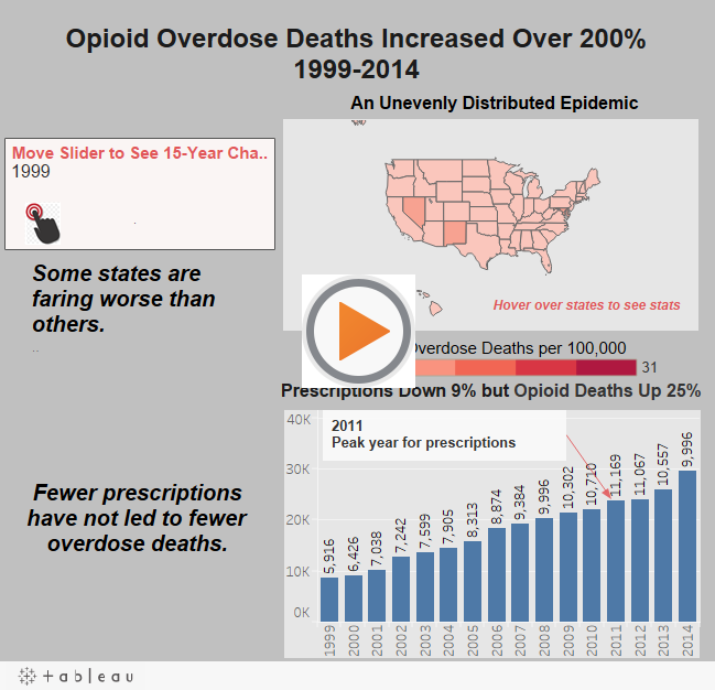
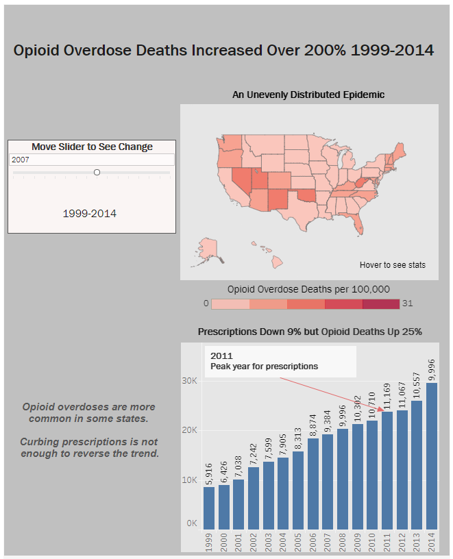
Using the year-by-year slider, the states become redder over time and certain states change in color dramatically. The red color uses the danger, “emergency” mental model so that the user recognizes the changes are moving toward more severity (more cases). By eliminating background map features, and thereby minimizing data-ink on the visualization, there are fewer distractions from the data itself. “Data graphics should draw the viewer’s attention to the sense and substance of the data, not to something else.” (Tufte, 2001).
Alaska and Hawaii were inset on the map and tied to the slider feature. The color key of reds reflects a calculated field that was created from the data to show the number of deaths per 100,000 people in the population. Showing raw numbers of deaths without also measuring these numbers in relation to population density would mislead the viewer. California and New York have large populations and therefore will have more cases of overdoses than New Mexico or West Virginia. However, when accounting for the population size, West Virginia’s epidemic becomes accurately defined as a much more striking issue. Comparing the severity of the crisis by state is one of the goals of the visualization.
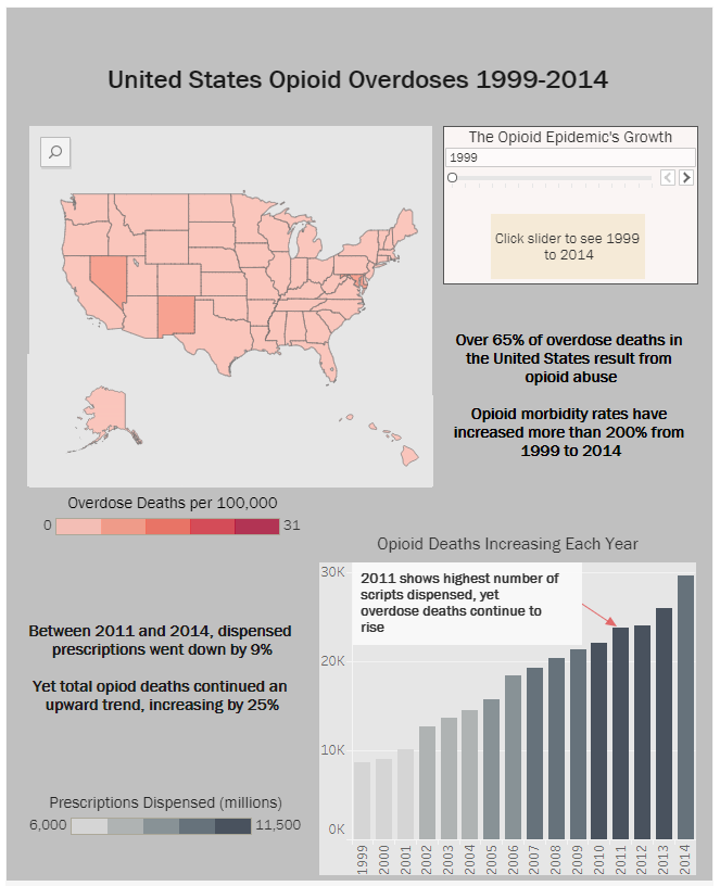
The second area of interest is how the number of prescriptions dispensed, correlates with overdose deaths. One tactic for managing the opioid epidemic is to curtail prescribing these drugs in the first place. The graph in the visualization uses a bar chart to show overall US deaths from overdoses and labels those bars by the number of prescriptions dispensed for each year. What this chart shows is that even though legal medical prescriptions declined, deaths continued to rise sharply. This indicates that drug users are obtaining opioids through illegal channels. Another possibility is that the reliance on unmoderated sources is leading to even more deaths from high-strength synthetic versions of the drugs found on the street.
Using a stepped color scale for the reds of the United States map gives the gradations more distinction. The user’s eye more easily distinguishes the shifts in shades, and thereby, trends. The text is in Franklin Gothic which works well for clearly showing numbers and un-fussy text.
Additionally, adding an annotation on the prescriptions and deaths bar chart spells out the notable and unintuitive data that deaths rose, even though prescriptions were down.
A text box on the date slider tells the user to move the slider since the button itself could be missed. When this instruction was also not noticed in two rounds of user testing, an illustration of a hand pressing a button was added to the slider bar.
Text written in the spaces on the dashboard offers opioid stats to tell the scary story of this epidemic’s growth. Even if a user chooses not to interact with the dashboard, they should come away with some information about the crisis. Italicizing the blurbs hopefully sets them apart from the titles.
Findings
Overdose Death Rates are Rising, but Unevenly
The data for this project shows a growing crisis in opioid addiction and death rates. The dashboard shows changes over time for different states in the U.S. and there is dispersion for death rates according to jurisdiction. This may provide a place to start in understanding which states are more effectively handling addiction, or at least preventing fatal overdoses.
Additionally, from this dataset, we discover that curtailing prescriptions from doctors has not yet shown an impact in death rates from these drugs. The dashboard introduces the concept that a solution will be complex and has not yet been discovered. Seeing the rapid, undeniable overall increase brings a sense of urgency to this issue.
There are multiple factors and more data across the many angles of this epidemic that must be studied to draw conclusions on how to change the trajectory.
User Testing Influences the Visualization
User testing was conducted at two stages of creating the visualization. Both occurred after “completion” of the Tableau dashboard so that the users could have a fully interactive model. Once the data from the testing was collected, it was used to evaluate the usability of the tool, recommend improvements, implement recommendations, and then re-test, in the spirit of formative evaluation practice, to continue improving the tool (usability.gov, n.d.). The methodology is described in the User Testing Procedure and Methodology section of this report.
User Testing Round One

Round One Feedback:
None of the users attempted to try the slider to see the United States map change over time. They missed it and therefore found the color scale confusing since there was no dark red reflected on the states.
None realized that they could hover on the map to see actual numbers and details.
“Which piece of information is more important? That different states have different rates, or that fewer prescriptions haven’t made the death rate go down?”
“Titles need to be pithier.”
“Titles need to be more active—tell the user exactly what you want them to take away from this.”
Make the text simpler to read (less of it)
“I am challenged by trying to understand two facts in one chart.” (Shading in deaths bar chart to represent prescription data)
“I would prefer the bar chart not be grey—it blends into the background.”
“I am not connecting the words with the charts. Which blurb goes with which chart?—I read left to right and would need to see the slider on the left to notice it.”
“I don’t like Hawaii on the right side—you are making me think it’s Cuba.”
User Testing Round Two

The users still did not see the date slider and none realized they could hover on the states to see details, even though I added text to let them know.
The prescriptions data was understood well by two out of three.
Round Two Feedback:
“Change the label on the States map to say ‘hover to see state stats’—I really didn’t understand what the hover meant.”
“Put numbers on the scale so that I know how it breaks down in the legend.” (Didn’t see slider)
“In the title put 1999-2014 on the line below—it is hard to see those numbers all together.”
“The slider needs more text on it to tell you it is there and what it does.”
“On slider write: See the changes over 15 years.”
“Instead of saying Prescriptions, say ‘Opioid Prescriptions.’”
“You need a symbol to show you should interact.”
Some of this feedback was incorporated in the visualization as it stands now. A judgment call must be made by the evaluator to decide which problems should be addressed. Usability testing should always be conducted with the goal of making improvements to enhance the effectiveness and satisfaction of the product or service (usability.gov, n.d.).
Conclusion
Based on evidence from the user tests, there is general reluctance or ignorance about interacting with visualizations unless very strong cues are added. In both test sessions (all with different participants) no one tried to move the slider or hover on the map until it was specifically suggested to interact. The participants responded best when the information was direct. Written blurbs that explained the data was important. They understandably do not want to have to work at figuring it out. Using the titles and subtitles to bring them down the path is necessary for them to get the point of the information. Cutting down the text while making all of the salient points directly on the visualization, left less to the imagination. The last touch was to add a copyright-free hand-pushing-a-button illustration on the slider.
User Testing Procedure and Methodology
A User Test was conducted to determine any usability pain points on the U.S. Opioid Overdose Deaths dashboard. Usability testing refers to “evaluating a product or service by testing it with representative users” (Usability.gov, n.d.). Conducting moderated testing is considered the gold standard of usability testing. Both qualitative and quantitative information can be gathered from the method. The moderator collects qualitative data as they directly observe what the user says and does, asks questions, and even observes body language and facial expressions to understand where the product or service is inefficient or frustrating. The evaluator collects quantitative data during the sessions through assigning tasks to the participants.
Goal
Determine how well the user understands the information in the Opioid Overdoses Tableau Dashboard, and whether there are any usability problems on the tool. Based on problems encountered, changes will be made or recommended for the dashboard.
Methodology
One moderator conducted three usability tests on the Tableau dashboard at two stages of development, for a total of six tests performed. The evaluator defined the target user profile, recruited participants, developed tasks and questionnaires, administered the tests, and then analyzed the results to develop design recommendations for the dashboard.
Target User Profile
· Average Internet Usage
· Interest in Social and Contemporary Issues
· Age 21+
Consent Form
A consent form was written for participants to sign. The purpose was to make sure they understood that they were participating in a research study, explained they would be recorded on an audio app to ensure the accuracy of feedback notes, and to assure them their name and personal information would not be shared.
Recruitment
Users were recruited by posting a request on the Slack account at a coworking space in Brooklyn, Industrious Brooklyn (https://www.industriousoffice.com/locations/brooklyn). The Brooklyn professionals who work at this shared office space would all be candidates who fit the target user profile.
Those who expressed interest were given a brief screener questionnaire to ensure that they fit the broad target user profile. There were six applicants for the test, allowing for two user tests, of three people each, at two stages of development.
A moderator script was used to explain everything to each participant and also acted as a checklist for the session. Having a script keeps instructions consistent for each study participant.
Tasks
TASK 1: Spend a few minutes on the Dashboard and give me any impressions you have.
TASK 2: How many overdose deaths occurred in 2013 in New York and West Virginia? Which of these states is experiencing a greater crisis during that year?
TASK 3: What is the trend in dispensed prescriptions from 1999-2014?
These tasks allowed quantitative data to be collected.
Participants were asked to follow think aloud protocol. After each task, open-ended questions were asked:
Did you come across any challenges trying to complete this task?
Do you have any recommendations for improving this tool?
These questions allowed qualitative data to be collected.
Immediately following each test, the moderator wrote down any additional observations and de-briefed major impressions from the session.
References
Allen, Greg (February 13, 2018). Article: ”Cost Of U.S. Opioid Epidemic Since 2001 Is $1 Trillion And Climbing.” NPR. https://www.npr.org/sections/health-shots/2018/02/13/585199746/cost-of-u-s-opioid-epidemic-since-2001-is-1-trillion-and-climbing Retrieved on April 28, 2018.
Brewer, Ryan M. (2017). Article: “The Economic Impact of Opioid Misuse in Indiana,” Indiana Business Review, Volume 92, No.4, Winter 2017. http://www.ibrc.indiana.edu/ibr/2017/outlook/opioid.html Retrieved on April 27, 2018.
Brookshire, Bethany (March 27, 2018). Article: “Explainer: What are Opioids?” Science News For Students. Https://www.sciencenewsforstudents.org/article/explainer-what-are-opioids Retrieved on April 28, 2018.
CDC Newsroom (March 29, 2018). Article: “U.S. drug overdose deaths continue to rise; increase fueled by synthetic opioids.” https://www.cdc.gov/media/releases/2018/p0329-drug-overdose-deaths.html Retrieved on April 27, 2018.
Glatter, Robert (March 30, 2018). Article: “Opioid Overdose Deaths Continue Their Rise in the U.S.” Forbes.com. https://www.forbes.com/sites/robertglatter/2018/03/30/opioid-overdose-deaths-continue-their-rise-in-the-u-s-cdc-study-finds/#281126cf651d Retrieved on April 27, 2018.
The Guardian (2015). Article: “Rapid rise of heroin use in US tied to prescription opioid abuse, CDC suggests.” https://www.theguardian.com/us-news/2015/jul/08/heroin-use-overdose-deaths-us-prescription-opioids Retrieved on April 29, 2018.
Kounang, Nadia (June 29, 2017). Article: “Opioid addiction rates continue to skyrocket.” CNN.com. https://www.cnn.com/2017/06/29/health/opioid-addiction-rates-increase-500/index.html Retrieved on April 29, 2018.
Merica, Dan (April 14, 2018). Article: “Trump administration worries opioid crisis could ‘get worse’,” CNN. https://www.cnn.com/2018/04/14/politics/trump-opioid-crisis/index.html Retrieved on May 1, 2018.
Mohlman, Mary Kate and Beth Tanzman, Karl Finison, Melanie Pinette, and Craig Jones (2016) Article: “Impact of Medication-Assisted Treatment for Opioid Addiction on Medicaid Expenditures and Health Services Utilization Rates in Vermont.” Journal of Substance Abuse Treatment, Volume 67, August 2016, pp9-14. https://www.sciencedirect.com/science/article/pii/S0740547215300659 Retrieved on May 1, 2018.
Science Daily (Dec 17, 2015). “How opioids cause dangerous breathing problems.” https://www.sciencedaily.com/releases/2015/12/151217130559.htm Retrieved on May 2, 2018.
Substance Abuse and Mental Health Services Administration (SAMSHA) (2016). https://www.samhsa.gov/medication-assisted-treatment Retrieved on May 1, 2018.
Tufte, Edward (2001). The Visual Display of Quantitative Information, p91.
Usability.gov (n.d.). Usability testing. https://www.usability.gov/how-to-and-tools/methods/usability-testing.html Retrieved on May 1, 2018.
Usability.gov (n.d.) Usability Evaluation Basics. https://www.usability.gov/what-and-why/usability-evaluation.html Retrieved on May 4, 2018.
The post Opioid Overdoses: An Epidemic Grows Up and Out of Control appeared first on Information Visualization.
