Understand Citi Bike’s Usage Pattern With A Popular Month Of Data From 2017
May 3, 2018 - All
Introduction
For this final project, I wanted to expand the topic scope on my Carto Lab that focused on mapping bicycle rack distribution in all five boroughs of New York City.
The Carto lab was targeted to bike commuters who own a bike. For this final project, I wanted to inform bike commuters who use the Citi bike service.
Although New York City has its charm to attract many travelers around the globe to visit each year, it is also known for the high volumes of traffic. Having the experience of driving and biking in NYC, personally speaking, biking is better in so many ways than driving in the city. Besides from taking the subway, biking is my preferred way of commuting.
Citi bike is distributed in many locations across the city, there are currently 750 stations and 12,000 bikes in service, and it is the largest bike-sharing system in the United States. As many of my friend who also commutes mainly by biking, three out of five participants who I interviewed with uses Citi bike service and are annual subscribers.
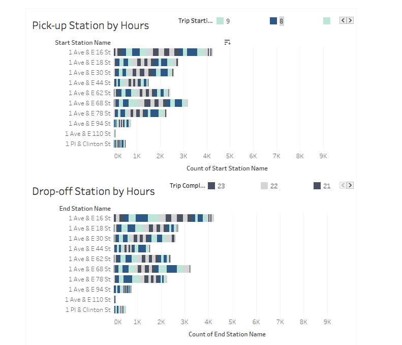
This visualization project consists both map and bar chart that aims to improve the understanding of Citi bike commuters about the availability of pick-up and drop-off stations throughout the day. I interviewed five of my friends who commute mainly through bicycle and conducted usability research on the visualizations.
Preliminary user research questions
I spoke to some of my friends who use the Citi bike service about this project, they seemed very supportive and provided me many insights on the project.
1. Do you use Citi bike service on a regular basis?
2. On average, what is your pattern of usage?
3. What is your source of information about the availability of bikes throughout the day?
Preliminary user research findings
1. A visualization that would show patterns of usage throughout the day is something they envision that could help with understanding.
2. Participants use the service most regularly on weekdays to commute during 7-10 AM and 5 – 8 PM. They also use the service during the weekend for short distant commute.
3. Most participants benefit from the live station map provided by the Citi bike app. The live map shows the number of bikes and empty docks available at each station in real time. They use the map to locate the nearest station and availability of bikes or docks.
Data
I used the Citi bike system data for this project. The dataset is very well formatted and does not require much altering or cleaning. Citi bike provides trip histories data that include details about each trip that took place in a month in both New York City and Jersey City from June 2013 to March 2018. The datasets are unsurprisingly large, so I decided to use only one month of data. The month I chose has to be representative to give the visualization more credibility. I decided to use the dataset of September 2017 because of three reasons: 1) more trips took place in summer months 2) Students are back to the city to continuing school in this month. 3) It is the most current summer month that data are provided.
The dataset is in CSV format and includes good details about each trip that happened during the month. Below is a list of details the original dataset includes
• Trip Duration (seconds)
• Start Time and Date
• Stop Time and Date
• Start Station Name
• End Station Name
• Station ID
• Station Lat/Long
• Bike ID
• User Type (Customer = 24-hour pass or 3-day pass user; Subscriber = Annual Member)
• Gender (Zero=unknown; 1=male; 2=female)
• Year of Birth
Out of these 11 columns, the “start time and date,” “stop time and date,” and “user type” interests me the most initially.
I deleted “Trip Duration,” “Bike ID” “Gender” and “Year of Birth” because they are unrelated to this project, and kept everything else. Then I split the dataset into two datasets, one consists of data about pickup information, and the other includes drop-off information. The final datasets I had were then named as “pickup.csv” and “drop_off.csv.”
Software
I used both Tableau Public and Carto to create the final visualization. I imported the dataset into both Tableau Public and Carto to achieve results that are supported by different features of these two software.
Design
With the idea I had, Professor Sula suggested doing two layers: one for pickup location, and the other for drop off location. Then apply different colors to different layers and see what station has more pickup or drop off by the mixing of color overlapping between layers.
Initially, I was going to compare the pattern of pick-up and drop-off stations between different user types. I started to map out the distribution of pickup and drop-off stations by types of users. I soon realized that they are more evenly distributed than I thought it would be. The first version of visualization wasn’t as informative as I wanted it to be. Instead of focusing on the different user type, I switched my focus to popularities of stations during a different time of the day.
Because of the insights that I got from talking to Citi Bike user friends, they use the service to commute mostly during the hour of 7-10 AM and 5-8 PM. I decided to highlight these hours during the day in a bar chart to draw viewer’s attention to these hours and use a more muted color for all the other hours. I also chose to use colors with high contrast for hours next to each other to create separation between hours. I was able to achieve this by selecting “discrete” as the data type for time. I used “station name” as the row, which listed all the station name nicely, and “count” for “station name” as the column that indicates the total number of users. The bar chart shows the total amount of bikes picked-up and dropped off at each station the entire September. Segmented with color that indicates accumulation of each hour during the day. I chose to list the two chart vertically that maximize the detail shown in each bar. With this way of arranging two charts, it is easy to compare the popularity of each station for both pick-up and drop-off. Users can select an individual hour to highlight the total number of bike or dock activated for a specific station.

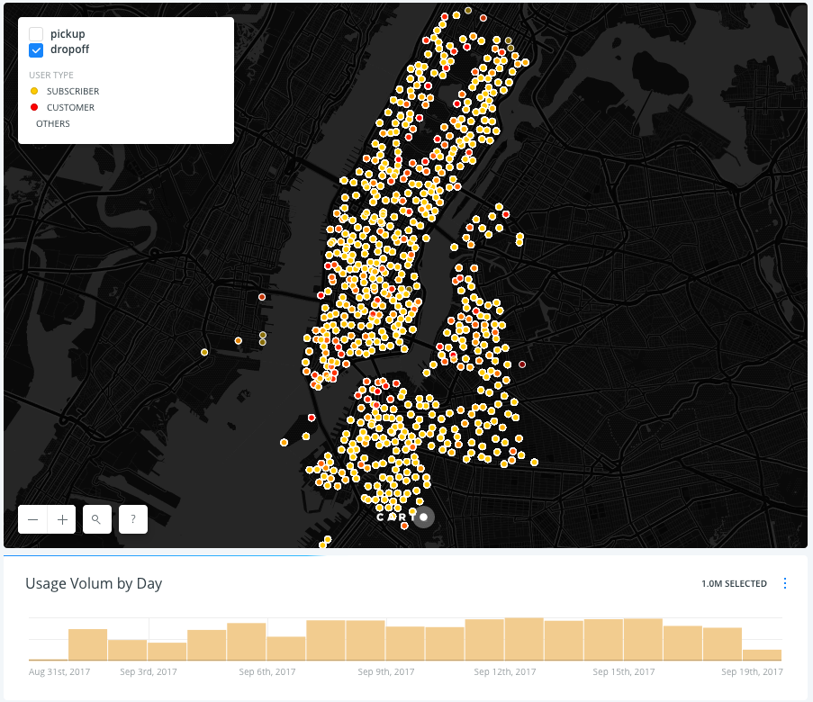
With the Map visualization, I focused on showing the popularity of each station by user type. “Subscriber” indicates annual subscribers, and “customer” indicates day-pass users. I chose to use color to differentiate the user categories. I applied red color for the “customers” category and yellow for “subscribers.” Because there are much more subscribers than customers, I wanted to use a color that would highlight the customer category. On both pickup and drop-off layers, I applied the same color and opacity on User Type Categories to make them consistent. With the layer selection, viewers can see the poplar pick-up locations as well as drop-off locations.
With the map, I also wanted to give a context of usage patterns from a month perspective. I added a time-series widget on the bottom of the map to help viewers understand the usage pattern by days during one month. With insights gained from preliminary user research, the histogram shows a consistent wave pattern with participants described usage of the Citi bike service. Weekdays, in general, have more total usage than weekends.
There was a limitation on which bucket I could select on the time series. I decided to use Carto mainly to help the understanding of station popularity by user type, and use Tableau for the understanding of the amount of usage overall.

Usability Research
I recruited participants for the usability research by reaching out to people I know that commute by bikes. I talked to 5 of them who are familiar with the service that Citi bike provides and conducted in-person interview with them. I asked them three questions at the end of each session to discover the scope of information they can absorb from these visualizations. I did not assign any tasks or instructions for them to explore the map; I only introduced the topic to them and asked them to “think aloud” about what they see and briefly answer the following questions:
1. Does the visualization give you a better understanding of what time during the day that your preferred stations are the busiest?
2. Does side-by-side presentation of the two visualizations assist the understanding of each other?
3. Which visualization helps you to understand the Citi bike usage pattern better? The map or the bar chart?
Usability Research Findings
1. Both visualizations were helpful. However, it was hard to connect the two visualizations conceptually
The visualizations are focusing on one topic but weren’t a link that bridge the two visualizations. The use of the different set of colors and the other kind of visualization presented are contributors to this disconnection.
Recommendation for revision: This isn’t a revision for visualization per se, but adding a text narrative and present the two visualization in one story is a better way just to put them side by side because some connection is usually assumed when multiple visualizations are shown together.
2. The legend of the bar chart is easy to be overlooked.
The concept of the bar chart appears to be easily understood by all participants. However, it took them a while to link the colors with hours. The legend didn’t help them to realize that the colors indicate hours right away.
Recommendation for revision: Instead of just showing a number that indicates each hour during the day, use a more recognizable time format. For example, change “7” to “7 AM” or “7:00.”
3. A search bar would be helpful to locate the specific station on the bar chart
A lot of scrolling was happening when users were looking at the bar chart to locate the station they frequently use. Many participants weren’t sure what exactly is the name of the station that they usually use, but they know what street it is located.
Recommendation for revision: add a search bar for “station name.”
Conclusion
Visualization user research is very different from the ones done for other interactive media. With visualization, it is more important to see how users interact with what’s put in front of them then telling them what to look for. It is more spontaneous in a way than how a user would interact with an application or website. The visualization needs to speak for itself. How easy it is to understand a visualization decide how much attention it gets from users. The beauty of visualization is to help viewers to absorb insights gained from a large quantity of data instantly and effortlessly.
This project not only created learning opportunities for me to experiment with user research for data visualizations but also gave me a better understanding of different visualization software, as well as their strengths and weaknesses. I also gained a better understanding of how visualization could be implemented when telling a story.
The usability research helped me to understand the process of iterating visualization and the method of improving its presentation based on user’s feedback. Comparing with the previous labs, where usability research wasn’t required, I focused mainly on what my interpretation of what aspects the data would be the most informative. However, with usability research, I was able to create visualizations based on elements of the dataset that benefits my target audience the most. Personal interests are the starting point that motivates me to look deeper into specific topics, but the target users who would also benefit from the visualization always provide fresh insights to widen the scope of the study by suggesting a different perspective. Always start with talking to people who care about the topic and would benefit from the results.
Click here to see the Tableau bar chart
Click here to see the Carto map
The post Understand Citi Bike’s Usage Pattern With A Popular Month Of Data From 2017 appeared first on Information Visualization.