Implementing Community Programs to Prevent Deaths by Drug Overdose in West Virginia
May 1, 2018 - All

The opioid epidemic is a devastating crisis that is ravaging rural areas of the United States. The state of West Virginia has been especially affected, having the highest rate of deaths caused by drug overdose in the United States in 2016 (CDC, 2018). Despite seeming insurmountable, some individuals and programs are working toward methods of overdose prevention. For instance, grants from the federal Substance Abuse and Mental Health Services Administration have been implemented, and other fundraising initiatives are being put forward to promote peer recovery programs by the Department of Health and Human Services (Jarvis, 2018).
An additional solution to this problem could be community programs developed by and through local public service providers, like public libraries, public schools, and hospitals. Although this type of effort has been limited in West Virginia, it has been effective in other states, such as Pennsylvania, where public librarians have become Narcan trained, and California, where the Partnership HealthPlan California has implemented programs for safe pain treatments (Newall, 2017; Partnership HealthPlan California, 2015). We hope to persuade West Virginia viewers to consider investing more into community programs hosted by these institutions to prevent deaths by drug overdose.
This dashboard consists of four visualizations that deal with the ongoing opioid crisis, with a focus on its effects in West Virginia. It examines the potential effect that community outreach programs are having on curbing drug overdose deaths as well as current rates of drug overdose deaths. Finally it considers the success of similar programs in certain California counties.
Dashboard
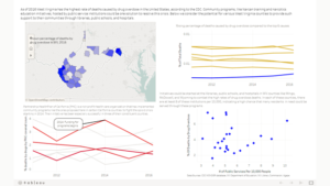
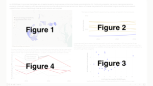
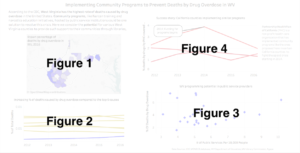
We created four visualizations, which were placed in a dashboard with some explanatory text (Figures 1-4, depicted in Figures 5 and 6):
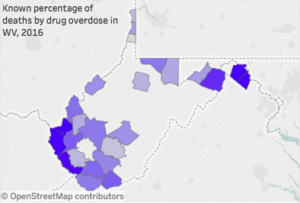
Figure 1: Known percentage of deaths by drug overdoses in West Virginia 2016. This map shows the counties of West Virginia whose data on drug overdoses was available from the CDC. The county color is determined by the percentage of drug overdose deaths, with darker being a higher rate.
Figure 2: Rising percentage of deaths caused by drug overdoses compared to the top 6 causes of death in WV. This line graph shows the overall trends of the top six causes of death in West Virginia (shown in gold) and the recent rise of deaths by drug overdoses (shown in blue) from 2011-2016.
Figure 3: WV programming potential in public service providers. This scatterplot shows twenty-seven of West Virginia’s counties plotted by their percentage of deaths by drug overdose and their number of public service programs per 10,000 people. The percentage of deaths is along the Y-axis while the number of public service programs is along the X-axis.
Figure 4: Success story: California counties implementing similar programs. This line graph shows the percentages of deaths by drug overdose in the seven counties in Northern California in which the Partnership HealthPlan of California (PHC) operates. PHC is a nonprofit organization whose community programs could be copied and adapted for use in West Virginia. An annotation notes that funding for these programs began in 2014. The counties that saw a decrease in drug overdose deaths starting in 2014 are marked in red, with the counties that saw either no change or an increase in drug overdose deaths are marked in gray.
The explanatory text describes the purpose of our project as well as some of the thinking behind what we chose to visualize. In particular, we wanted to introduce the issue of the opioid crisis in West Virginia and our idea that public service providers had the potential to be a resource for local community programs. The text above Figure 3 in the original dashboard talked about the counties that might benefit most from such communities programs, while the information above Figure 4 described similar programs having been implemented in certain California counties by the Partnership HealthPlan of California.
Example visualizations
We drew inspiration for our project from three similar maps and scatter plots.
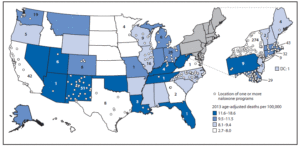
The first such visualization was a map by the CDC of opioid death rates in the United States in 2013 (Figure 7). Like our visualization, it uses the choropleth technique of color variation to illustrate a range of death rates, although they show states rather than West Virginia counties. They also include markers for naloxone programs in each state, giving viewers a sense of what kind of programs were implemented at the time of its creation. This map pairs well with our visualizations as it gives users an earlier idea of the landscape of opioid death prevention programs, in particular that West Virginia did not have any as of 2013 despite the high death rates.
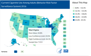
Another similar map created by the CDC is this one (Figure 8) showing current cigarette use among American adults in 2016. It likewise uses a choropleth map to depict statistics across the United States, although this map’s color range could potentially be more confusing for users since it is not a direct shading from white to light blue to dark blue, but rather a white to light blue-ish green to dark blue. We did appreciate its interactivity and use of the tooltip hover to expand on the information provided.
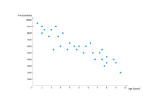
The third comparable visualization is the generic scatter plot offered as an example on conceptdraw.com. This graph is simple, with little chartjunk crowding the image, making what information is their readable (Tufte, 2001). The difficulty with this visualization, however, is that there is little context, which is something we have remedied for our own scatter plot.
Dashboard methods/rationale
For our dashboard, we elected to take advantage of a variety of visualization types and techniques to draw our users’ attentions to specific areas. For instance, we used the pre-attentive attribute of color to highlight certain aspects and draw away from others (Few, 2009). The main colors of this visualization were blue and old gold, which are the colors of the West Virginia University Mountaineers football team. In the experience of our West Virginian teammate, Heather, most West Virginians associate these colors with their state and make it an easy identifier for the area. We also felt the blue would stand out particularly well against the old gold in our line graph of deaths by drug overdose compared to the top six causes of death in West Virginia and emphasize the line we want to highlight (Figure 2). Finally, we tested the blue and gold against the visible color palette for those with tritanopia (blue-yellow color blindness) to make sure the visualizations would still be observable to those with this impairment.
In addition to using blue and gold for West Virginia, we used a sharply contrasting color pair to represent California in our original dashboard: red and light gray. We want to make clear that this particular graph (Figure 4) was distinctly different from the others because it was representing a different state and already established programs. Additionally, for the initial visualization we used red lines for the counties with seemingly successful programs while we employed light gray to downplay the less successful programs, which could potentially draw away from our narrative.
We decided to use line graphs for two of our visualizations because we wanted to represent our data over time and line graphs are especially helpful for representing changes over time for continuously collected data. The two line graphs depicted here have longitudinal data for the top 6 causes of death and drug overdose over a certain period of time (Figure 2) and the causes of death by drug overdose in California counties supported by PCH over time (Figure 4). The decision to use a line graph to represent this data did inhibit one particular feature, which was the set of California counties that PCH covered that did not have continuous data on deaths caused by drug overdose. We could have created a graph with broken lines to incorporate all of the data, but we decided to select the counties with a complete dataset so as to depict a complete narrative.
For another visualization, we decided to use a map to show data on each county in 2016 so that users familiar with West Virginia geography could orient themselves. We also wanted to have the tooltip to include more information about each county, including the percentage of deaths, county name, raw number of deaths by drug overdose, and the number of public services per 10,000 people. Having the hovering tooltip option would allow users to access that information without crowding the visualization with even more chartjunk, which could be distracting (Tufte, 2001).
Finally, we used a scatter plot to depict the rates of death by drug overdose in West Virginia counties in 2016 against the number of public service providers available per 10,000 people in the county. We elected to use a scatter plot for this data because we wanted to determine if there were a negative correlation between the death rates and the public service providers. This graph uses the pre-attentive attribute of spatial position to determine a horizontal and vertical ranking for each county (Few, 2009). Although we did not observe the trend that we had anticipated, this portion of our data did show which counties had the greatest rates of death in this crisis and which had the most potential for institutional programs. Having the comparison of death rates and public services more visible makes this visualization complementary to the map we created, since it adds a new layer of analysis to the information provided.
Findings
Several points are made apparent through our dashboard of visualizations.
Finding 1
The visualization Known percentage of deaths by drug overdoses in West Virginia, 2016 (Figure 1) provided us with a geographic representation of our data. While most of the central county data was unfortunately unavailable, it allowed us to see that that the counties with higher percentages of deaths are clustered in the southwest portion of the state (the counties of Cabell, Wayne, and Mingo). Since the southwest part of West Virginia is the only area with near complete data, we can only judge these counties against those in their region, with the rest of the data providing only scattered information.
Finding 2
Our second visualization was the Rising percentage of deaths caused by drug overdoses compared to the top 6 causes of death in West Virginia (Figure 2). We used this visualization to see just how close the recent rise in drug overdoses is to the leading causes of death. Ultimately, despite the rate of drug overdose deaths nearly doubling from 2015 to 2016 (0.00080 to 0.00150), drug overdoses are not even half as prevalent as the 6th most common cause of death (stroke, not specified as haemorrhage or infarction; 0.00310).
Finding 3
Our third visualization was WV programming potential in public service providers (Figure 3). Our hope was for there to be a negative correlation between the number of public services per 1000 people and the percentage of deaths from drug overdoses. This would strengthen our thesis that more community funded programs could curb the rise in opioid deaths in West Virginia. Instead, our data showed a slight positive correlation, with the majority clustered between 4-6 public services per 1000 people. That cluster of results had death percentages that varied from 2.269 (the second-lowest percentage) to 7.472 (the second-highest percentage). Instead of revealing a correlation between the amount of programs and the percentage of deaths, it seems to instead showcase which counties could benefit the most from an increase in programming (low program rate, high death percentage).
Finding 4
Our final visualization was Success Story: California counties implementing similar programs. (Figure 4). This visualization compared the drug death rates in the seven counties that have PHC community programs. We were hoping to see a clear decline in overdose deaths in 2014, when funding for opioid death prevention programs began. Instead, we saw a near 50-50 split. Four counties had their rates either stay the same or rise after 2014, with three counties seeing the death percentages drop. The results of PHC, as far as the information from this dataset is concerned, is therefore inconclusive.
User Test
We conducted a user test to improve our dashboard and carry out an iterative design process. Below we discuss our methods and findings.
Methods
We used a combination of in-person user tests and online remote user-testing for our visualization. We tested eight users total, of which five remote users only took an online questionnaire via Google Forms, while the other three took the questionnaire and had a discussion about the dashboard with a moderator. The users first answered pre-test questions on their familiarity with data visualization in general and Tableau Public specifically, and whether or not they had blue/yellow colorblindness. They also answered questions on whether or not they had lived (or are living) in West Virginia, their familiarity with the opioid crisis, and if they work for a library, school, hospital, or other service position.
Each of our users was screened to make sure they fit at least one of the following criteria: former/current resident of West Virginia, library/school/hospital employee, or they know someone who was affected by the current opioid epidemic. We felt that this way we would have viewpoints (or at least comparable ones) from those in the areas affected, the people who would be organizing/hosting the proposed community programs, and those actually affected by the epidemic.
Users then moved on to complete several tasks. Their first was to simply spend 3-5 minutes exploring the dashboard. They were then asked to describe, in a few sentences, what they believed the content of the visualizations to be. Users were then asked three short answer questions related to the data in the visualizations:
- Which West Virginia county has the highest percentage of deaths from opioids?
- Do any West Virginia counties have death rates from overdoses under 2%?
- Which year saw the rate of drug overdoses in West Virginia nearly double?
Finally, users were asked to “write one or two sentences you would send to a WV representative or an administrator in a local WV institution using the information provided by this dashboard.”
These questions would allow us to see if users would both understand the general content being displayed on the dashboard and to determine if they could locate specific pieces of data within it.
After these tasks were completed, users were asked a series of post-test questions. The first was whether or not they felt the dashboard made the information more or less confusing. Users were also asked to rate their opinion of their understanding of the opioid crisis in West Virginia, whether or not they now believed that West Virginia communities should implement more programs to prevent deaths by drug overdose, and if they would want their tax money to go toward overdose prevention programs. Finally, users were asked if there were aspects of the visualizations that were confusing, and if they had any general suggestions about how to improve the dashboard. Users were also asked if they would consent to providing contact information if there were any answers that needed qualification.
We also conducted three in-person user tests. These followed the same method as the remote user tests, but a proctor was there to answer questions and keep track of any problems the user encountered. The in-person tests also included an informal debriefing after the post-test questions, either to expand on the user’s response or to ask follow-up questions on possible improvements to the dashboard.
Findings
Between the two methods of user testing, we made several findings that could improve our original dashboard. Overarching topics of our findings include the explanatory text, the number of visualizations we had, the differences between West Virginia and California in the graphs, the map, and device compatibility.
Text
At least half of the users tested had concerns regarding the text included in the visualizations. One complaint in particular was that the amount of text included made it difficult to determine what was the most important information to look at. Similarly, the small size of the font made it difficult to read. Users suggested that the amount of text be shortened, or at least the paragraph originally going across the top to be narrower across the screen. They likewise wanted the important words to be bolded, the titles to be more explicitly stated, and the font itself to be larger.
Number of visualizations
Some users also felt that the amount of information and the number of visualizations were too much to understand. For instance, the first thing one interviewed user said upon looking at the dashboard was, “This is a lot of stuff.” Users suggested that we reduce the number of visualizations used or somehow rearrange the layout so that it would seem less overwhelming. One noted that the similarities between the scatter plot (Figure 3) and the map (Figure 1) may allow them to be combined into one visualization, leaving space for the amount of explanatory text we initially included and for a cleaner look for the dashboard altogether.
WV vs. California
Another confusing point for users was the usage of both West Virginia and California data. Based on their descriptions of the dashboard from the second task, up to five users did not recognize that California was represented at all. The difference of color and the description above the graph with California data did not provide enough indication to them that this data stood out separately from the others. Additionally, users were unclear about the fact that West Virginia programs had not been implemented, just suggested here, while the California counties had actually started these programs in 2014. Part of this was possibly related to the confusion about the California data, which indicated that funding had already begun and had been regularly mixed up with West Virginia data. Users suggested making a clearer title to indicate that this data was from California and showed areas where community programs have been successful.
Another issue with the California data specifically was our use of gray lines to depict certain counties covered by PCH. Our original intention was to be more transparent about our data while avoiding emphasis on areas that did not support our cause. However, users thought that no programs had been implemented in the counties with the grayed lines, when in fact they had not been as successful as the counties we highlighted. They suggested that we get rid of the gray lines or provide more explanatory text about why they were there.
Map
Users were drawn to the map and thought it had a lot of promise, although it did not maximize on its potential. They liked having the map as reference and as a reminder of the state that they were looking at. However, there were three overall issues with it that were brought to light. First, the tooltip for the map was unclear for users. We had included the percentage of deaths caused by drug overdose in each county with data, the county name, the total number of deaths by drug overdose in each county, and the number of services we counted per 10,000 people in the county. At least one user did not realize that it was interactive and never accessed the information within the tooltip. For those that did see it, the meaning of “servicesPer10000” was unclear. It also had too many numbers for them to understand what it was portraying. The second problem with the map was that it was filtered by the scatter plot in the bottom right of the dashboard when users expected it to do the opposite. This connection was actually accidental and would need to be resolved in the next iteration of this dashboard. The final issue mentioned by users about the map was the lack of a key for our visualization. One interviewed user in particular requested this information so that she could more quickly recognize how the colors corresponded to death rates.
Mobile compatibility
The final major finding from our user test was incompatibility with different devices. We focused on creating a dashboard that would fit a MacBook Air in a fullscreen. Our users, however, accessed our dashboard through a variety of devices, emphasizing how unsuited it was for them. In particular, cell phones could barely fit the visualizations on the screen and cut off nearly all of the text. People on laptops viewing the dashboard through Tableau likewise had difficulties because they were not viewing it in full screen mode. We did not realize prior to the test that this screen mode difference would be an issue, so we did not account for it in the instructions for the user tests.
Final Results
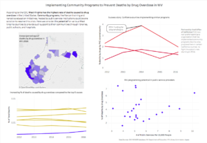
For our final dashboard, we implemented the following changes based on the user test findings:
- Users requested the tidying up of explanatory text (for example, bolding for keywords). The explanatory paragraph has been shortened so that it does not go all the way across the dashboard, allowing more room for Figures 2 and 3. Figure 2 has also been given a title that makes it more obvious that the data is from California, not West Virginia.
- The filter tag was removed from Figure 3. The visualizations do not all use the same dataset or have correlating county data, so it was difficult to properly filter between them.
- A key was added for Figure 1, showing the range numbers of percentages and shades of blue. This addition was a specific request by an interviewed user.
- We removed the gray lines from the California graph (Figure 4). Several users were confused as to what the difference was between the red and gray lines. Some believed the red counties meant that the community programs had been implemented in those areas, with the gray counties being areas with no community programs. Though we had initially kept the gray counties in order to not mislead users on the success rate of PHC’s programs, we believe that removing them will clear up confusion. We also changed the title and added a note to reflect the fact that these are the successful counties, so as not to imply that these are the only counties where PHC operates.
- The word “potential” is highlighted in the explanatory paragraph, and has been added to the title of Figure 3 to reinforce the difference between the programs that already exist and the programs that could be added to reduce drug overdose deaths.
- The visualization titles have been changed to more clearly delineate the data being depicted and which state it was collected from.
Future directions
Although we were able to apply several of the suggestions users made during our test, we have room for improvement in future iterations of this dashboard. For instance, in order to make the increase in drug deaths in Figure 2 more obvious, we may shorten the time frame portrayed in the visualization from 2012-2016 to 2014-2016. Additionally, Figure 3 was found to be the most confusing of the visualizations. In the future, we may remove it and incorporate its data into Figure 1. This would also give us more room to work, thus alleviating the spacing issue. Finally, we could work to improve our compatibility with mobile devices. For this particular dashboard, we envisaged it being used in a professional or governmental setting that would most likely be in full screen mode on a desktop. However, to make it more accessible to everyday users who might want to reach out to local government or public service providers, we could create different versions that would be compatible with cell phones and tablets.
— By Heather V. Hill & Kevin Cosenza
References
Centers for Disease Control (2018). Drug overdose mortality by state. Retrieved from https://www.cdc.gov/nchs/pressroom/sosmap/drug_poisoning_mortality/drug_poisoning.htm
Few, S. (2009). Now you see it: Simple visualization techniques for quantitative analysis. Oakland, CA: Analytics Press.
Jarvis, J. (2018). W. Va. awarded grant to combat opioid addiction crisis. WV News. Retrieved from https://www.wvnews.com/news/wvnews/w-va-awarded-grant-to-combat-opioid-addiction-crisis/article_e35fb112-cb41-5e62-9062-e0046eb1ae92.html
Newall, M. (2017, June 1). For these Philly librarians, drug tourists and overdose drills are part of the job. The Inquirer Philadelphia. Retrieved from http://www.philly.com/philly/columnists/mike_newall/opioid-crisis-Needle-Park-McPherson-narcan.html
Partnership Healthplan California. (2015). Managing Pain Safely. Retrieved from http://www.partnershiphp.org/Providers/HealthServices/Pages/Managing-Pain-Safely.aspx
Tufte, E. (2001). The visual display of quantitative information (2nd ed.). Cheshire, CT: Graphics Press.
The post Implementing Community Programs to Prevent Deaths by Drug Overdose in West Virginia appeared first on Information Visualization.