
Visualization of US Domestic Flights
April 30, 2018 - All
Introduction
This project was the extension report of the Gephi Lab which I had done previously for the US domestic flight. In this project, I had included the historical records of US domestic flights of 2009 to create the further visualizations. This project would be focusing on the traffic volume as well as the connections of airports. Addition to the network map that I had created in the previous lab, I had created a flight route map, the passenger bar charts and monthly traffic volume area chart from Tableau and created a dashboard to support the visualization.
Datasets
In this project, I had used two datasets, one from the previous lab which was the dataset of the domestic airline from the Github website, and the other datasets that I had used were acquired from Kaggle website. The original data of the second dataset from the Kaggle website was a csv file that contained data over 3.5 million monthly domestic flight records from 1990 to 2009. It has been taken from OpenFlights website have a huge database of different travelling mediums across the globe. The information included origin and destination airport, origin and destination city, origin and destination population, number of passengers, seats, flights, distance, and fly date. Since I only needed the record of 2009 and only focusing on passenger volume, I selected those records and saved them in a new csv file. The data were normalized and so it could be used directly on the Tableau.

Method
-
Creating the network map to show different communities
This network map was created in the previous lab using Gephi. Detailed method could be found in the Network Visualization and Analysis for the Domestic Airlines blog.
-
Creating the flight route map
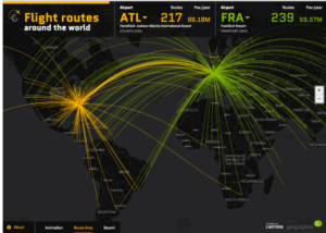
The dataset was imported to the Tableau as a csv file. I first started with creating a flight route interactive map. The inspiration was from a similar map that was created using Carto.
In order to prepare a suitable data for the map, I had to refine my data source. I had to create a path ID for every unique path between the origin airport to the destination airport. That is, there should be two rows in the data source for each path, one row for origin airport, and one row for destination airport, and repeated for every path. Since I already have the origin and destination airports in a separated column, I could create the path by create a union with the same csv file. First I opened the csv file on Tableau, then created a union with the same file by dragging it under the original csv file. To build a path between the Origin Airport to the Destination Airport, I created a calculated field based on the origin airport. I used the formula
[Origin airport] + "_" + [Destination airport]
and renamed the new column as “Route Identifier”. This created another column “Table Name” that indicated the origin airport in the Route Identifier was obtained from the origin file (airports2_2009), and the destination airport in the Route Identifier was obtained from its duplicated file (airports2_20091).
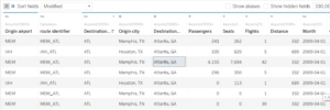
For each Identifier, we needed to create a route order to connect the points in a particular drawing order. That was, the route order 1 should be extracted from Origin Airport, and the route order 2 should be extracted from the Destination Airport. This was done by created a calculated field for route order using the Table Name. I used the formula
Table Name > calculated field >rename to “route order” > input formula
if [Table Name] = ‘airports2_2009’ then ‘1’
Else ‘2’
End
and renamed the new column as “Route Order”.
To show the location of the airport that indicated Route Order 1 would be the Origin Airport and Route Order 2 would be the Destination Airport, I created another column called Route Location. This was done by created another calculated field under Table Name using the formula
if [Table Name] = 'Airports2_2009' then [Origin airport]
else [Destination airport]
end

Even there were magnitude for both Origin and Destination Airport, it was still necessary to create a separate filed of magnitude for the Route Location so that it would know which magnitude should be used. To create the magnitude of the Route Location, I created a calculated field using the following formula
if [route order] = '1' then [longitude]
else [Destination longitude]
End
Same formula was used for the calculated field for latitude, except using latitude instead of longitude.
if [route order] = '1' then [latitude]
else [Destination latitude]
End
Then enabled the latitude and longitude for mapping by changing the value to number decimal and geographic role to latitude/ longitude.
Now the dataset was ready to use for mapping.
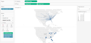
Created a new worksheet for the Flight Route Map. Double clicked the “longitude” and “latitude”, and dragged the Route Identifier to “Detail”. Because this graph was to show the route map as well as the passenger volume, we would drag the number of passenger to the “size” to visualize the count.
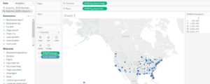
To show the route path instead of just the location of the airports, the chart was changed to display as line chart, and Route Order was dragged to “path” to display the route path. I created a filter for the airports so that individual airport could be viewed.
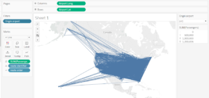
Now the map showed the flight route of the airports, but the volume of passenger was not nicely shown in the map. In order to create a better visualization, further steps were done. I created two maps on the same worksheet by dragged the latitude to create two graphs.
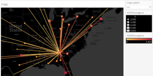
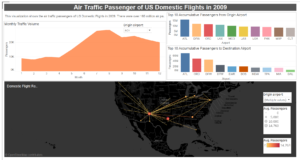
For the first graph, I dragged out the sum of passenger, and narrow down the size of the lines. In the second graph, I changed the chart from line to circle. Now one graph would show the flight route, and one graph would show the passenger volume. To merge the two graphs, I used the “dual axis” from the Airport Latitude of the second graph. Then I changed the passenger from sum to average, and adjusted the size of the circle. The bigger the circle, the more the passengers.
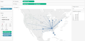
To enhance the visualization, a red-gold color with gradient for the lines and circle, and a black background were used to enhance the intensity. The deeper the color, the more the passenger travelled.
-
Creating the bar charts for accumulative passenger flow
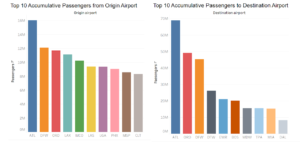
Next was to create a bar chart that indicate the accumulative passenger flow at each airport. First I created a bar chart that calculated the accumulative outflow of passenger for each airport. The Origin/ Destination Airport was displayed in the column, and the number of passenger was displayed in the row. I created the chart for both origin and destination airport. I chose to filter the airport within the top 10 number of passengers to make the analysis more relevant. I used the same color for the same airport so that it would be easily to compare the two charts.
-
Creating chart to show air traffic volume
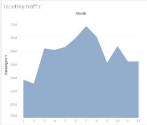
Then I wanted to explore the fluctuation of the air traffic volume during the year. I used an area chart for this visualization instead of line and bar chart. At the beginning, I already changed the fly day from “date” to “string”, so the data was ready to use. The fly date was displayed in the column and the number of passenger was displayed in the row. I renamed the x-axis label to number and edited the alias to month’s number. I changed the y-axis by starting from 10,000,000 since it would not be necessary to start from 0.
User Research Method
After I have finished the first draft, I conducted an observation and interviews with 3 participants. One participant is working in a science center and is interested in data and statistic, and the other 2 participants are frequent flight passengers and are familiar with the flight route. Participants were asked to study the network graph and then interacted with the graph in dashboard. They were also asking to think out loud, and observation was done during the process.
Interview was done afterwards and a brief information about the topic was introduced. The interview was done in an informal and conversation way, and notes were taken during the interview.
Following were the research questions that I was focusing on during the interview:
- What information do you get from the graphs?
- How are you going to work with it?
- What kind of experience do you have with the similar data in the past?
- What kind of information will you be expected to get from the graph?
Findings and Recommendations
Network Graph
One participant said that this graph was useful to check the alternative flight route. Another participants said that this graph might be useful in optimizing the allocation of resources and policy adjustment because it showed the traffic of the airports. All participants claimed that had not seen similar data displayed like this before, but they had seen similar network graph used to represent the relationships of the characters in the movies and drama.
- Colored network graph is better than the gradient colored network graph when showing different communities.
Finding:
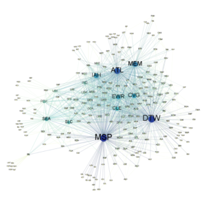
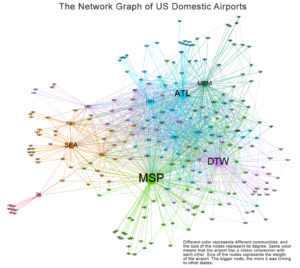
All participants found that the network graph was quite understanding and visualized. The colors helped to define the different relationships of the airport, and which airport were more connected to the other one with the same color. One participant was very interested in looking at the connection between airports and said that this graph would be helpful in choosing a connected flight.
Recommendation:
The network graph with the gradient color was presented to participant after they had finished looking at this network graph. All participants said that this was also a clear way to display the connections and relationships of the airports, but in this case, if it was used to show which airport was more frequently connected to the other, the colored network would be a better way to represent the different communities.
- Use clear and descriptive title and caption to make the graph easy to understand
Finding:
One participants was quite confused about the edges because some of them have different colors with the nodes, and thought it represented the distance between the airports. Also, all participants said that it would be interesting to show the travelling volume in this graph as well.
Recommendation:
Since the key feature of this network graph was to show the relationship of the airports, and the Dashboard graph would be used to show the traffic volume and distance travelled, it would not be necessary to show these feature in this network graph. However, a proper title and caption would be included in this graph in order to specify that it was used to represent the connection frequency and different communities of the airports.
Dashboard Graphs
All participants said that the graphs were very clear as they have showed the connections between the airports as well as the passenger volume. They have seen similar graphs and maps displaying similar data, for example, the flight route map in the airline magazines. They were expecting to see the airlines to be included in the map as well, but since this data was missing, it would not be able to do it this time.
- Multiple value options for the dropdown box for the map.
Finding:
Two participants said that it would be more interesting to see multiple location instead of just one individual airport in the map so that they could look at how different flight were connected with one another.
Recommendation:
The dropdown box was changed from single value to multiple values of origin airports for allowing user to choose multiple airports and look at their connections.
- Adding airport filter for monthly
Finding:
Two participants said that they would like to look at the passenger volume for individually airport in the month chart as well instead of just looking at the sum of monthly volume of all airports.
Recommendation:
Filter for airports was added to allow user to choose which airports they want to look at. The dropdown box was for multiple values so they could also choose to look at the monthly passenger volume for multiple airports too.
Revision
After the user research with the participants, I revised the first draft and made the following changes:
- Added a title and caption for the network graph.
- Edited the dropdown option of the map from single value to multiple value options.
- Added an airport filter and multiple dropdown option for monthly traffic volume.
- Edit the y-axis for the monthly traffic volume starting from 0 instead of 10,000,000.
- Adjusted the area color of the monthly traffic volume to orange so it had the similar color as the flight route map.
Following is the revision version of the network graph and dashboard:
https://public.tableau.com/profile/guida5123#!/vizhome/USdomesticairport5/Dashboard1?publish=yes
Further Development
As this project targets more about the flight route and air traffic volume of US domestic airline, I did not further rearrange the data for network graph based on the dataset that I obtained from the Kaggle website. For the network graph, I was looking for the research findings from the participants rather than the validity of the data. In the future, I would generate a new dataset for creating the network graph from the dashboard dataset. Furthermore, I would find the airline dataset and merge it with the dashboard dataset for a more complete visualization.
The post Visualization of US Domestic Flights appeared first on Information Visualization.