NYC wifi hotspot locations visualization and analyzation
April 24, 2018 - All
Introduction:
Using the data from the NYC Wi-Fi Hotspot Locations from NYC Open Data website. I was able to visualize a part of the data and focus on mapping specific types of wifi hotspot locations. The relationship between the wifi hotspot and metro line/entrance also been discovered. This is not only a map but a deep and detailed analyzation of the NYC wifi hotspot locations. The wifi provider and region were covered at the same time.
Examples:
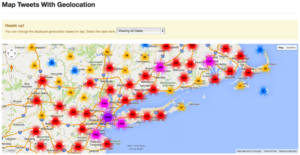
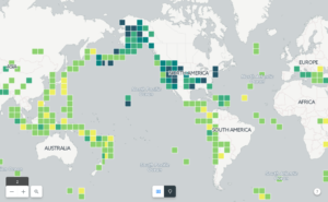
When I browsed the map visualization, here are some attracting maps stimulate my interest to imitate.

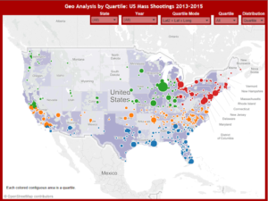
These three images use the different form separately for displaying the elements impact, or its classifications.
Materials:
- NYC open data
- Carto
Carto is a creative and powerful tool for visualizing dataset to complete geo-analysis. With the fully customized appearance and multiple analysis tools, Carto can create amount sophisticated visualizations.
Methods:
Once the aggregate data was downloaded, these two maps separately based on wifi hotspot locations and metro line/entrance were immediately created by Carto as Figure 1 & 2.
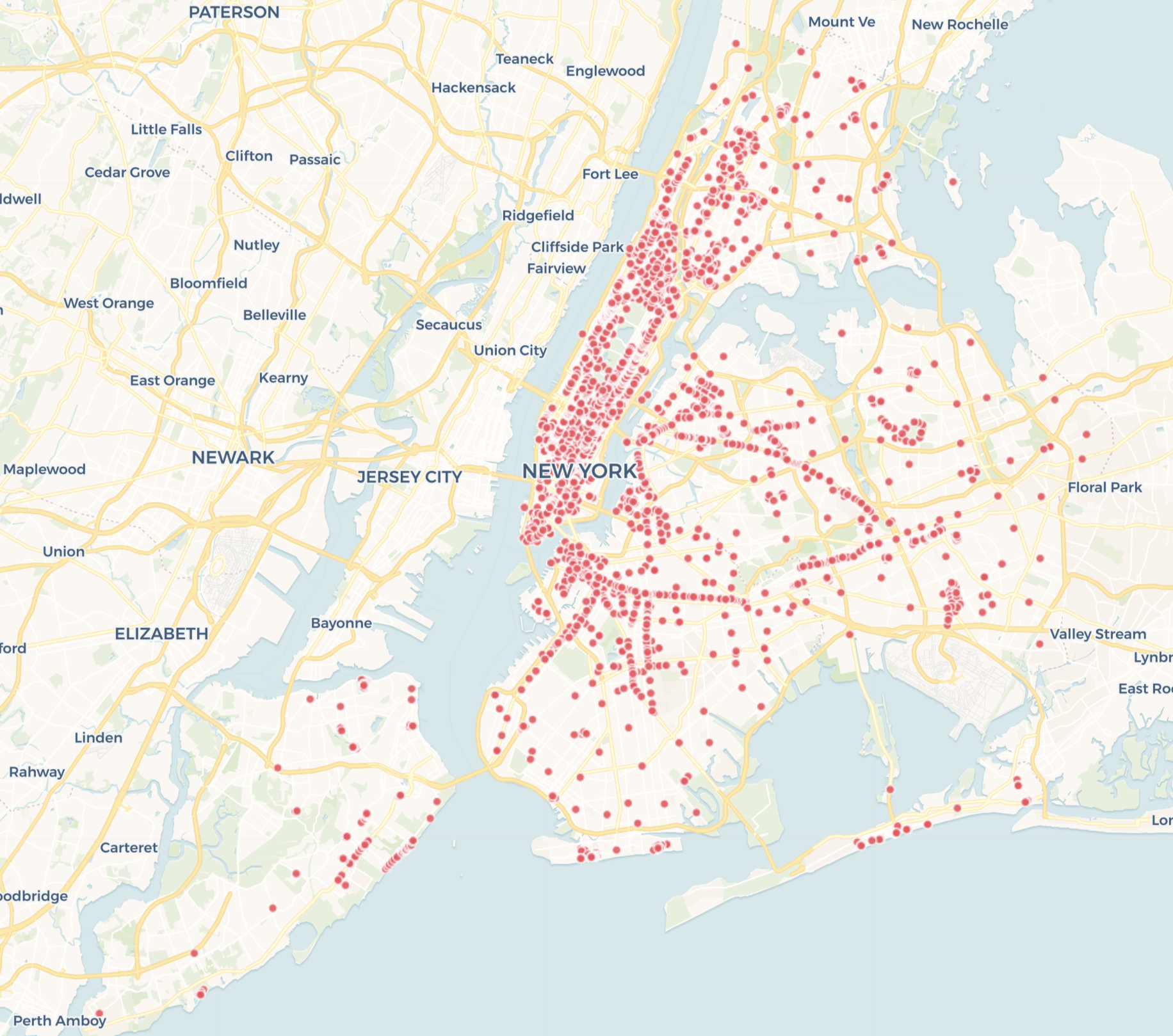
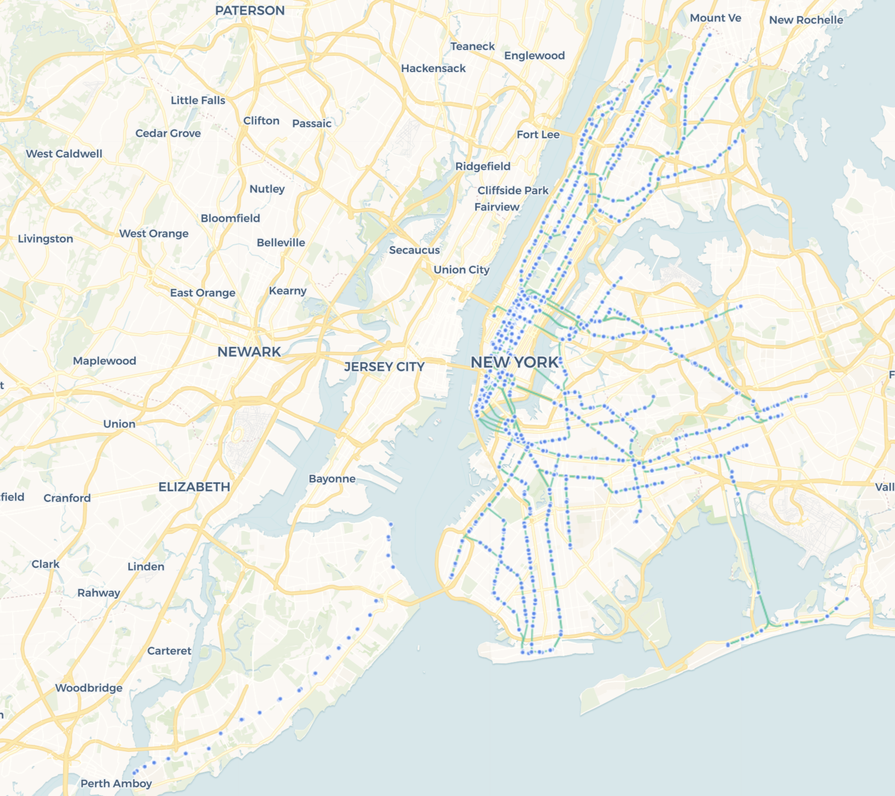
To deeply dig out the details of NYC wifi hotspot locations information, its visualization of wifi providers, region, service set identifier (SSID) were created one by one.
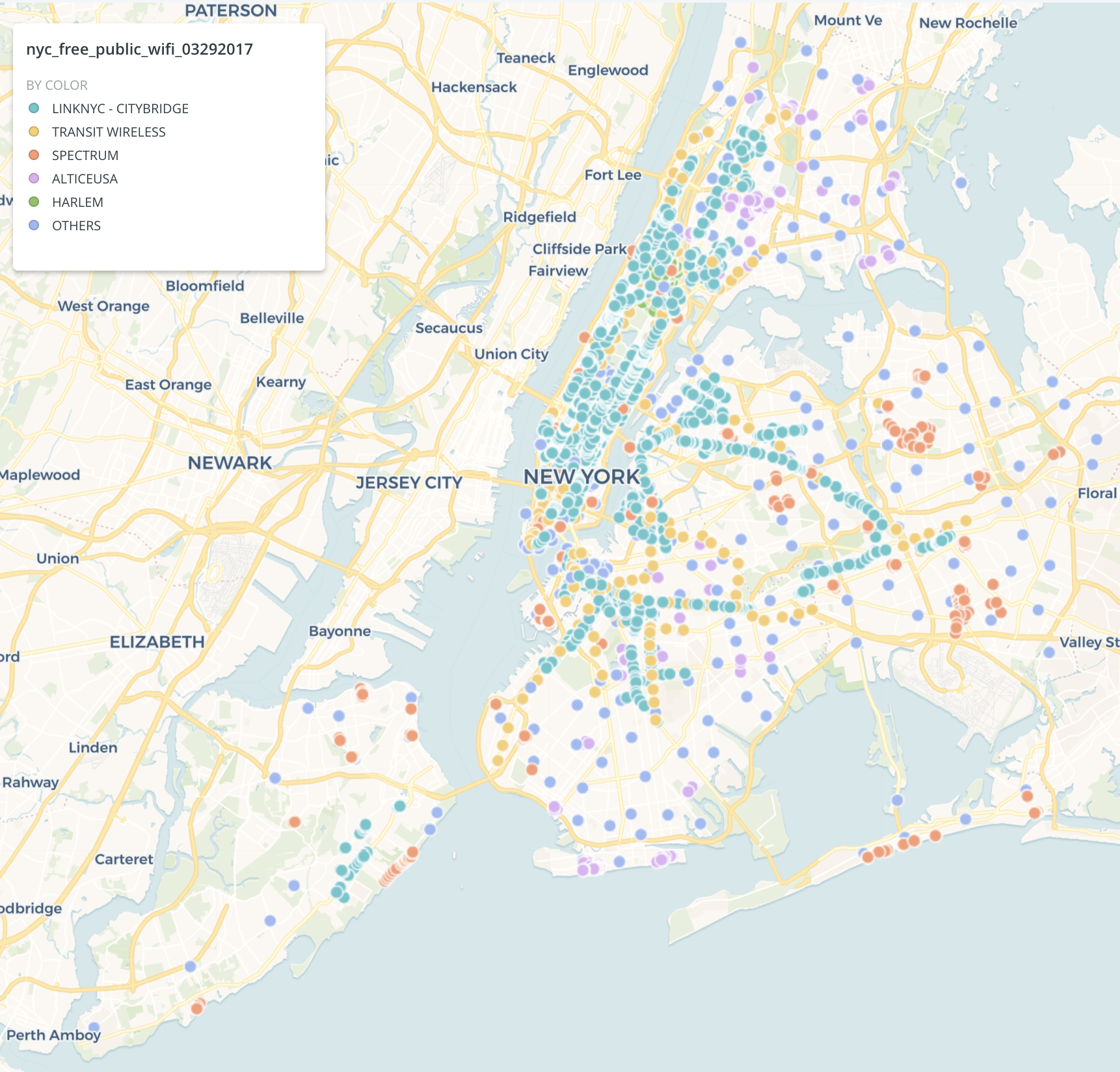
The providers’ id in the dataset were distinguished and set as a widget to display on the map. This figure shows that the main provider is Citybridge distributing in Manhattan, and in other regions, the Spectrum and Alticeusa are two main providers. The transit wireless is arranging alone the metro lines. The Citybridge, Transit wireless and Harlem are all free wireless.
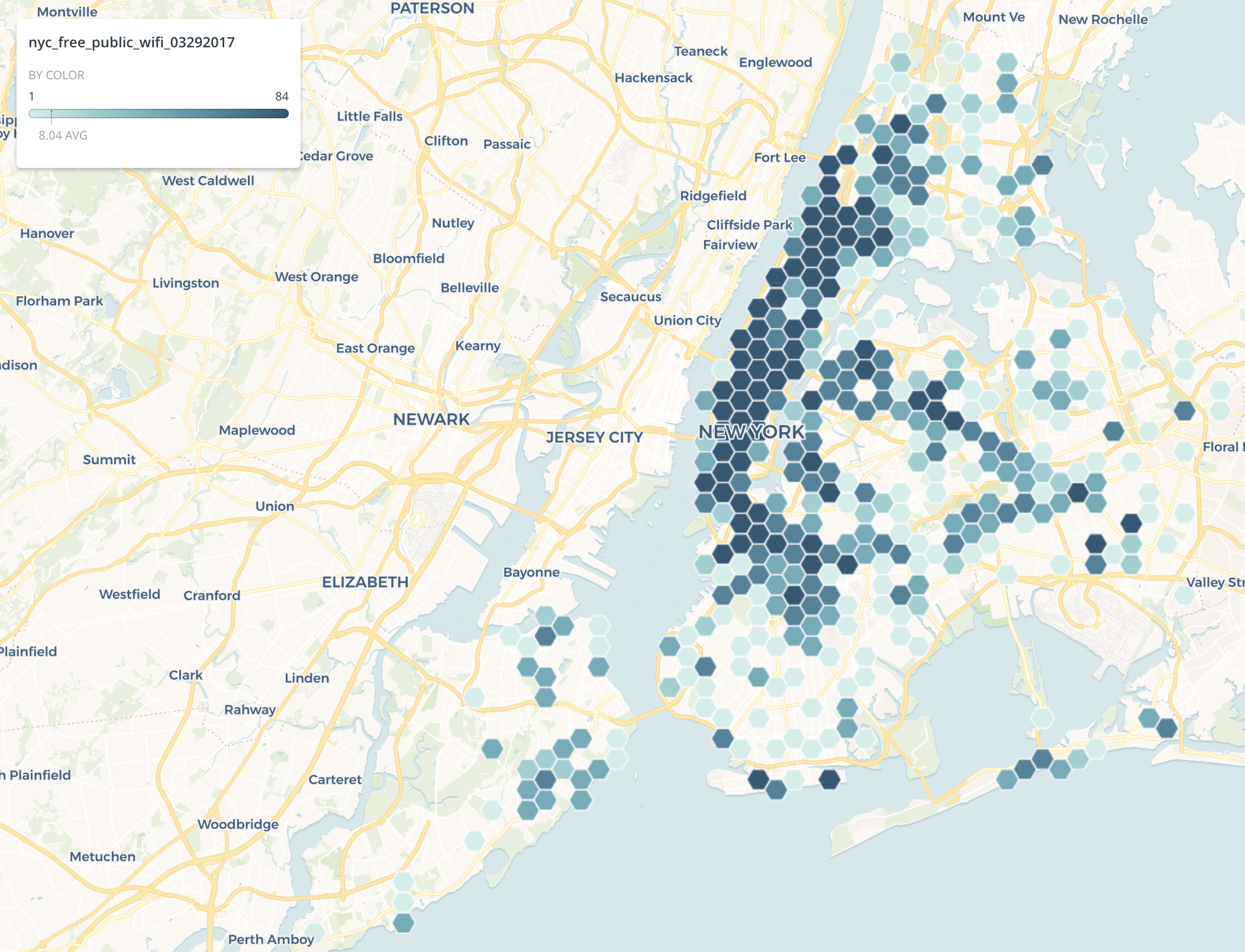
From figure 4, we can find that Manhattan has more wifi hotspot comparing with other cities. Also, the wifi hotspot density is higher than other areas.
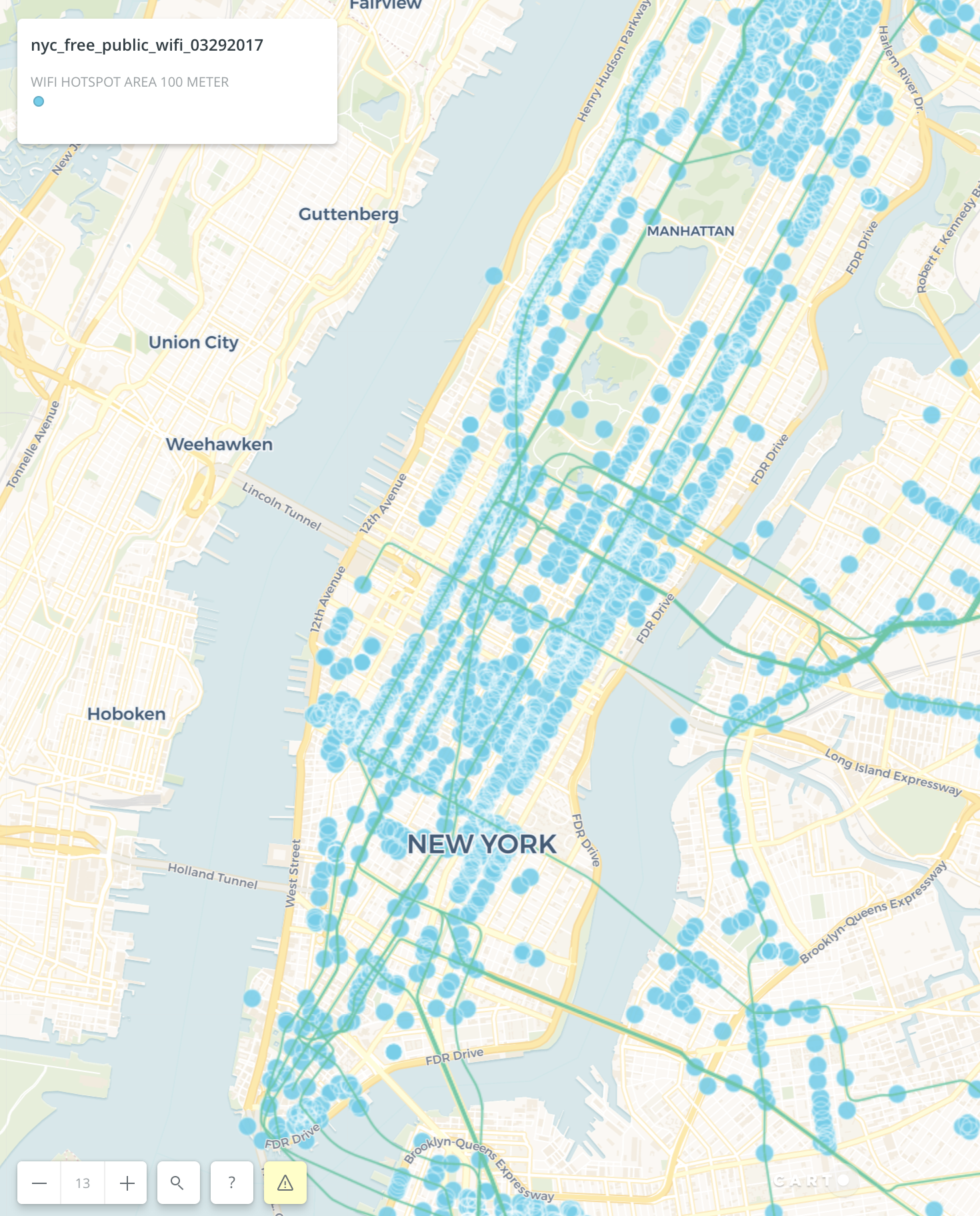
To analysis the wifi scope I used analysis tool “create the travel/distance buffers” in Carto. The NYC metro line has been imported into the map. We can find most of the wifi hotspot distribute along the metro lines. This image also illustrates that the central park and some of the blocks don’t have the wifi hotspot.
When looking the small scope of the map, some information can be dug out.
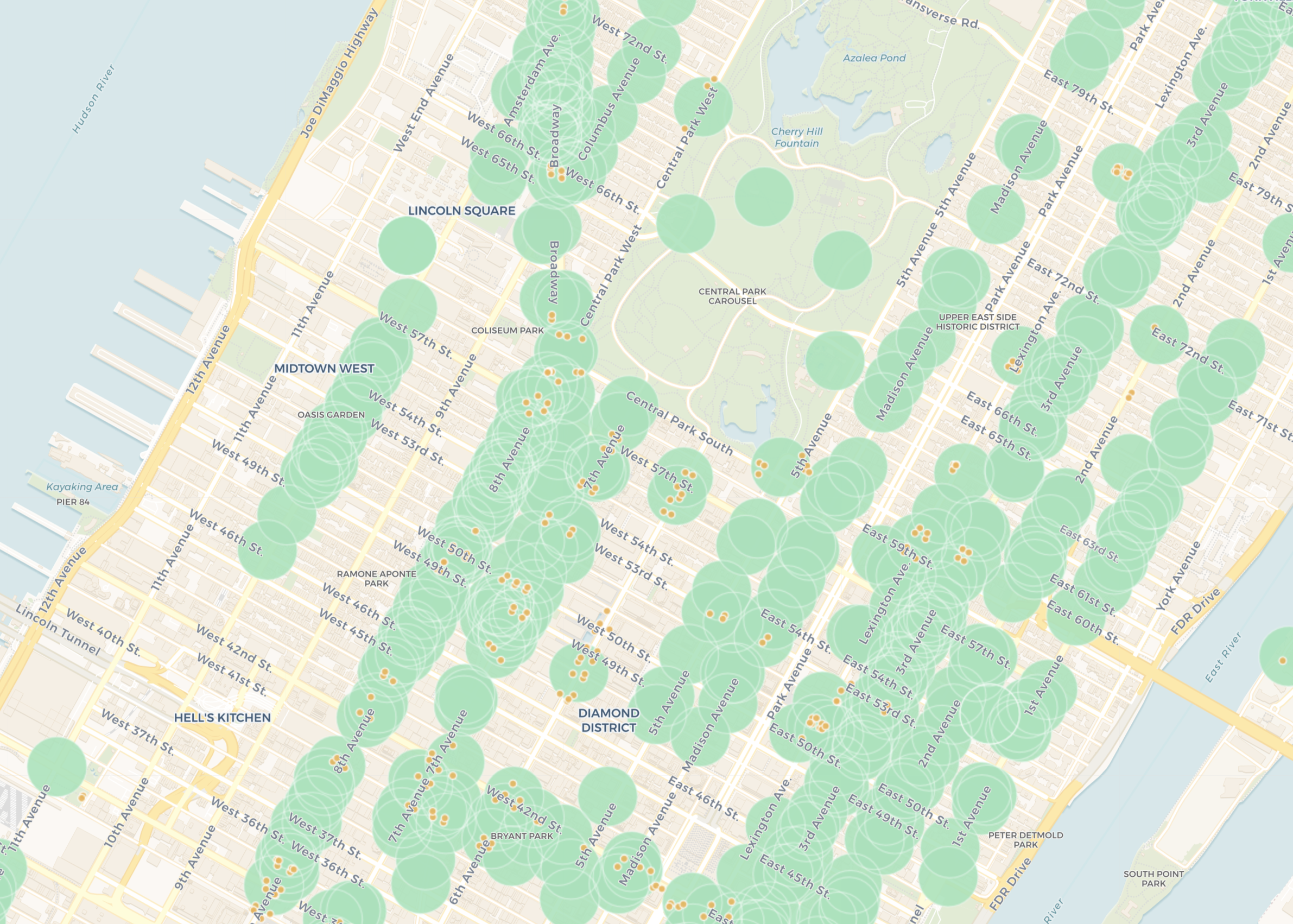
When we see figure 6, the 9th avenue, part of 6th avenue and park avenue have less wifi hotspot locations. Another thing is that the wifi hotspot locations also appear in the area where no metro entrance around, such as 10th avenue and 1st avenue.
Results & Discussion:
The results of the map in Carto shows the exact location of the wifi hotspots, distinguished by the type of providers and area, which presented by various colors on the map. Also, I choose wifi hotspots’ 100-meter unit to show its range and combine the result with metro line and station to find something interesting.
At first, I tried to use “find nearest” to draw the connection between wifi hotspot and metro entrance, but Carto didn’t display the results as I want. However, I still review the map to find the connection between through the “create the travel/distance power” analysis tool.
Carto is an effective and user-friendly software to achieve the geo-analysis. The simple function, clear interface and powerful analysis and widget tool make the visualization faster and more beautiful.
Resources
Example 1: Getting Started with Carto Builder from http://2016.padjo.org/tutorials/carto-getting-started/
Example 2: Geo Analysis by Quartile: US Mass Shootings 2013-2015 from https://public.tableau.com/views/USMassShooting2013-2015v2/Dashboard5?:embed=y&:display_count=yes&:showTabs=y&:showVizHome=no
Example 3: SOCIAL MEDIA TRACKING AND ANALYSIS SYSTEM from https://blog.idl.ssrc.msstate.edu/2013/10/02/hello-world/
Dataset: NYC wifi hotspot locations, NYC metro line, NYC subway entrance
The post NYC wifi hotspot locations visualization and analyzation appeared first on Information Visualization.
