Visualizing the Content of Science Fiction with Gephi
April 21, 2018 - All
According to Goodreads, “Science fiction (abbreviated SF or sci-fi with varying punctuation and capitalization) is a broad genre of fiction that often involves speculations based on current or future science or technology.” It is a very popular genre of fiction which often includes some imaginative concepts and explores the potential consequences of scientific and other innovations.
Within the genre, there are also many topics of science fiction, such as spaceflight, timetravel, robots, etc. It will be very interesting to see which topics are the most popular and how they are related to or overlapped with each other.
Data Sources and Inspirations
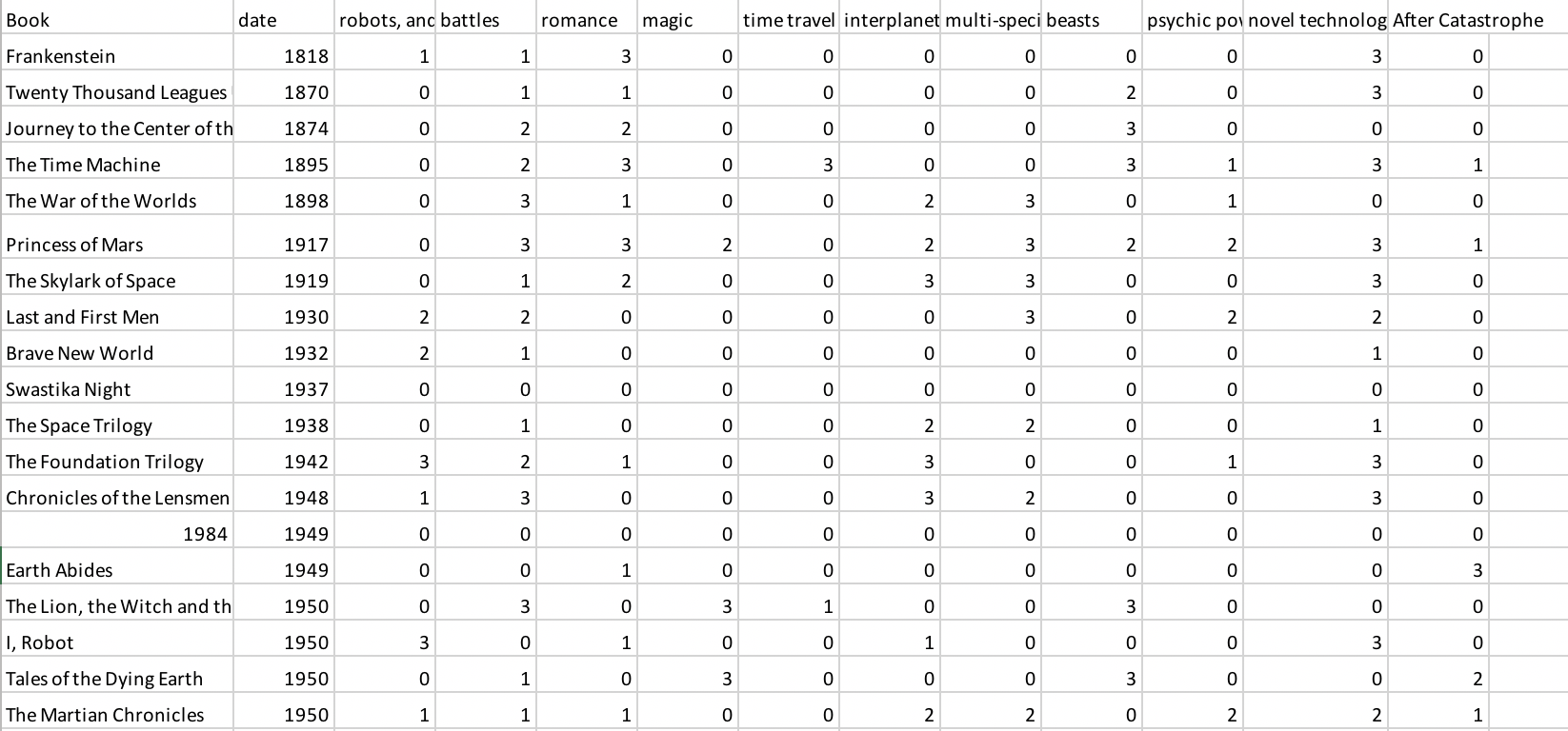
I found a dataset from CASOS collected by Dr. Kathleen M. Carley, which includes the date, author, century, author gender and content of story of 157 Sci-Fi books. I intentionally used the data of “content of story” and Gephi to create a network visualization about the content of science fiction.
Before jumping into creating the visualization, I collected three Gephi examples for inspirations. I like them having different sizes and colors to visualize the connections and grouping, and annotated labels for readability.

Tools and Process
To create the network visualization for the content of science fiction, I used Excel and R to clean the dataset, and then used Gephi to create the visualization.
At first, I used Excel to remove the irrelevant data in the original dataset, just leaving the “content of story”. There are 11 kinds of content identified in the dataset: robots, androids or AI computers / battles / romance / magic / time travel / interplanetary / multi-species, sentient species / beasts / psychic powers / novel technology (not AIish, ex. steam based technology is considered novel) / after catastrophe – often post apopolyptic. Each fiction has different rates (0-4) for each content.

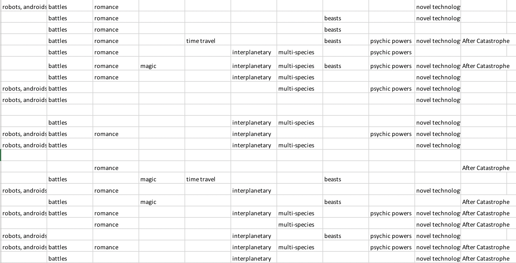
In this project, I put away the fiction title and rates, and replace the rates (1-4, except for 0) with the content label and saved the file as CSV file in Excel.

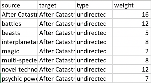
Then I used R to permute the network data and wrote out the weighted edgelist as a new CSV file. Now the dataset is ready for importing to Gephi to create the network visualization.

Results and Analysis
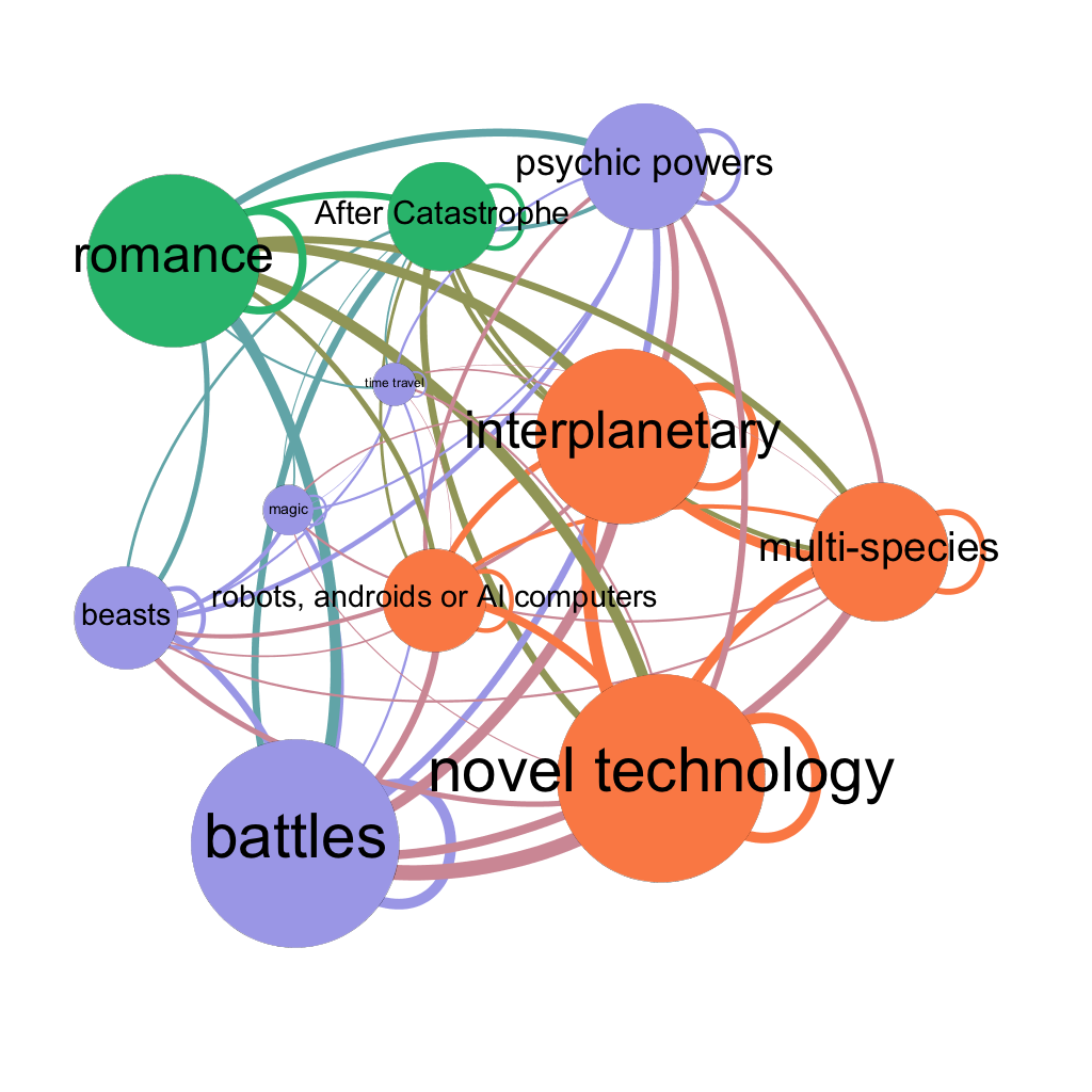
In Gephi, I ran Average Degree and Avg. Weighted Degree to create the visualization with expansion layout, from which shows the most-common content in the larger nodes: Battles, Novel Technology, Interplanetary and Romance, followed by Multi-species, Psychic Powers, After Catastrophe, Beasts, and Robots, Androids or AI Computers.
To further identify how different content are related to each other. I ran “Modularity” to see which content tend to appear together. The result shows there are majorly three groups:
1. (Orange Nodes) Novel Technology, Interplanetary, Multi-species, and Robots, Androids or AI Computers;
2. (Purple Nodes) Battles, Psychic Powers, Beasts, Magic, and Time Travel;
3. (Green Nodes) Romance and After Catastrophe.
It means the content within each group is often mixed with other content in the same group.

Future Direction
Besides the content data, there is also “date” data in the dataset which refers to the date the science fiction first published (if it is a series, date listed is the date first book was published). I believe it will be meaningful to separate the dataset based on the century and run the analysis again to see the popularity and relation of content in different centuries.
Network visualization is an interesting while relatively complicated kind of information visualization. It requires great understanding of both data and the tools. I would like to explore more features of Gephi in the future, so I can create more in-depth visualization around the topic, for example, trying more the layout and metrics features. Creating real-time and interactive visualization are also the directions that I want to explore more, because it provides flexibility for the audience to find out the information they want. It’s also important to learn more about data cleanup using tools like R and OpenRefine, because how the data files look like directly affect the visualization result.
By going forward, I will try different kinds of dataset to explore more about network visualization. For example, the social media data and character relationship of fiction or tv show. Furthermore, after learning different kinds of visualization, I hope I can use different tools at the same time to gain more insights from one dataset or project.
References:
- Sci-Fi Books Dataset: http://www.casos.cs.cmu.edu/tools/datasets/internal/index.php
- Science Fiction Intro: https://www.goodreads.com/genres/science-fiction
- First Design Example: http://www.martingrandjean.ch/network-visualization-shakespeare/
- Second Design Example: https://noduslabs.com/courses/network-visualization-and-analysis-with-gephi/units/section-3-network-visualization-and-analysis-case-study/page/8/?try
- Third Design Example: https://health-policy-systems.biomedcentral.com/articles/10.1186/s12961-016-0104-5
The post Visualizing the Content of Science Fiction with Gephi appeared first on Information Visualization.