
Visualizing Ingredient Networks
April 19, 2018 - All
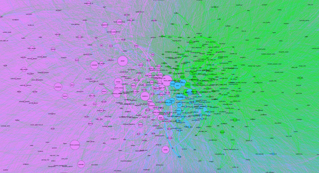
As someone raised by a chef and cookbook author, I’ve always loved cooking and experimenting with different recipes. So after running into the “Flavor Network and the Principles of Food Pairing” dataset in Jeremy Singer-Vine’s database, I knew I had to try to analyze the network myself.
This visualization was intended as an ingredient exploratory tool for people interested in food and cooking. By exploring the visualization, users can look at which ingredients are used the most and least as well as discover rare and fun ingredients they might not have previously known existed (e.g. ).
Process
The Dataset
I first found the ingredient dataset through Jeremy Singer Vine’s weekly newsletter, “Data is Plural”. According to Singer Vine, four scientists created this edge list by analyzing 56,498 recipes downloaded from three websites and counting how often any two ingredients appeared together in the same recipe.
Excel
The dataset was mostly ready for importing into Gephi, an open source network analysis tool, and only needed a bit of cleaning up in Excel as it had extra whitespace above the titles. To clean the data, I added new headers for “source”, “title”, “weight” and “direction” and imported it into Gephi.
The data featured upwards of 220,000 pairs of ingredients, each accompanied by the number of times they appeared together in a recipe. Some of the most common pairs were different kinds of teas, beers, and cheeses. An uncommon pair, which was only featured once, was roasted Spanish peanut with raw lamb.
Inspiration
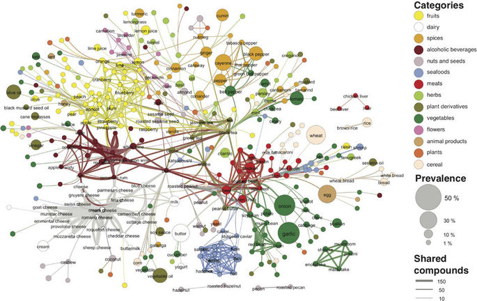
After finding the dataset through Data is Plural, I was immediately interested in the visualization created by the authors in the original paper, which was fairly segmented and clustered. I used this as my main inspiration with the goal of recreating a similar visualization.
While searching for inspiration, I also found two other visualizations that represented large networks. Both of these visualizations inspired me to try to make sense of the network’s individual nodes as much as possible, within such a dense whole network.
Analysis and Design Process

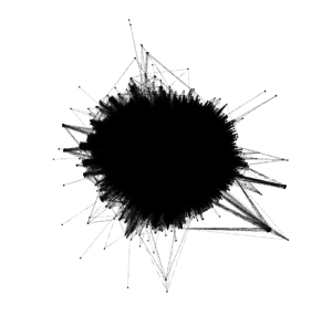
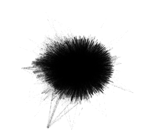
When first importing the data into Gephi and due to the number of nodes and edges, the network first looked like a solid black box. I used Force Atlas 2 to try to untangle the network and give it more meaning and then utilized the Expansion layout to try to expand the density and be able to more easily and freely analyze it. Although after utilizing the Expansion layout the network began to take on more shape, I could immediately tell that it was going to be fairly dense.
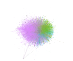
I then ran a few Network Overview analyses and chose to apply the modularity partition the network’s nodes in order to create clusters and begin analyzing the data. In doing so I realized that my network was already was more dense than the original article visualization, as the largest cluster contained more than 60%. The second and third largest nodes contained about 25% and 11%, respectively.
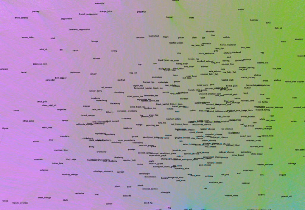
After creating clusters, I added labels to analyze particular nodes and see if I could begin to observe patterns. As soon as I zoomed into the center, I noticed that the purple cluster, the one with 60% of the nodes, contained a number of fruits and teas. The second group, colored green, contained a number of proteins like beef, chicken and fish, and carbohydrates. Finally, the third smallest group contained alcohol and cheese.
Analysis
Although I realized I was ultimately not going to be able to create a similar visualization as the original one due to the size of my clusters, I decided to continue to analyze the network I had. I chose to change the node sized based on centrality, betweenness centrality and clustering coefficient.
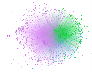
Clustering Coefficient
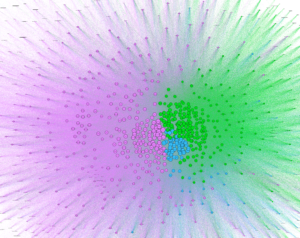
Centrality
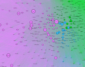
Betweenness Centrality
Obstacles and Future Work
During the process of creating the network visualization I ran into one main obstacle—the size of the dataset. With such a dense whole network, understanding the relationship between two specific ingredients proved almost impossible. The with upwards of 220,000 edges, the lines overlapped each other so I was not able to analyze connections between two individual pairs. The dataset’s size also caused Gephi to load more slowly than a smaller one.
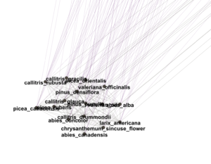
Although I could not analyze the individual relationships utilizing the network’s edges, I was able perform higher-level analyses based on centrality and clustering coefficients to better understand overall trends. It was interesting to see the ingredients that were utilized the most often as well as looking the fringe cases and discovering new ingredients.
If I had more time I would like to work with the data to create smaller clusters and then transform these into hypergraphs, similarly to what the original visualization explored. Additionally, I would like to analyze the ingredient list by clustering these based on cuisine or region.
Overall, I found Gephi to be a great tool for creating networks. Although it requires a learning curve, it truly makes creating networks much easier. Recreating such a network by hand would have been impossible.
Sources:

http://www.visualcomplexity.com/vc/project_details.cfm?id=941&index=941&domain=

http://www.visualcomplexity.com/vc/project_details.cfm?id=995&index=995&domain=

https://docs.google.com/spreadsheets/d/1wZhPLMCHKJvwOkP4juclhjFgqIY8fQFMemwKL2c64vk/edit#gid=0

https://www.nature.com/articles/srep00196
The post Visualizing Ingredient Networks appeared first on Information Visualization.