Use Gephi to present the metal world trade in 1994

April 19, 2018 - All

Introduction:

Gephi, one of the useful software to analyze and visualize the amount of big data sets as networks, is a helpful tool to review multiple connections among several elements. Also, Gephi uses a 3D render engine to display graphs in real-time and speed up the exploration (Gephi website).

For example, when analyzing a network, all the elements have two significant information. One is the nodes, the elements themselves, and another is the edge, which pinpoints the relationship between different nodes. Considering the complexity of the world trade, using Gephi is the right tool to visualize it. Besides, by applying the multiple functions of Gephi, we can analyze and find more results.

Here are three examples, which help me to form the ideas.
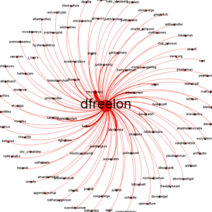
The first is the Spreadsheet converts tweets for social network analysis in Gephi. The spread shape and the clear relationships present the author’s network.

The second example is the world trade theme. Although there are no labels on this image, the colorful nudes and edges and average layout display the variety of the world trade.

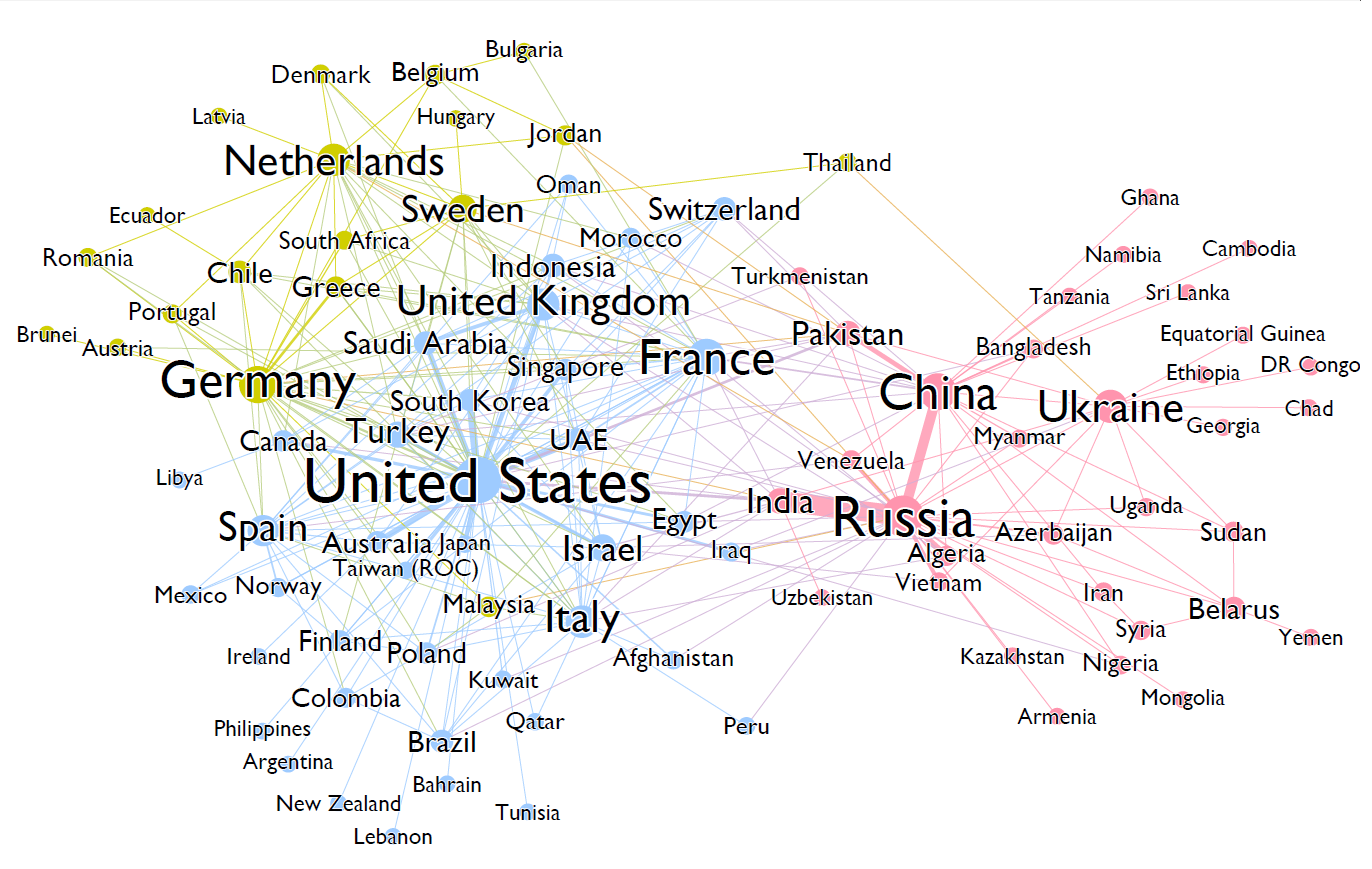
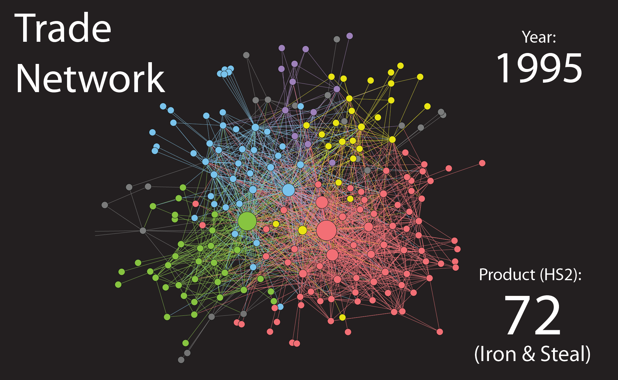
The third example is also a world trade image. This image has partly obeyed the location of different countries. The different size of nodes and edge are both clarify the trade amount and easy to read the trade relationship from the image.


Methodology:

The dataset of world trade miscellaneous manufactures of metal among 80 countries (world trade) in 1994 was chosen to present the complex trade relationship among different countries.

The original file is xml. type, which was transmitted and the trade source and target countries have been picked up from the dataset and saved as csv. file type. Then the csv. file was inserted into Gephi. The absolute value of imports (in 1,000 US$) was set as the weight of each edge. Once imported, each node, the country’s name have been automatically marked, and also the trade has been input.


Process:

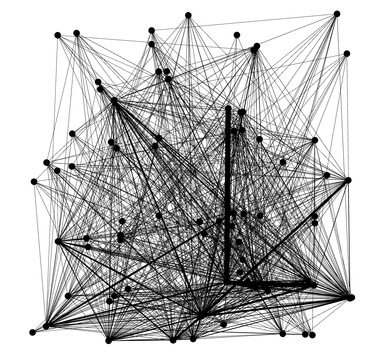
Download the dataset at first and transmitted them into csv format and then insert the file into Gephi. The original image looks like as this:

Overview image

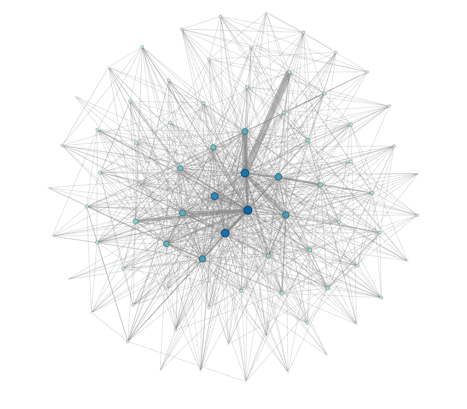
Once adjusted the color, set the nodes size by ranking weighted degree, each node and edge display the scope of the trade. Fruchterman Reingold layout was used to create a circle shape of the image to visualize dataset.

The modified image

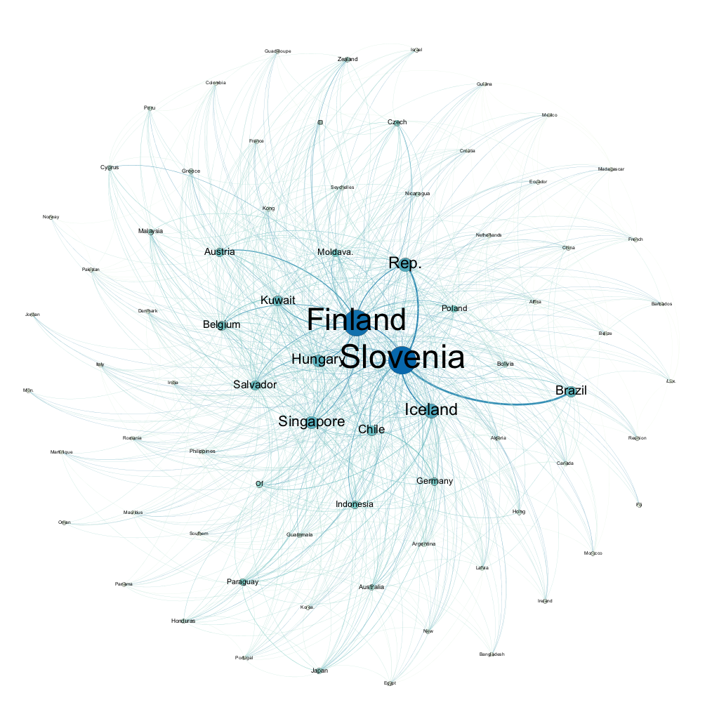
After run the average degree, modularity and preview the result, here is the final verison of the database.

The world trade in 1994

We can see that the Finland and Slovenia are two major exporting countries of metal world trade in 1994.

Future trend

For using this software, the rough world trade image has been created. Not only the trade relationship but also other networks can also be visualized by Gephi, especially the social network. With the booming of big data, the social influence shown by social networks is far beyond people’s imagination. Many recent incidents on the Internet have shown that how to measure and present the relationship and effectiveness of information dissemination in social networks is a question worthy of consideration for each of us.

References

  1. Gephi website: https://gephi.org/users/
  2. Example 1:Spreadsheet converts tweets for social network analysis in Gephi: http://dfreelon.org/2013/04/26/spreadsheet-converts-tweets-for-social-network-analysis-in-gephi/
  3. Example 2: WHERE WILL YOUR COUNTRY STAND IN WORLD WAR III? https://algobeans.com/2016/04/12/network-graphs-where-will-your-country-stand-in-world-war-iii/
  4. Example 3: TRADE NETWORKS AND MORE… https://visualeconophysics.wordpress.com/2013/06/15/trade-networks-and-more/


The post Use Gephi to present the metal world trade in 1994 appeared first on Information Visualization.

› tags: data / visualization /