From Treemaps to Network Graphs: Further Visualizations of Hierarchical Relationships in The Art Genome Project
April 19, 2018 - All
Introduction
This report explores categorical and hierarchical data from The Art Genome Project, Artsy’s ongoing study into the characteristics and connections between artists and artworks, using Gephi, an open-source network analysis and visualization software. The goal of the resulting network visualization is to graphically represent abstract information hierarchies, providing a shared point of reference for internal stakeholders at Artsy.
Background
As described in my previous post “Visualizing Dynamic Hierarchies in The Art Genome Project,” Artsy’s mission is to make all the world’s art accessible to anyone with an internet connection. By partnering with the world’s leading art auctions, galleries, fairs, and museums, the site functions as a free and powerful resource for users interested in art collecting and education. At present, there are over 800,000+ works of art and design featured on the platform by more than 80,000 artists.
The Art Genome Project (“TAGP”) is the classification system and technological framework that fuels Artsy. TAGP maps the characteristics, referred to as “genes” in-house, that connect artists, artworks, architecture, and design objects across time. There are currently over 1,300 genes of more than 40 types covering art-historical movements, subject matter, formal qualities, and more. Importantly, unlike tags, which are binary—something is either tagged “chair” or not—a gene is evaluated on a scale from 0-100 and then hand applied to an artist or artwork record by an expert contributor. While TAGP also uses tags to highlight specific iconography, motifs, and subject matter, dynamic genoming allows for greater nuance when capturing the conceptual and formal aspects of cultural heritage records.
TAGP is a semi-structured controlled vocabulary, however it is not in compliance with ISO 25964 or related standards (ISO, n.d.) and its information hierarchy is relatively flat, going two levels deep at most. To meet these standards and create a deep taxonomy that is truly user-friendly, one of the first steps is to visualize its current structure and identify areas that are working and, conversely, need improvement to prioritize future iterations.
Previous work in Tableau Public resulted in a unified dashboard that visualizes quantitative analytic data through line graphs, packed bubble charts, and treemaps. Rather than focus on user engagement with gene pages however, this visualization studies the hierarchical connectivity of TAGP through network mapping.
Inspiration
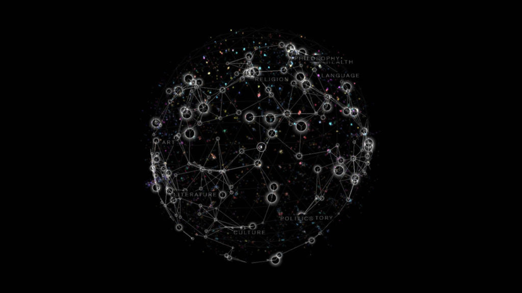
Wikiverse, a “galactic reimagining of Wikipedia” as a cosmic web of knowledge by Owen Cornec provided initial inspiration for visualizing TAGP (2014). Although the interactive 3D visualization relies on JavaScript and webGL in lieu of Gephi and dwarfs the TAGP dataset of 1,301 genes with its 250,000 Wikipedia articles, Wikiverse’s ability to cluster related concepts in a such a way that transforms abstract ideas into a navigable, representational tool directly informed this network graph.

Figure 1. Screenshot of Wikiverse by Owen Cornec.
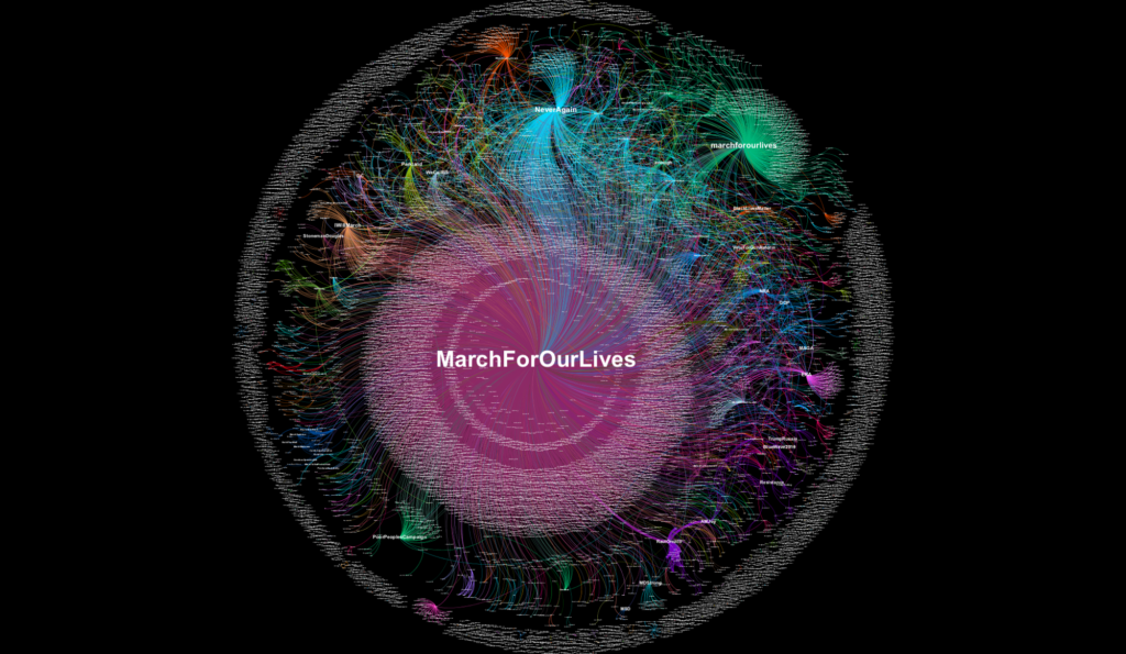
Erin Gallagher’s network visualizations of Twitter hashtags associated with #MarchForOurLives and #NeverAgain marches in March 2018 also served as inspiration for the TAGP mapping. Unlike the custom code of Wikiverse, Gallagher uses Gephi’s plug-and-play GUI, specifically its built-in OpenOrd and Force Atlas 2 layout algorithms, to create the Twitter user-to-hashtag graph. Gallagher’s visualization inspired the author to try changing the layout algorithm for the TAGP network visualization from the Frutcherman-Reingold algorithm to Openord, although ultimately the former was used in the final version.

Figure 2. Screenshot of user-to-hashtag graph of 12,987 #MarchForOurLives tweets from March 23 to 24 by Erin Gallagher.
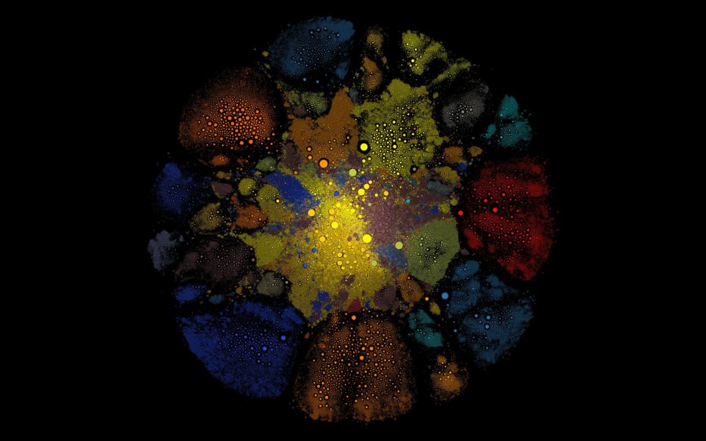
Finally, a network visualization found on the Gephi forums that uses Gephi’s GUI, Google Maps API, and Valve’s Steam Web API to render a large graph of Steam Community members informed the clustering of the TAGP graph. Despite the link rot in the original forum post, the author was able to find the code on GitHub, along with an active link to the Steam Community network.

Figure 3. Screenshot of Steam Community network graph.
Methodology
Data Collection and Transformation
This dataset was created by running SQL queries in Looker, a proprietary data analytics platform, against Artsy’s AWS Redshift data warehouse. After querying all genes, types, and families, the results were exported to a local CSV file to be further transformed in OpenRefine, an open source desktop application for data wrangling.
OpenRefine was used to shorten and standardize the names of the various gene types. For example, “X – Automated Collector Category (Concept) (Display by Artwork, do not factor into similarity) DO NOT USE,” “X2 – Automated Collector Category (Content) (Display by artwork, DO factor into similarity) DO NOT USE,” “Y – Automated Collector Category (Display by Artist, do not factor into similarity) DO NOT USE” were all changed to “Collector Categories” in the interest of reducing the label lengths later in Gephi. To optimize the import process into Gephi, the column labels for “Gene Name” and “Gene Type” were changed to “Source” and “Target.”
Visualization Creation
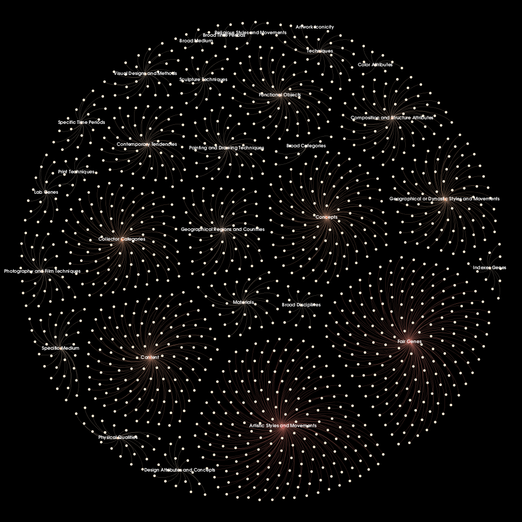
The CSV file of the genome data was imported into Gephi, resulting in directed graph of 1,330 nodes and 1,301 edges. Labels were selectively added in the Data Laboratory mode for gene types, as listing every gene name would overwhelm the visualization. A warm color palette was chosen with automated gradient values calculated by Gephi based on node ranking by out-degree. Inspired by the aforementioned network visualizations, a black background with white labels and pale grey edges were selected to create a firework-like effect. Since the Gephi desktop application does not offer inline frame features for web publishing, the visualization was exported as a PNG file for display.
Results

Figure 4. Network graph of The Art Genome Project hierarchy at one level of inheritance.
Future Directions
In the next iteration of this design, the author envisions additional attributes to capture the count of artists and artworks for each gene application and changing the weights in the edge table from a uniform 1.0 to reflect the term frequency-inverse document frequency (tf-idf) values. tf-idf weighting ensures that terms that occur frequently throughout the global genome (e.g. “Painting”) are weighted less heavily than genes that occur rarely (e.g. “Political Figures”), even if the gene for “Painting” has been applied at a value of 100. By including gene application counts and tf-idf values in the node and edge tables, a richer, more complex network graph could be generated that maps The Art Genome Project with greater nuance.
References
Cornec, O. (2014). Wikiverse [Web application]. Retrieved from http://wikiverse.io/
Gallagher, E. (2018, March 25). #MarchForOurLives & #NeverAgain [Blog post]. Retrieved from https://medium.com/@erin_gallagher/marchforourlives-neveragain-a59ee4a078cb
International Organization for Standardization. (n.d.). The international standard for thesauri and interoperability with other vocabularies (ISO No. 25964). Retrieved from http://www.niso.org/schemas/iso25964
Large Steam network visualization with Google Maps + Gephi. (2012, November 18). Retrieved from http://forum-gephi.org/viewtopic.php?t=2314
The post From Treemaps to Network Graphs: Further Visualizations of Hierarchical Relationships in The Art Genome Project appeared first on Information Visualization.