
Exploring Network Data With Gephi
April 19, 2018 - All
When I was looking for the appropriate dataset for this project, I explored different network datasets repositories. By studying the available network dataset on the Internet, I realized that the structure of a network dataset is more defined than those that are used to create other types of visualization. This project allows me to understand the importance of data structure to achieve the result. Because of the defined structure required to use specific data to created network visualization, there is a limited amount of data on the topics that I’m interested in. I came across a dataset that is appropriate for the exploration of using Gephi. For the amount of time that was given and the limitation of collecting and constructing data into usable form, I treated this project as a learning experience of using the Gephi software. For the subject matter, I decided to explore the internal connectivity of a CMU based startup company.
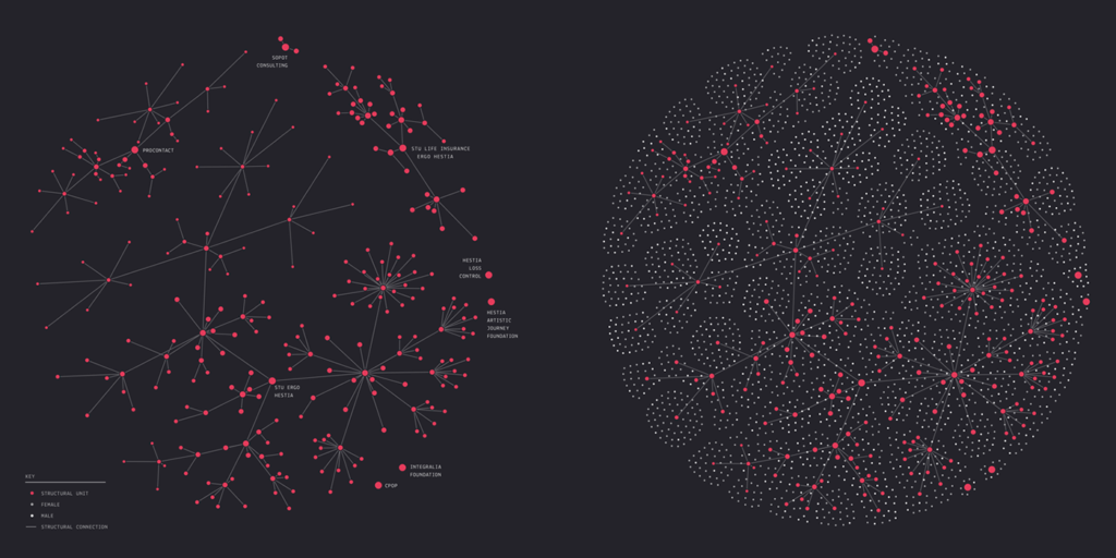
My first inspiration of exploring a similar topic came from this visualization created by Hanna Dyrcz. She visualized the connection between a company’s structure and how they work with each other in two degrees of modularity and hierarchy. Her visualization uses a Fruchterman-Reingold layout to simulate of a company as a whole. The simplicity of color choices highlights the modular structure of a company.
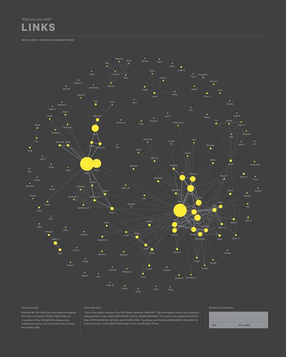
The second inspiration came from designer Nicholas Felton’s 2012 annual report. Part of his report used network visualization to explore the idea of links between people. The use of ranked node sizes highlights people that have the most connections in the network.
The third inspiration came from Free Code Camp’s tutorial published on Medium. The tutorial explained the process of creating a network that illustrates the connectivity between different programming languages. The use of different node colors and sizes highlight different language groups. Selective node labeling eliminates the distraction of small nodes.
I came across the dataset when I was looking at CASOS produced datasets. The dataset is hand-coded base on ethnographic observations of a CMU based Startup. The dataset was structured in XML format. I used Open Refine to separate the XML file into a node file and an edge file. I used Gephi to create the network visualization.
I wish there are more description about the dataset so that I could understand the categorizing better between nodes. The category I used to create this visualization is my interpretation based on the data. There is no explanation of why the same name is coded twice in the dataset.
Many elements constitute the look and feel of a network visualization. I explored the use of colors and sizes for nodes and the use of colors and weights for edges. Here is the finished result.

After I took a closer look at the node file, I realized those 29 nodes could be split into three different categories. I added categories for each node: person, subject, department and programming. I differentiated those nodes by assigning a different color to each category. I also wanted to make the nodes that have the most connection to stand out. I chose to use a ranked font size and node size to make them stand out. I decided not to use curved line because it is a bit distracting, and it adds more noises to the overall graph. Here is a side-by-side comparison between the straight and curved edges.
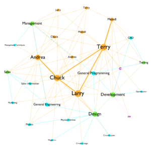
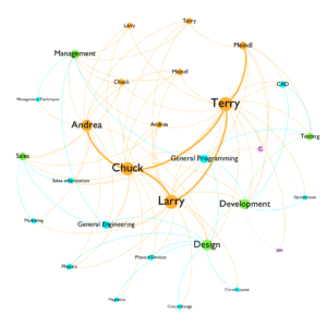
For a small network like the one that I’m working with, many details get to show in one graph. The problem here is some of the node labelings have long phrases, such as “general programming.” It gets more visual attention because of its length. However, it is not the focus of the graph. Therefore, font size can help the understanding of the hierarchy of nodes visually.

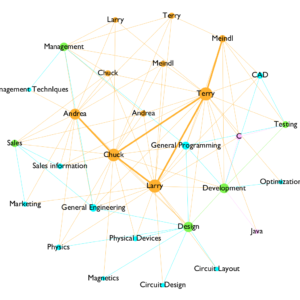
With differentiating font size, I discovered that Gephi could generate word cloud as well. With the font size ranking option, a user could create a word cloud by creating a network without the edge.
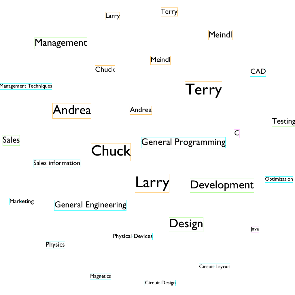
Another experiment I did with the graph was I change the color of the edges by following the color of their sources and targets. When switching the edge coloring options between source and target, the difference is noticeable and interesting. With the source option, the dominant edge color is orange, which suggests that connections between people are the most frequent in the dataset. However, when I switch to target, blue edges became dominant, as it suggests that subjects have the most connectivity with other individual nodes. This shows me the smallest change could tell an entirely different story within the same dataset.
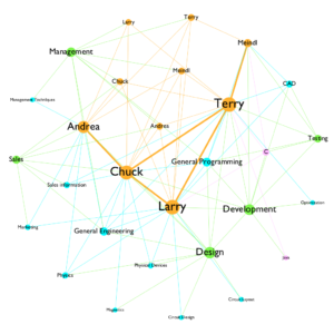

I think the result I have is understandable, and it is suggesting some interesting facts about this startup company. It is very obvious to see that the orange color is dominating the color landscape, which suggests there is a strong connection between people who work for the startup. There are a lot of blue edges connecting between nodes that are green and blue, which suggests that the connection between departments and subjects are very dense. Chuck Larry and Terry has the most involvement with the company.
Like I mentioned at the beginning of this report, I would like to learn how to collect and code a network data by myself in the future. I think knowing how to transform available data into network data is essential for the creation of a network graph. For future projects, it will also be interesting to work with more complex networks and see what the possibilities and problems that will emerge with larger datasets.
Reference
Carley, Kathleen M. (2014). ORA: A Toolkit for Dynamic Network Analysis and Visualization, In Reda Alhajj and Jon Rokne (Eds.) Encyclopedia of Social Network Analysis and Mining, Springer. Retrieved from http://www.casos.cs.cmu.edu/tools/datasets/internal/index.php#startup
The post Exploring Network Data With Gephi appeared first on Information Visualization.