Job Industry As Per The Empire State Development Regions of NY From 2012 to 2017
October 12, 2018 - All
Introduction
The Great Recession without a doubt affected the country’s economy, but the state of New York certainly did snap back. It is being said that the state is undergoing its largest and longest job expansion since World War II and New York City has been the driving force behind the employment growth in this particular state. A new report from state Comptroller Thomas DiNapoli found that since 2009, the city has experienced its most robust growth in modern history. In December 2017 the unemployment rate was just 4.3%, down from 10.2% in late 2009.
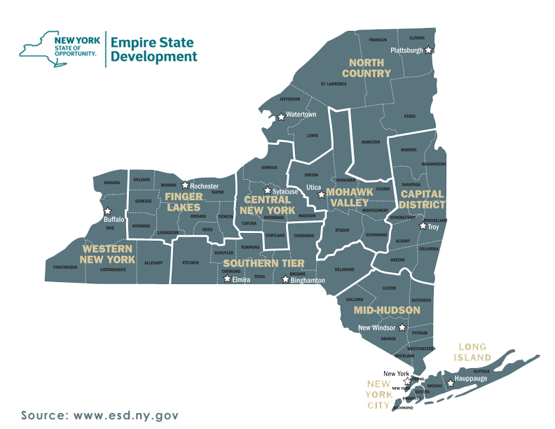
As a budding designer who wants to work somewhere around New York City, this report grabbed my attention. While doing an in-depth research on this report, I came across an open data set that was published by Open Data NY. It talked about the growth in the job industry as per the Empire State Development Regions of New York (Figure1). In order to do a full analysis of the data set, I used Tableau Public.

Figure1 – Regions of New York State divided as per the Empire State Development Corporation
Some of the information that I wanted to explore from the dataset was:
- Which region has the most number of jobs for the quaternary sector (the sector that I wanted to explore the most)?
- Which sector has the least number of jobs in the state of New York?
- Jobs in which sector have dipped the most from 2012 to 2017?
Inspiration/Critique
While doing my research on the job industry in the state of New York, I came across a couple of visualizations that helped in making my visualizations better and understandable. Some of the examples that I liked:
- Employment Growth by Boroughs of New York City
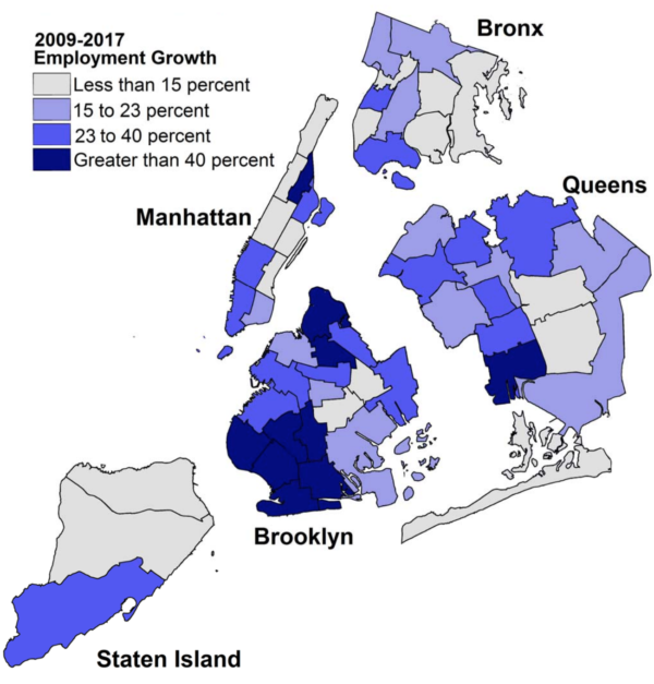
Source – https://osc.state.ny.us/osdc/rpt10-2018.pdf
This visualization represents the employment growth in 5 boroughs of New York City – Manhattan, Bronx, Brooklyn, Staten Island, and Queens. What I liked the most about this visualization was the map representation. It is easily understandable and looks clean from the design point of view. One thing that I think is missing from this visualization is the bifurcation of jobs in each borough. It gives the reader an overall idea of the job industry in a particular borough but it fails to inform them about a particular industry.
2. New York City Job Gains or Losses by Sector (2017)
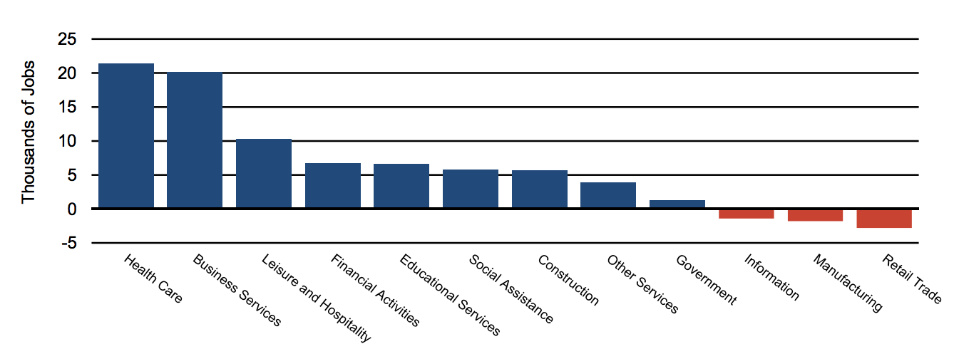
Source – https://osc.state.ny.us/osdc/rpt10-2018.pdf
This visualization informs about the job gains and losses in 2017 by sector in New York City. According to me, this visualization does a good job in bifurcating jobs to different sectors. It gives the readers a clear idea about various job industries. Talking about the Y-axis of this visualization (Thousands of Jobs), I think as a reader I would be more interested in seeing the percentage increase/decrease from the previous year or getting the exact job numbers, rather than getting an estimated number of jobs which we get from this bar graph visualization. That will give me a better idea of the job industry.
Materials
- Jobs by Industry in the Empire State Development Regions of New York From 2012 to 2017: The data set used for the analysis. This data set was published by Open Data NY.
- Tableau Public: A free software that can allow anyone to connect to a spreadsheet or file and create interactive data visualizations for the web.
- OpenRefine: A tool for working with messy data: cleaning it; transforming it from one format into another, and extending it with web services and external data.
Method to Create This Visualization
- Selecting the Data Set
This was to most difficult part of this project. With so much free data available online, I was really getting confused with the selection of the topic. Once I made my mind with the topic for the data it was easy to find the right data set as the websites with free datasets are easy to navigate and have good filter options to filter out content. The datasets were available in many formats but I chose to download a CSV file of it.
2. Refining the Data
After I download a CSV file of the data, I analyzed that there was some messy data within that data set which needed to be cleaned. So I decided to refine the data using Google’s OpenRefine. Firstly I removed the column – “NAICS Code” from my raw data because I already had the industry names in the data so the code column was not useful for my visualization. Then I applied a text facet to the industry column and found that there was a formatting issue like extra spacing with some data. After solving that spacing problem of the data, my data set was ready for the next step.
3. Data Visualization Using Tableau Public
After the refining phase, it was now time to import the refined file in tableau public. It was my first interaction with this software so it took me a while to get used to the interface of the software. I had to use a lot of hit and trial method to explore different features and options within the software. After exploring the software, I realized that I should combine some of the industries because showcasing 25 – 30 industries on one graph will make it difficult for the readers to understand the visualization. So I decided to combine the industries into 4 sectors – Primary, Secondary, Tertiary and Quaternary.
List of industries under each sector –
- Primary Sector – The primary sector of the economy extracts or harvests products from the earth.
Agriculture, Forestry, Fishing, Hunting, Mining, Quarrying, Oil and Gas Extraction
- Quaternary Sector – The quaternary sector of the economy consists of intellectual activities.
Administrative, Arts, Entertainment, Recreation, Educational Services, Government (including support, Waste Management, and Remediation Services), Information, Professional, Scientific, and Technical Services
- Secondary Sector – The secondary sector of the economy manufactures finished goods.
Construction and Manufacturing
- Tertiary Sector – The tertiary sector of the economy is the service industry.
Accommodation and Food Services, Finance, Insurance, Health Care, Social Assistance, Management of Companies and Enterprises, Wholesale Trade, Retail Trade, Real Estate, Rental, Leasing, Transportation, and Warehousing.
Once everything was in place, I mapped out the visualizations in a way I thought would be the best to represent this data. I came up with two different dashboards – one having a drop-down wherein the user can select each region and see the total and sector wise job growth. The second dashboard has two subparts, having one visualization with all the regions and sectors and the other visualization showcasing the total increase/decrease in the number of jobs per region.
Both the dashboards can be viewed here –
Findings
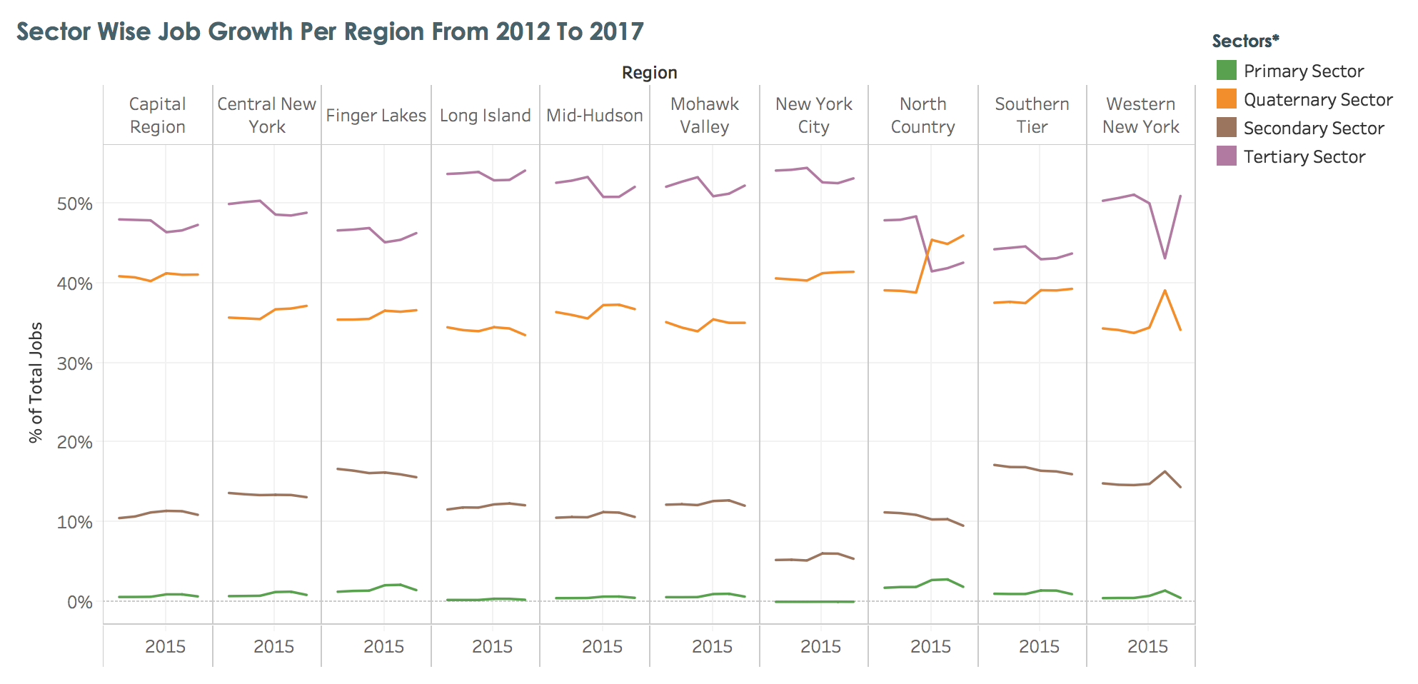
Figure2 – Sector wise job growth per region from 2012 – 2017
Overall, I think jobs in the primary sector have not increased that much and there is also not a lot of fluctuation in the secondary sector. One of the most important observations from this visualization is that wherever there is a huge fall in the tertiary sector, the percentage of jobs in the quaternary sector increase especially in the north county and the Western New York region (Figure2 refers to the visualization discussed here).
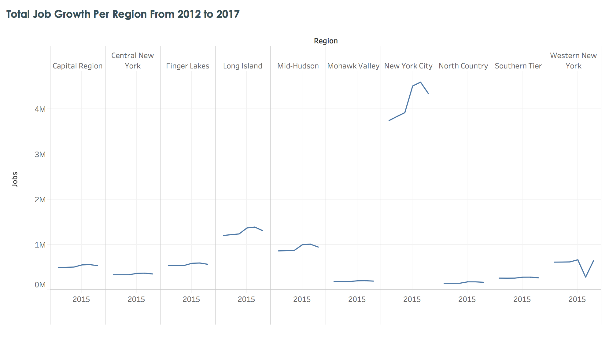
Figure3 – Total job growth per region from 2012 – 2017
Talking about the visualization showcasing the total job growth per region (Figure3), we see that New York City had the maximum number of jobs when compared to all the other 10 regions and North County had the lowest number of jobs. It can also be analyzed that from 2014 to 2016, the total number of jobs in all the regions have increased except in the Western New York region wherein there is a decline of about 40%.
Reflections
Overall, I think Tableau is a very powerful tool for data visualization. After working on this project, I strongly feel that finding the right kind of data set with less messy data is very important and for me, that was the only time-consuming part of this activity. For me cleaning the dataset was not an issue because of two reasons – firstly, Google’s OpenRefine is a very friendly and easy tool. Secondly, the dataset that I found was less messy and it was very easy to clean that data. Talking about Tableau as a software to use, I think it is an efficient software which comes with its drawbacks. Initially, I struggled with finding some options within the software and I think a lot of its powerful features are hidden. The dataset I was working on talked about regions and I thought of making an interactive custom map in Tableau which I could have added in both the dashboards. On exploring the software more I realized that it is not possible to make a custom map and then I had to settle down with a static map image that can be seen in my dashboards. I also struggled while making the dashboards as it restricted me a lot while adding the horizontal and vertical blank spaces. I had to move around a lot of things to make the final dashboard.
In all, I think if someone gets used to Tableau, it is a very wonderful tool to make data beautiful. I would love to explore Tableau in the future using different data sets that fall in my interest area.
The post Job Industry As Per The Empire State Development Regions of NY From 2012 to 2017 appeared first on Information Visualization.