History of Thematic Mapping: A Timeline
September 12, 2018 - All
History of Thematic Mapping: A Timeline

Introduction
For this lab report I chose to focus on study the milestones in the history of Thematic Mapping. I was particular interested in this part of information visualization because the understanding of “location intelligence and its applications” across the public has grown a lot, and thematic maps are becoming more essential as a tool.
What is Thematic Mapping? It is a map that created to display a certain topic or theme. It has many different forms to present such as showing with choropleth (color), a scaled-symbol, charts, or dot-densities. “Unlike other reference maps, which tell us where something is, thematic maps tell us how something is.” (5 Popular Thematic Map Types and Techniques for Spatial Data)
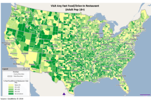
For example as the diagram below which utilizes choropleth color to(Figure 1) to demonstrate the Fast Food Restaurant – Visit Any (Adults 18+) – 2Q 2014 in the US. .
 Figure 1. Fast food Visit by ages/2014
Materials
- TimelineJS – an open-source tool that enables users to build visually rich, interactive timelines
- Google Sheets – Used to update content on the timeline
- Google Images – Used to find images
Method to Create This Visualization
I went through the brief history of Thematic Mapping, and selected the milestones that I wanted to display on my timeline – starting from 1743-1843, because this century witnessed explosive growth in thematic mapping, at a rate which would not be equalled until modern times. Research was conducted through a few websites that were found online in order to make sure all milestones displayed on the timeline are most important.
After selecting the milestones, I searched corresponding media for them, I selected pictures that meaningful enough to present the history.

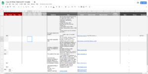
Figure 2: Google Spreadsheets
Results
The Timeline. can be viewed HERE
Here is the link to the google sheets template –HERE
Reflections
The TimelineJS is very helpful and efficient tool, especially when people wants to show an interactive timeline but don’t have enough time to prototype it. It is very easy to use and publish online. But it has certain disadvantages, such as it restricts the user from applying designed layout to the timeline, the image sizes and positions can not be changed easily because of the restrictions.
In terms of the history of Thematic Mapping, it surprised me that this kind of complicated infographic has been applied since such a long time ago, and on nowadays thematic mapping is very interactive, people can display many different dimensions at once on the map and let it just display the certain topic or theme you want to see, which is astonished.
Related posts:
1. 1800-1849: Beginnings of modern data graphics
2. Quantitative thematic maps
The post History of Thematic Mapping: A Timeline appeared first on Information Visualization.