Avatar: The Last Airbender Social Network (Season 1)
July 19, 2018 - All
![]()
Inspired by the Les Miserables network example that Gephi provides, I decided to take a look at the social network of a TV show I was more familiar with, the Nickelodeon cartoon Avatar: The Last Airbender. While I initially wanted to take a look at the overall show, I ended up focusing just on the first season. With data I compiled from episode transcripts I found on the fansite Avatar Spirit, I put together a graph that maps the co-occurrence of characters in scenes in the first season of the show. The show ran for three season altogether.
I drew inspiration from three sources. The first, as previously mentioned, was the Les Miserables network data that came as an example in Gephi. While there are multiple visualizations of this data, it was the way the data was formatted that really helped me. I was able to see how characters were organized and co-occurrences were weighted, which is the method I ultimately used when put together my own data. The next source was a social network visualization of characters in the first season of The Simpsons by Chris Pudney. Pudney’s data showed which characters appear together in episodes. I think this method makes a lot of sense for a show like The Simpsons, where the cast is sprawling but contained. One of the key elements of Avatar is how often and far the main characters travel. Characters that have a big influence on the characters often only appear in one or two episodes, and creating data using only episode count as the baseline wouldn’t have provided an accurate representation of relationships.
Finally, the last source I drew inspiration from was a series of visualizations on The West Wing created in Tableau by Austin Pate. While none of Pate’s visualizations are network graphs, he does ask a lot of questions that usefully interpret connections between the characters in The West Wing. While a network graph is useful in creating an at-a-glance understanding of character interactions, many of Pate’s visualizations seem like they might be kinds of conclusions someone might want to draw from the information generated through the network.
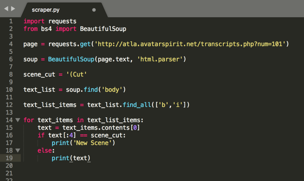
I wasn’t able to find the data I needed–a scene by scene breakdown of character co-appearances–so I had to start by making it. I used the transcripts from Avatar Spirit and primarily followed a DigitalOcean tutorial on using the BeautifulSoup Python package to scrape the information I needed. It’s been a long time since I learned the basics of Python, and I was never especially good with it, so creating even a very simple script to scrape character names and include scene breaks took a lot of googling and trial and error. Even after I was able to write something that seemed to work, some of the transcripts were coded in a way that returned errors and I needed to further tweak my code for specific episodes. An example of a draft that didn’t work:

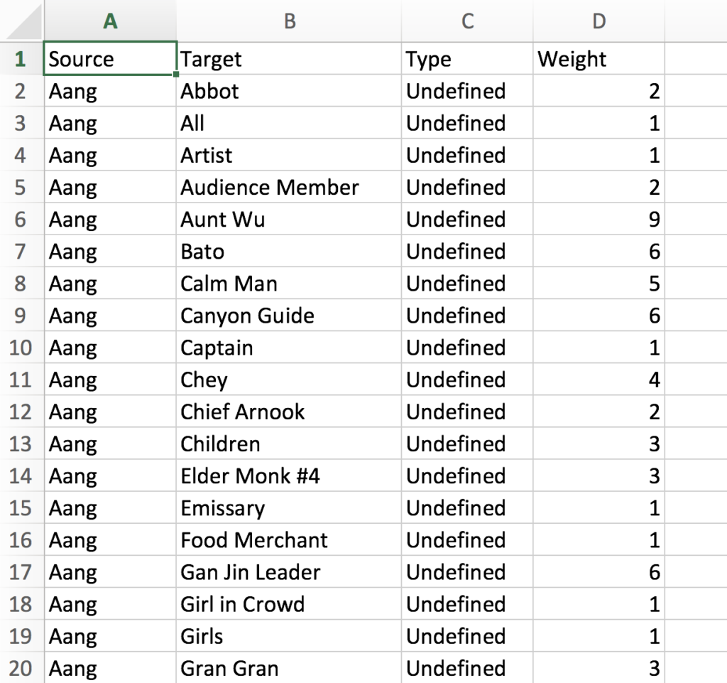
After scraping the data, I still had a long way to go to get it into a usable format. The data I scraped was only the name of each character who had a line of dialogue. The episode was then roughly divided into scenes for each time the code found a string that started with ‘(Cut’. I ended up doing a lot of manual cleaning and organizing, since with my level of coding experience, it would take me much longer to learn how to code something that would clean my data than it would be for me to just manually prepare 20 episodes worth of data. I used Excel and OpenRefine to format the data. I tagged each dialogue occurrence by scene, adding in some scene cuts that the code had missed, and then only kept one instance of each character in a scene speaking. Those would be my nodes/sources. I then had to transpose each character co-appearance into targets. Once that was done, I put all the episodes together and counted how many scenes each pair of characters shared and used that number as a weight for the relationship.

I loaded that data into Gephi and created my graph from there. I had initially tried to load a data file that just had all the scene co-occurrences and didn’t collapse and weight them, but Gephi didn’t seem like it could handle the size and would crash. The modularity calculation in particular would fail and I couldn’t make a usable graph. Once I collapsed everything and added weights, it worked smoothly. I based the size of the nodes on the degree calculation and the color on the modularity class. The edges are weighted to show stronger relationships.
I think the graph effectively shows who the main characters are and the strongest relationships in the show are represented, but I think including other seasons of the show in the data would provide much more insight. As I mentioned, the main characters travel often and only interact with many important characters briefly. Including more data would also allow me to collapse periphery characters into categories in a hypergraph rather than have a profusion of low weight relationships. For example, there are several “Guard” or “Soldier” characters who attack the protagonists and could be understood as one entity.
However, being data that was quickly compiled through a mish-mash of coding and manual methods, it’s also not entirely accurate. Any interaction without dialogue is missed, which includes some non-verbal animal characters who are very important to the show. There would also need to be a way to understand ally vs antagonist relationships, further complicated by characters who shift allegiances. Finally, I’d also look into other ways of color coding characters. Each character belongs to one of four nations, which would be one way to understand relationships between nations in addition to between characters.
The post Avatar: The Last Airbender Social Network (Season 1) appeared first on Information Visualization.