Musical Network Visualization
April 20, 2018 - All
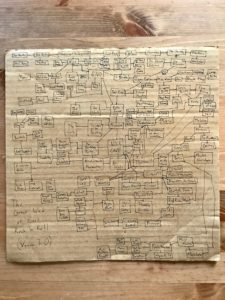
I went a little nuts for this week’s lab, attempting to recreate digitally a network graph I drew by hand almost ten years ago. At that time I was a college student (or college radio DJ moonlighting as a student), besotted with my own ever-shifting cross section of rock and roll hagiography. Here is that canon as it stood circa 2010:

(I hope you can open that full size)
I drew this thing mostly off the top of my head, with only loose regard for consistency in the types of nodes I drew or the basis for their connections (edges). In most cases, the connection is based on some history of collaboration, or shared members between bands. However, I made a number of quirky exceptions to the rule. For example, the Seattle drone outfit Earth is linked to Nirvana because Kurt Cobain and Earth’s Dylan Carlson were once roommates.
My original graph, in retrospect, illustrates the personal or subjective nature of canon better than it does any useful historical fact. Notice that The Beatles are marginal, while weirdos like Current 93 land close to the center of the graph.
For a digital version of this graph, I wanted to be more consistent and even-handed, producing something with more historical than just historiographic meaning. I was inspired mainly by the network visualizations produced by Pratt’s own Linked Jazz project. The Linked Jazz graph does not purport to represent all of jazz history, but it is rigorous in describing a social network based on transcribed interviews.
Taking the cue from Linked Jazz, I set out to build a graph containing individuals only (no bands), and to limit the edges to one type of connection–shared credits on a record. I created my own adjacency data by writing Python scripts to iterate through artists’ albums on Wikipedia. I started with David Bowie and worked outward, modifying my scripts to accommodate the format and quirks of each artist’s Wikipedia footprint. I ended up writing scripts for the following artists:
- David Bowie
- Nick Cave
- The Clash
- The Cure
- Current 93
- Brian Eno
- Parliament-Funkadelic
- PJ Harvey
- Richard Hell & The Voidoids
- Iggy Pop
- Teenage Jesus & The Jerks
- Bill Laswell
- Laurie Anderson
- Lou Reed
- Nico
- Painkiller
- The Sex Pistols
- Praxis
- Public Image Ltd.
- Roxy Music
- Siouxsie & The Banshees
- Sonic Youth
- Swans
- Talking Heads
- J.G. Thirlwell
- The Velvet Underground
- Yellow Magic Orchestra
Clearly the scope and discipline here are limited, and the results varied depending on how well each artist was accounted for in the Wikisphere.
My scripts also took a couple of scenic detours based on how chronologies overlap on Wikipedia. One of my many Brian Eno scripts jumped over into Harold Budd’s discography, and then pulled in part of the Cocteau Twins’ oeuvre. Another skipped over into U2 territory. I decided to let these unintended offshoots stand in my final product.
I used OpenRefine to clean my data as well as reasonably possible. Cleaning mostly entailed merging aliases (“Clint Ruin” = “Jim Foetus” = “Foetus Over Frisco” = “J.G. Thirlwell”), removing nodes named for instruments and technical credits (“guitar”, “mixing”), and cleaning up names that included instrumental designations (“Elizabeth Fraser – vocals”).
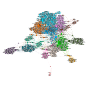
The alias situation was most complicated within the vast P-Funk pantheon. This being the most heavily African-American segment of my graph, it led me to consider how tools for network analysis may be poorly suited for representing black communities. But I digress. Here’s the graph:

The finished network is messy, but I’m still pleased with it. It does justice to the work of great session musicians like Carlos Alomar and Bernie Worrell–and those are just ones I knew about. It also made me aware of a few other prodigious collaborators whose names I’d overlooked before, like cellist Jane Scarpantoni, engineer Bob Clearmountain, and percussionist Aïyb Dieng. These three are all “bridges” between disparate groups. I guess this is something network analysis can do well!
Still, there’s no avoiding the fact that my main graph is too large and dense to represent in a static image. This is made all the worse by my poor understanding of the “preview” function in Gephi. I’ll need to familiarize myself with it more later.
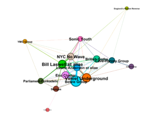
I decided to try my hand at a hypergraph. With the numbered modularity groups I used to color my graph, I used the VLOOKUP function in Excel to substitute group numbers for names in my adjacency table. I loaded the new table into Gephi, in a new workspace, and graphed the groups with the same colors as clusters from the original graph, and sized based on the percentage of original nodes in each group. Here’s what I got:

I named the nodes in the hypergraph after the fact, based on the clusters from the first graph. The interesting thing to me here was how closely the Bowie, Eno, VU, and Laurie Anderson groups clung together. Maybe it’s a generational thing. Either way, the logical next step here would be MORE DATA.
Every time I updated my graph with more information, new deficiencies and loose ends revealed themself. Some major figure, appearing as a guest on a single album, begs to be represented further and lend their own discography to the network. Furthermore, some discography scrapes close to my heart (namely Current 93) were abortive due to poor or inconsistently formatted Wikipedia entries.
A valiant project would be to encode discographies as linked data. The fastest route to that goal, as far as I can tell, would be transferring “personnel” sections from Wikipedia album pages into the Infobox, so that they might be enshrined as linked data on Wikidata. That would open up avenues of inquiry liberated from the tyranny of the frontman, so to speak. But that’s a task for another day, or many days sometime in the future.
The post Musical Network Visualization appeared first on Information Visualization.