
Introduction
After walking through the brief history of information visualization with our professor, all students in class requires to hand on the very first info viz creation by using Timeline Js- a tool to create a beautiful timeline with ease. What interests me a lot is that there is no comprehensive introduction of “timeline” in our reading or slides, and I’ve also read about the creator of TimelineJs aims to focus on “visual storytelling” not statistical data visualization, and it’s obvious to me that the relationships (for example, how those events impact each other?) in between those events on the timeline seems are less important especially when those events almost happened at the same time.
This article would focus on how I use Timeline JS to create my first interactive data visualization design, and the final outcome. Since TImeline JS not aiming to create statistical data visualization, and emphasize on “visual storytelling”, I’ll also share my thoughts about if the tool can really help users to achieve the goal or not.
Inspiration/Critique

The sample timeline-Women in Computing is really good for feature demonstration about what Timeline JS can do to make users tell an interesting story by supporting the multimedia display. Timeline JS does a great job on visual composition with correct text hierarchy (heavy font weight for the header, and light font weight for paragraph), the time navigation indicates when those events happened, but not too emphasized, which is great to me, since I care about “event details” than date/year. The interaction of Timeline JS helps users to focus on one event at a time, and the “backward”, “forward” transition animation also emphasize the “chronological” factor. Support multimedia also makes the browsing experience more entertaining and convincing. However, there are some rooms for improvements for a more immersive visual storytelling by using Timeline JS.
First, the layout/template to display event detail doesn’t optimize for long content in event detail display, users can still put an in-depth content, but the UI would look a bit off or broken. Second, the Timeline JS UI doesn’t use a fullscreen layout, the rest of white space is a bit distracting especially when users don’t assign the background color for events, or at least to make the video full screen when playing. Third, the storytelling is plain/flat, there is no way to emphasize some really special events, users might find it interesting for the first few events, but after scrolling five events, no highlight event might bore audiences because there is no up and down. Last but not least, some of the supported media in Timeline JS make less sense to me, I wonder when is the best context to showcase an interactive map since that’s more for taking an action (you are going somewhere in most case), and the embedded Wikipedia UI cause the UI inconsistency because of the different display font, that’s also annoying, when you really want to focus on content than style.

Tools and datasets
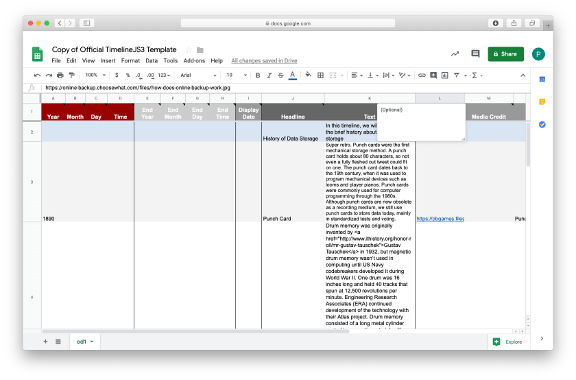
The assigned tool is TImeline JS, it works with a google spreadsheet that requires a specific format, in order to make sure nothing will go wrong, Timeline JS lets users to copy the spreadsheet easily and provides an understandable description to help users apply their dataset into the sheet. Since the focus of Timeline JS is “visual storytelling”, there are some options that allow users to “customize” their timeline by changing the display font set, assigning background colors for each event, setting the navigation placement (top or bottom).
I was more tend to explore the possible visual display in Timeline JS, so I actually just grab another dataset that is about the history of data storage, and just picked the most breakthrough event in each time period to display on the timeline.

Methods/Process
1. Understand the limitation of Timeline JS
I walked through the timeline story example (Women in Computing) and checked possible presenting/display techniques I can use for my design.
2. Get inspired

It’s tough for me to choose the topic for my timeline story, and how to use the integrated google spreadsheet somehow made me decided to pick a random but tech related topic-data storage history. This site is where the dataset originates from, it also displays as a timeline, but the browsing behavior is vertical. Also, I found other similar timeline design that is interactive, and more immersive with multimedia presentation. This one provides an overview timeline pagenation, so users can jump around in different years. It also uses parallax scrolling effect, so the content display with visual depth like foreground/background. My favorite part is the animated background with a different color theme for each event, I actually tried to recreate the same effect with the correct context in my design.

3. Play with the data and media

As I mentioned in the previous section, I’ve been inspired by a timeline that provides a more eye-catching visual storytelling technique- the animated background. After I checked the limitation of background settings, I decided to go for a try with gifs, and it works! Also, I tested the layout by adding a long paragraph of text, to see how Timeline JS handle such case, and it tuned out broken. After all these testing/tryout, I started to implement my design.
4. Design outcome

I am a person tend to showcase my personality into any of my design, so the audiences can always find something funny, creepy, or entertaining element in my design works. My timeline design somehow follows the tone of the Women in Computing: starts from a B/W photo to add the “historical” flavor, and showcases objects with different media. Some events I just set up the background image and text, in order to add a visual pause for the whole timeline. The most interesting part of my design is the animated DVD storage background. If you were born in the 80s, you would definitely get the point and smile, because that’s what DVD player would display when there is no video to play, and I only add one animated background in this design, since context matters than format.

Reflection
Playing with Timeline JS is really a good starting point for creating interactive data visualization, the tool empowers the power of visual storytelling, and it’s really easy to use, so the users can focus more on the content. The goal of data visualization should either help audiences to understand complex fact/data, or tell a comprehensive story. When creating this timeline, I didn’t really spend much time to think about the goal of thie data viz design, and the result turned out not so satisfying. Next time, I would work more on the topic and try to transform those data/information I observe into a good story even when the tool might have restricted display format.