Introduction
New York, as one of the most historic city, has so many landmarks like THE DAKOTA and Trinity Church. Some of them are built 10 years ago, and some others have more than 200 years of history. How would their combination look like on a map? How about they appear with time passing by? What if their height distinguishes them by color? I choose only main Manhattan to create my temporal map due to most of the historic buildings there.
Inspiration
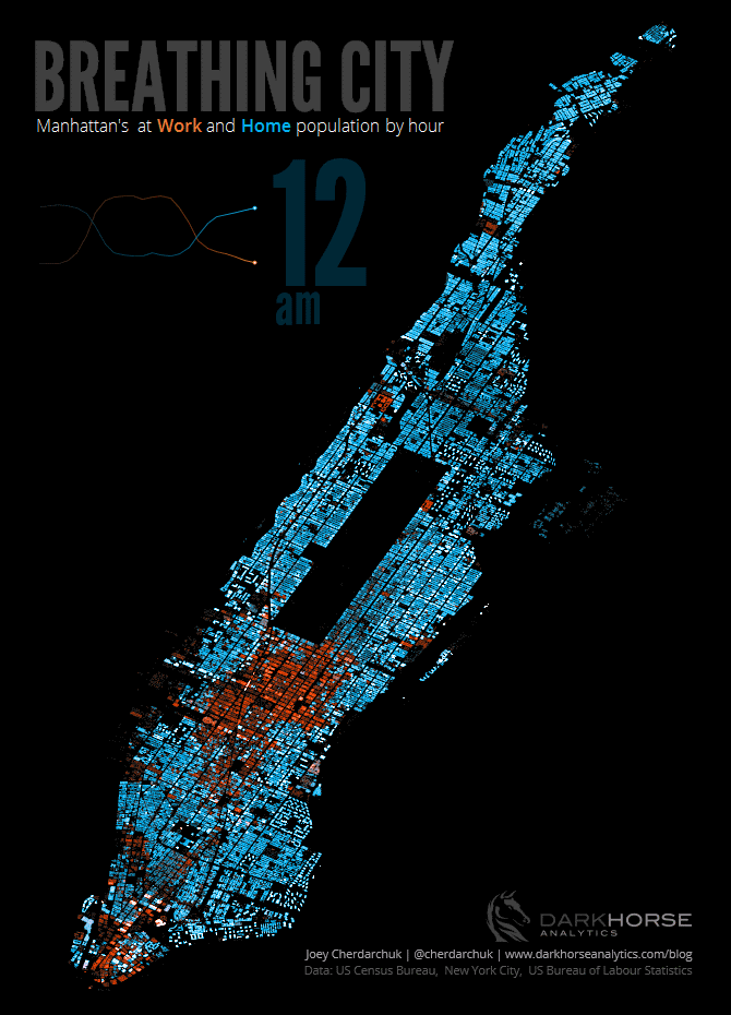
I got inspiration from the famous and impressive map BREATHING CITY showed in last class. That was also the first time for me to know the name “Temporal Map.”
Temporal maps look amazing for me is because they could catch the audience’s attention just by the first look. They also could tell a story themselves without any additional explanation. Of course, they have distractions about data and theme, such as cyclic or historical themes.
Also, this map’s color scheme, bright colors with a black background, looks fantastic. Due to it seems like lighting, it matches the creator’s theme more. I love this decent style a lot even though my map’s idea won’t be lighting related.
Tools & Dataset
NYC Open Data: Explore and get open data on it. Its advantage is that most of the data is super clean and has the location data which could be read by Carto.
OpenRefine: A data cleaning tool. Nowadays, I don’t open data by Excel anymore because of the messy. OpenRefine is my new best friend who could open and edit my data fast and smart.
Carto: The mapping tool to create, edit my map and add some excellent visualized analysis. It annoyed me a lot due to its marketing strategy, such as decoding limitation of 6000 data or pay to own more.
Adobe Photoshop: Helped me to create the final gif, cut all screenshot and add the legend, etc.
Process
I struggled a lot when I was looking for the perfect data. To be honest, this temporal map is not the first idea that came up to my mind. At first, I tried to make a pizza map of Manhattan. I found the food data without longitude and latitude. Fortunately, it has the address, building and zip code. I tried to decode them to location data in OpenRefine by Google Map’s open API, but it failed because Google closes it or some other reason. Then I used Carto’s decode function, and only keep pizza’s because it has less than 6000 data(more than 6000 data need to upgrade Carto’s account.) Unluckily, the map did not tell a story, so I passed it. After built NYPD complaint map, subway, and open park map, I finally found this historic building data.
I got this data on NYC Open Data, which means I didn’t need to clean them much. The most exciting part of this data was that is had the height of the building and built year. Therefore, I decided to create a temporal map with different colors of height.
The problem I faced here was that Carto only allows animation when there were dots instead of area. However, I didn’t want to give up this idea and decided to make screenshots of every 7 years(or more than 7 but less than 8 years, it was an equal unit automatically given by Carto) from 1800 to 2015.

Another problem was that I built them by screenshots, so I need to choose which part to use due to it was not changeable as a Carto map. I picked the region in the image above, because if it came to a smaller one that it would look like nothing in the first 15 screenshots. Also, I did not keep the legend of color interpretation, because the legend only had this one color scheme which did not fit my black map at all. I add this legend in Photoshop afterward.
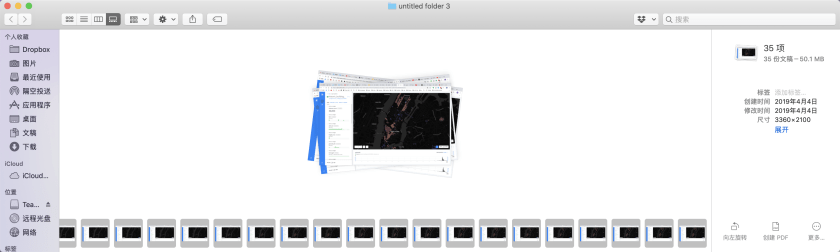
After so many decisions to make, I finally got all 35 screenshots by all screen, because I could not guarantee to get the same size screenshot every time. I cut them and create animation in Photoshop together.

I added a new layer to add the legend bar only and added interpretation and headline as well. Changed animation speed to 0.2 seconds each and saved as a Web gif.
Results

Here is my final temporal map. Historic buildings show by built year, and distinguished by different colors depends on their height. I choose this violet-yellow color scheme which looks fancy with the black background to me. Also, there are violet, pink, orange and yellow colors on the map, which could let the audience understand that the spectrum color means something, and if they are curious, could find the legend in the corner.
Meanwhile, it easily tells some small buildings were built in midtown, high buildings in downtown and around Central Park. Also, many historic buildings suddenly built around 1900, and landmark buildings started to be made in downtown slowly in early 1800.
I also publish the original map. If you are interested in, please drag the year built bar on the bottom of the map to see the change through these years.
Reflection
This mapping work was literally a struggling experience for me. I thought about to give up or make the other not too lousy map do for my final plan, but I was not reconciled to that results. After sharing experience to Joanna and Ping in class, I found out that we all encountered this same situation. The biggest challenge is having no idea of what result would get and if it is meaningful. Also, be comfortable with ambiguity and “failure,” and always keep the courage to start again. Okay, these are from my emotional perspective.
Let’s talk about what I learned from my logical perspective. First, Carto did a great and annoying marketing job, and it could not solve many map problems, such as the temporal map by area. I believe there is a better way to create this gif than what I did, but Photoshop is my familiar way that I could guarantee what I will get at the end. At least, I don’t know another tool could cut all these photos together to keep my map images have the same range. Then, one thing I am not satisfied is that my map is not the whole of Manhattan because of some reasons. It would make more sense if it succeeded.
Last but not least, my map would look better and more clear if I could add the year of every screenshot. I could do it though, but it was too exhausting for me. Not only because I need to add that on every image, but also the year is not an integer. Carto cut them equally, and I just take it. However, this is the part I want to work on better in the future.