Introduction
In exploring network visualizations, I thought it would be interesting to build a network graph of relationships among baseball teammates. Specifically, I considered the case of teammates on MLB world championship teams. For the purpose of this exercise, I limited myself to champions since the advent of free agency, in 1977. The introduction of free agency to baseball has meant an increasing mobility of players between teams, which could potentially be reflected in a network graph, showing associations with multiple championship teams by certain players. I also expected that the network graph would highlight certain baseball dynasties, such as the New York Yankees of the late 1990s to early 2000s, and the San Francisco Giants of the last decade.
Inspirations
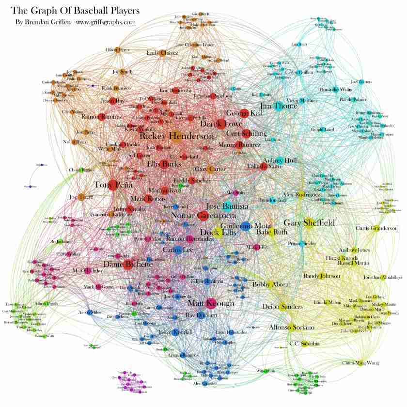
For the purpose of this exercise, a force-directed graph seemed to be most appropriate. As in the image below, my expectation was to see significant clustering for individual championship teams, with a small number of players acting as bridges between teams. Unlike the below image, where we see a single central node for each cluster, every member of a team is connected to every other teammate, with edges connecting the entire team. As a result, I would expect an even tighter clustering for individual teams.

The below graph is an example of a similar project, where individual baseball players are linked based on having played on the same team. We see a number of effects that I would expect in my own visualization, such as clustering of players who remained on the same team, with bridges of players who moved between teams. Additionally, I note the use of color to differentiate between clusters. I would expect this to be highly correlated to the individual teams played for, and it would be especially suited to highlight dynasties in my own visualization. A key difference between this network graph and my own project is my focus on individual championship teams, whereas the below graph represents the entire player universe over a shorter timespan. Looking at championships adds an element of increased familiarity as these have been the most visible teams and players, and also places a historical context onto the network as it draws these relationships over several decades.
To highlight team affiliations, it seemed appropriate to apply team colors to the clusters which my network graph revealed. The image below illustrates team colors for the 30 MLB teams, although the Florida Marlins used a different set of colors when they won their championships in the 1990s. For this graph, I selected the original teal colors for those Marlins teams.

Materials
My data was collected from the baseball statistical resource www.baseball-reference.com. I looked up the team roster for every championship team between 1977 and 2015, including every player that played at least one game for that team during the regular season. Data were cleaned to remove extraneous characters representing the handedness of individual players. I then processed the data to create a one-to-one relationship between every player on an individual championship team. The nature of the teammate relationship means that the connections are undirected, and existing within a single mode, individual players.
This dataset was then imported into the network visualization software, Gephi. Gephi was used to plot the data into a force-directed network graph. Individual node size was set to represent the number of connections for that player, with the expectation that this would highlight players on multiple championship teams. I then ran a clustering algorithm to break the nodes up into individual teams, and applied team colors to each cluster. Finally, node labels were applied to identify the players represented, with label size proportional to their number of connections. Below is the visualization that resulted:

Network of Championship Teammates, 1977-2015
Results
The network graph displays a number of interesting features. Firstly, as expected, individual teams show significant clustering, appearing as very tight bundles in the image. One can also clearly observe the bridge players, typically occupying the spaces between teams. Coloring according to team clusters also achieved the desired effect of highlighting championship dynasties, especially the Yankees dynasty which dominates the center of the graph, in addition to the aforementioned Giants on the far right, as well as significant presence for the Boston Red Sox on the bottom right, and the St. Louis Cardinals on the top right.
An unanticipated outcome was a more or less linear progression across time. This graph can be read from left to right, with 1970s championship teams appearing on the far left, 2010s teams on the right, and the 1990s-2000s Yankees appearing in the middle of the timeline. This arrangement makes sense, as there is less connectedness between players across decades than there is within decades, as player lifespan is rarely longer than 15 years or so. Therefore, the force-direction naturally pushes the more historically disconnected players away from each other to opposite ends. This lends to a natural historical readability of this graph, enhancing the information it represents.
There are, however, a number of issues with the visualization, as well. The presence of dark team colors, especially the Yankees, makes the node labels difficult to read in places. The very tight clustering also results in a great deal of overlap between labels, which also affects readability. Although some color values were adjusted to differentiate between teams, there is still a great deal of similarity between some team colors, such as the reds of the Red Sox, Cardinals, and Minnesota Twins, and the oranges of the Giants and the Baltimore Orioles. While the player names help disambiguate these teams for readers who are familiar with these historical teams, the image itself lacks a certain clarity as a result.
I also note that, while the clustering was effective at identifying individual teams, it was not quite perfect, and there are several instances of different teams being grouped together. This should be resolvable by adjusting the degree of clustering.
Finally, because of the nature of the data, it is possible for one player name to represent two different players. One notable instance in this case is the node for Dave Roberts in the bottom center of the graph, who is connected to both the 1979 Pittsburgh Pirates and the 2004 Boston Red Sox.
Future Directions
There are a number of adjustments that could be made to address the issues mentioned with this graph. Regarding the data, it would be advantageous to use unique player IDs in order to disambiguate players such as Dave Roberts, and have these IDs associated with labels representing the actual player names. Colors should be adjusted to avoid dark-on-dark issues, and to help better differentiate between teams. This could also be helped by putting text labels by team clusters indicating the team name.
The issue of overlapping labels is a bit trickier, but could be addressed by converting the visualization to an interactive format where labels only appear when the user selects an individual node.
Finally, I would be interested to see the resulting graph if this exercise were extended over the whole of baseball history. New dynasties would emerge and new players would be highlighted. However, to accomplish this would require development of a script to process the data, as the method used here was very manually intensive and time consuming. Using a base dataset from a relational database could make this process more streamlined.