
Visualization of WWI Historic Aerial Bombing
November 28, 2018 - All

Introduction:
This is a geographic about the bombing locations of the Allied Powers during WWI between 1915 to the end of 1918.
Inspiration/Dataset:
Initially I thought it would be really fun to create a map about fictional worlds like Games of Thrones or Harry Potter, which couldn’t be done on Carto. Then it occurred to topics around real life wars would be a good alternative. With this idea in mind, I found World War I THOR Data on data.world. There’s a series of geospatial datasets of historic aerial bombings from WWI to Vietnam War. THOR is short for Theater History of Operations.
The dataset includes the attacking countries, attacking month and year, attacking locations, weapon weight, bomb load, airplanes attack, etc.
Tool:
- CARTO “is a Software as a Service cloud computing platform that provides GIS and web mapping tools for display in a web browser. The company is positioned as a Location Intelligence platform due to tools with an aptitude for data analysis and visualization that do not require previous GIS or development experience”. [1]
- Tablueau
Method:
- Choosing the data is the most challenging part for me. First I tried to find an appropriate data on Data.gov, but the dataset available there was mostly too big or not in the right format.
- I used two layers for this geographic. One is the WWI bombing locations data, the other is the European Countries data from the Carto Data Library. I wanted to present a clear, simple image of the European countries that were involved in the War, but the basemaps provided by CARTO don’t have what I want.
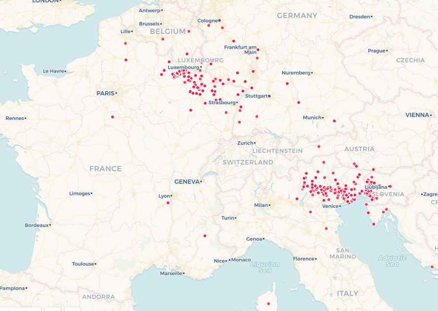
As seen, the boundaries of the countries are blurry, and the city labels are distracting.
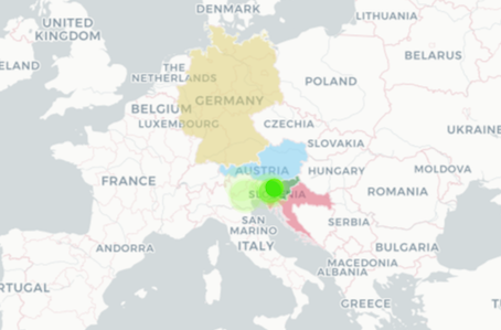 But with the European Countries layer, the name of the countries are highlighted, major cities were hidden, and I was able to custom color the mainly attacked areas.
But the custom widget coloring is really limiting and confusing on CARTO. Also, I’ve been experiencing trouble saving the changes that I made. The coloring is always different on the view page.
- I used animated aggregation for each bombing event based on its time series. I also marked the point color by different attacking countries. In this way, I hope audience could have a grasp of when and where which Allied countries had dropped more bombs. Blue represents the UK, green represents Italy, thus for instance, audience can see in early 1918, the UK and Italy were doing most of the attacking against the Central Powers in the Western Europe.
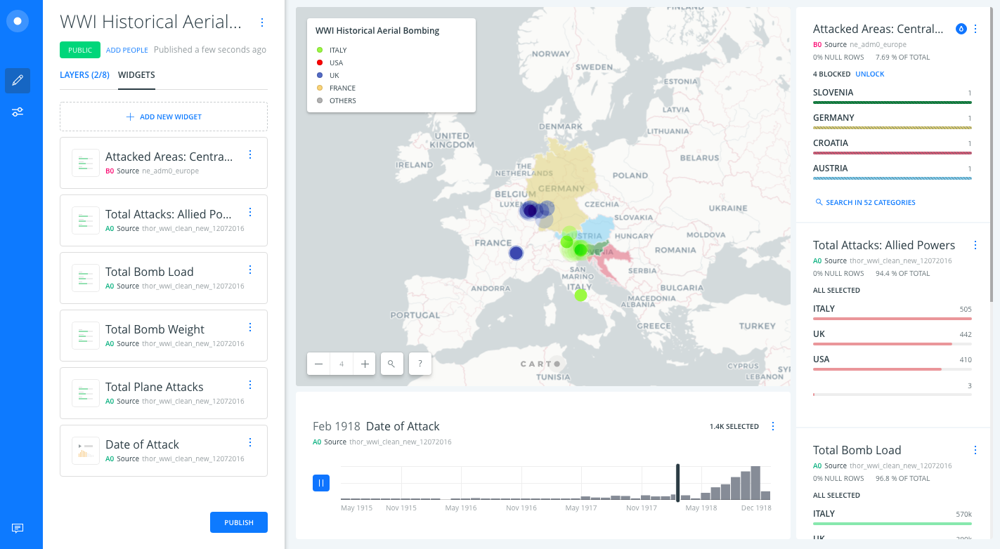
- I also uses a few category widgets to show the bombing statics of each major attacking countries.
Result:
The link to the map: https://savi.carto.com/u/oyolim/builder/a9453185-85f9-41f9-a782-fa91f7b3408f/embed
Reflection:
Overall, I like the geographic I’ve made using CARTO, I think it can give audience a clear and brief idea of the bombing attacking in Western Europe during WWI. But I still have a lot of confusions using CARTO, especially how to customize widget category colors and how to save the changes on the map.
Reference:
[1]: https://en.wikipedia.org/wiki/CartoDB
Revision:
After talking with Seth during class, I made a few changes.
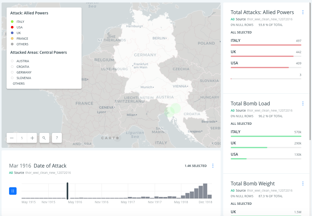
Instead of coloring each Central Powers areas, I just distinguished the boundaries between two Powers by using grey and white color. Also, the original Central Powers widget was removed and replaced by another legend.
But we still couldn‘t figure out how to assign different colors to individual category in the widgets so the widget coloring could match with the legend coloring.
The post Visualization of WWI Historic Aerial Bombing appeared first on Information Visualization.