Visitor Motivation Survey and Audience Segmentation for the Whitney Museum of Art Website
November 13, 2018 - All
This post is a summary of the pilot research project at Pratt Institute undertaken by Sydney Stewart and Samantha Nullman. This research was conducted as part of the INFO 685 course: Digital Analytics: Web, Mobile and Social Media in collaboration with the Digital Media department at the Whitney Museum.
Introduction
In recent years, the Whitney Museum has experienced significant growth in both their physical and virtual environments. As a response to increased visitation and interest, the Whitney Museum aims to better understand how their digital visitors are interacting with the website (https://whitney.org/)
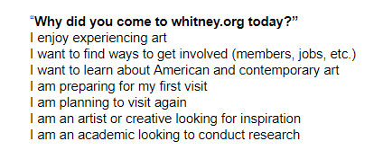
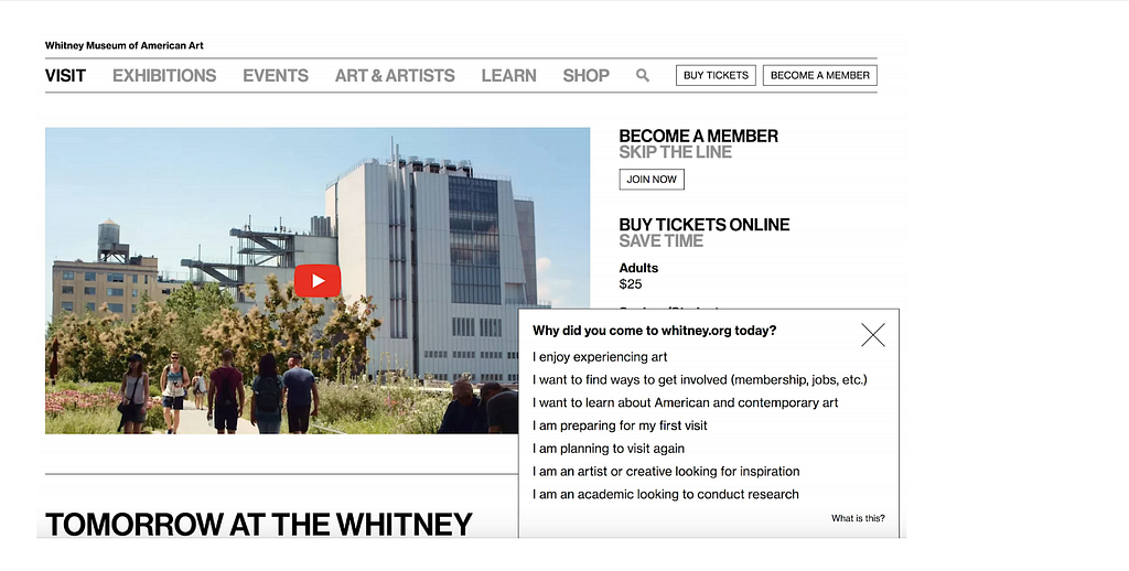
In order to discern users’ motivations for coming to the site, a visitor motivation survey (VMS) was implemented that asked users why they came to the whitney.org at the specific time.
The goal of our research was to help the Whitney Museum better understand the website users by creating user segments based on the motivation survey and Google Analytics. These insights will be used to inform future web development and content to targeted profiled audience need
Methodology
The tools for this analysis included a single question survey on the Whitney.org combined with Google Analytics. Google Analytics provided insights by tracking website interactions and allowed web visitors to be segmented by why they came to the website. To start the website analysis, a visitor motivation survey (VMS) ran for two weeks (March 6 — March 20, 2018) on the website and accumulated 11,878 responses. The VMS prompted website users to answer the following questions:

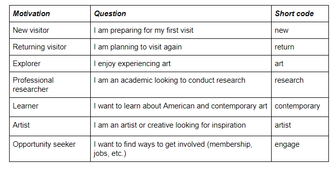
In Google Analytics, an event was created for the VMS every time a user selected a response and each response was recorded in the event label. If a visitor chose to select a response, the rest of their interactions on while on the website were tracked under the segmentation specific to their response. Google Analytics reflected the survey responses with the following segments and assigned motivations:
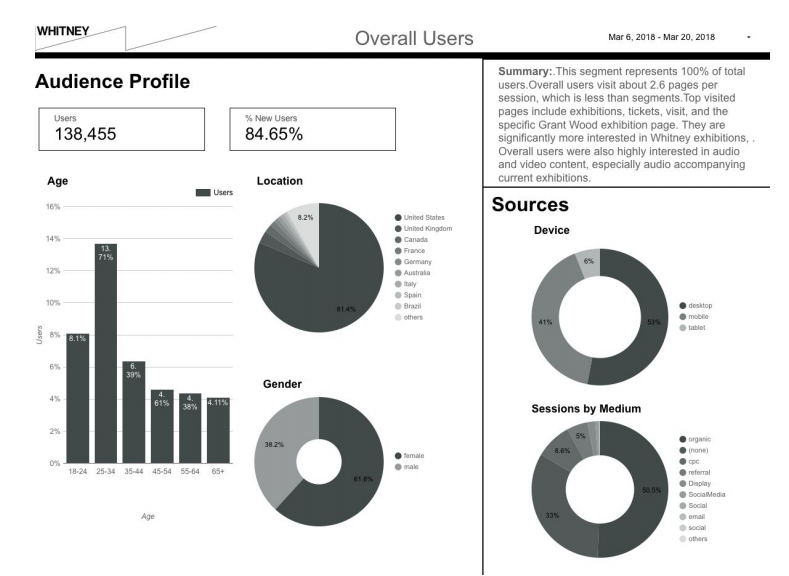
To best analyze and visualize how the separate segmentations interacted with the website during their visit, Google Data Studio was used to create dashboards of key metrics. Google Data Studio is a free data visualization tool that connects to data sources, including Google Analytics and creates interactive dashboards. As a student learning and engaging with data visualization tools, using Google Data Studio is both a challenge and a blessing. The biggest challenge we encountered was making the decisions to design the layout in regards chart types, graph metrics, page size etc. However, the ability to interact live with the data visualizations and have all the content side by side made it easy to spot trends.
For our analysis using Google Data Studio, it was important to identify what data would important to gather. The first page contained basic demographic information such as age, gender, location and devices used to access the site. The second page focused specifically on behavior or content interactions. For the purpose of this research project, content was defined as exhibition pages, object pages, audio plays, and video plays.

Using Google Data Studio made it quick and easy to distinguish significant similarities and differences across the segments and define common behavioral trends. It highlighted specific areas that would be useful to do more in-depth analysis and made pulling the data easy.
Findings & Recommendations
The analysis of the data focused on specific types of content interactions and behaviors by profile on the site.
Finding 1: Split between visit-related and Collection/content-related visits
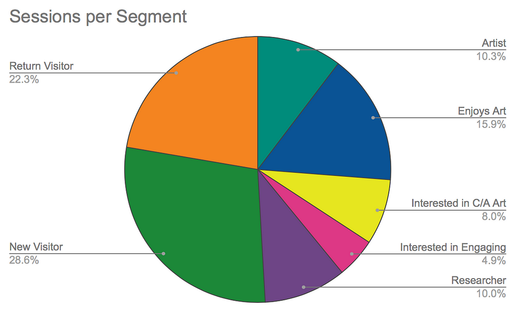
Figure 1.1 shows the breakdown of how many sessions were from each segment. New and Returning visitors made up half of the segment sessions, while content driven users (Researcher, Enjoys Art, Interested in Contemporary & American Art, and Interested in Engaging) made up the other half. This split has the possible potential to vary depending on certain factors that can influence website traffic, such as academic year, exhibitions, or programming that might lead more people to the site for different reasons at differing times throughout the year.
Finding 2: Audio and Video Content Reach
After analyzing each individual profile, there were several behavioral patterns that stood out. There is a potential opportunity to increase the visibility and usage of audio and video content.
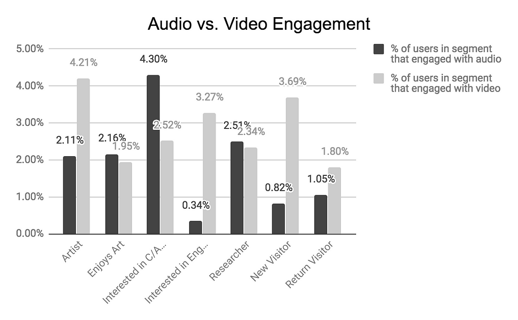
Interested in Contemporary Art and Researcher users were the most engaged with the audio content. The percent of each segment that engaged with video was often higher than the percent of each segment that engaged with audio. As a whole, there is room to better engage users with both these types of content, especially audio. This finding highlights an opportunity to make this type of content prominent in order to aid those using the site to learn.

Finding 3: Object and Exhibition Page Reach The second key finding shows that users looking to explore more about art and the collection (such as artists, researchers and enjoys art) spent more time and clicked through mostly exhibition pages. The exhibition pages are good content sources for users because they contain exhibition descriptions, tour information, related object images, related events, videos, and audio guides.
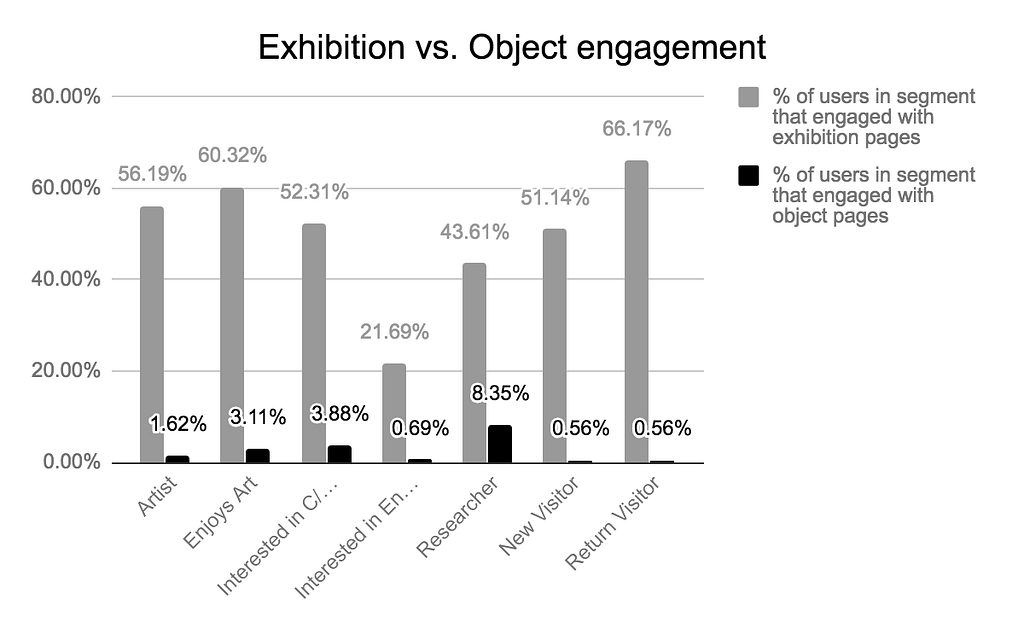
Enjoys art and Return Visitors users viewed more exhibition pages than other segments. New Visitors were less interested in exhibition pages than Return Visitors. Interested in Engaging users were the least interested in Exhibition pages but viewed more object pages than visitors. As expected, Researchers were the most engaged with object pages compared to all the other segments. Overall, object pages were less visited than exhibition pages, indicating the opportunity to create more opportunities for users to discover object pages.
In regards to the online collection, there is room boost engagement with object pages. There is an opportunity to create a navigation structure, emphasize collection objects more heavily on the homepage to allow for increased interaction or improve the optimization of objects pages for search engines.

There is also room to encourage users to spend more time on object pages. The majority of the web traffic was towards exhibitions pages, which are the most content heavy. Including larger images with zoom options, more descriptive captions and other related resources might increase visitor engagement with content and create better learning opportunities
Wrap-up
The Whitney was successful at promoting the exhibitions and related content to exhibitions (such as audio tours of the objects in exhibitions). However, further work using this framework of analysis will provide more insight into how whitney.org users are interacting with the website and how to best serve their needs. Further research can also offer more insights about the website users for example surveys about satisfaction, the context of usage, user profile or surveys on specific sections of the website, those related to the visit vs. Collection and other content-heavy areas.
Reflection
This student project was not without major challenges and huge learning opportunities. While the VMS accumulated significant numbers of responses, it ran only for two weeks. This means that the data does not showcase how users are interacting with the site all year round. This indicates a need for repeated studies for comparison to gather deeper insights into user behavior. Additionally, the survey only prompted one question, which provides limited insight into user motivations compared to a longer, more in-depth survey.
The pairing of the Visitor Motivation Survey with Google Analytics was the first learning opportunity. Google Analytics can tell a lot about user behavior but not why they came to the site and their personal interests. Alternatively, the Visitor Motivation Survey, without Google Analytics, only provides the basic segments of who the users are but not what they do on the site. Combining the two allowed for greater insights into user behavior overall.
When our Pratt research group began the project, an initial challenge was the need to define what metrics would be most useful to focus on because it is very easy to start drowning in all the data that Google Analytics can provide. After setting the key demographic and behavioral metrics, it became clearer where to go with the direction of dashboards. Google Data Studio was the second big learning moment. Juggling the data for all seven segments was made much simpler by using Google Data Studio. Being able to copy each dashboard and simply switch the segment filter saved time and energy and allowed the desired data to be visualized consistently across every segment.
Despite some limitations of the tools, the combination of a Visitor Motivation Survey, Google Analytics, and Google Data Studio allow for a useful method of web user evaluation and data visualization that can easily be replicated for repeat studies and compared over time.
Following this research phrase, the Whitney has carried out a second VMS survey. The results of the second survey are not reflected in this post, however.
Visitor Motivation Survey and Audience Segmentation for the Whitney Museum of Art Website was originally published in Museums and Digital Culture – Pratt Institute on Medium, where people are continuing the conversation by highlighting and responding to this story.