
The Human Disease Network
November 8, 2018 - All
Introduction
I found I kind of love to research about human diseases’ related topics, which are really worth to understand and take the precautions. Therefore, for lab 3, I am also trying to design a visualization for human diseases and disorders. Based on the data set of a network of disorders and diseases that I found at Gephi wiki, here are the three questions I would like to get the answers:
- What is the relationship between diseases, disorders, and genes?
- What disease or disorder that humans would have a higher chance to get?
- What the communities would look like in the network of disorders, diseases, and genes?
Inspiration
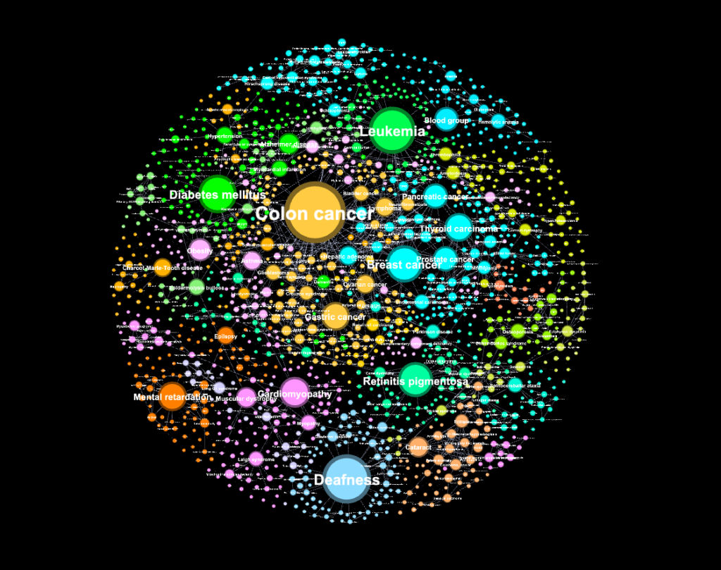
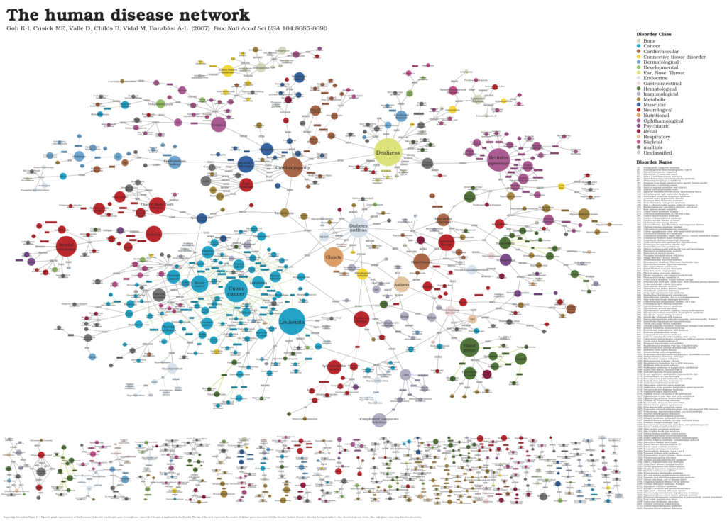
I found the following visualization when searching some related disease network maps, and I think the visualization is based on the same data set as what I found at Gephi wiki. It gives a very clear picture of the relationship between diseases, disorders, and genes. It classifies the diseases by colors and labels the disease name. Besides, it also visualizes the small groups and put them on the bottom of the picture. I guess the reason why it moves the small groups down to the bottom may be because of the limitation of space or keeping the picture clearer. Furthermore, from the visualization, we could clearly see what disease has the most degrees. The more degrees the disease have, the bigger the dot is. Also, we could interpret that the disease with the bigger dot may have higher possibilities to happen in humans because it has more potential factors (degrees). It is really a good modal and direction that I could do for my own visualization.
Materials
- Gephi wiki – A free resource where you could find network data sets.
- Gephi Software – A software that helps to creat network visualization
Methods
1. Find the ideal data set
2. Clean the data set
3. Visualize the data set
The post The Human Disease Network appeared first on Information Visualization.