
Projected Population Increase of California (2019-2050)
October 10, 2018 - All
Introduction
Data can be a list of overwhelming amount of columns and rows of informations. Tableau Public is a program that allows quick synthesis and digestion of massive amount of data by translating the numbers and information into visuals and colors.
Having grown up in Southern California under homeowner parents, I’ve consistently heard about rising and falling of home prices and witnessed the correlation between seeing my hometown of Irvine grow in population and seeing neighborhoods expanding as population increased. Irvine became more and more popular as word got around about the good public school districts. Exploring and processing the county population of California was to better understand at what rate was it projected for the counties to grow individually and as a whole. I wanted to understand and speculate if specific counties was projected for a major increase or decrease to be able to look deeper into what could possibly be the causes to the drastic change and look into the changes in the housing market for potential future investment. I wanted to digest the population data to start off my first step of thorough research in future potential investment and planning.
Inspirations
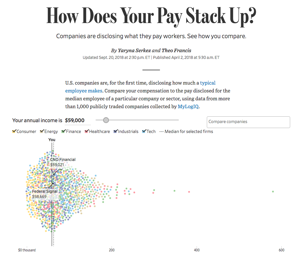
During my research I came across interactive scatter plot by Wall Street Journal visualizing the median pay of companies based on the size of the companies. This visualization took on 1,144 companies and it’s data to show overall high level graph of where companies laid in its compensation for their employees. The high level visual made it easy to see what amount was generally in the market standard.
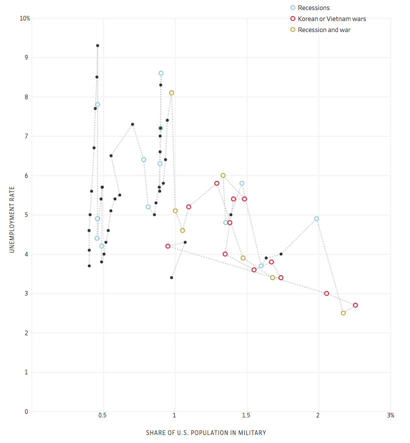
Another inspiration I came across was Wall Street Journal’s Job War line graph. This graph visualizes unemployment of Americans from 1948 to today and the population of the army of the time. The graph is interactive, taking the user through time and showing the relationship between unemployment and the size of the army and indicating historical events like recessions and wars that may have had a play in the number of unemployment. This graph added the layer of time through its interactive elements.
Tools
- Tableau Public: A free online open source data visualization software
- CA.gov
- Excel: Spreadsheet software by Microsoft
Method
Data was found on ca.gov and downloaded. The data consisted many layers of information. The excel sheet was imported into Tableau Public in order to easily explore and visualize the data.
In exploring Tableau Public, I worked with a set of data that showed projected population increase in California. The data set broke population increase by county, gender, year projected, and total population increase.
Results and Interpretation
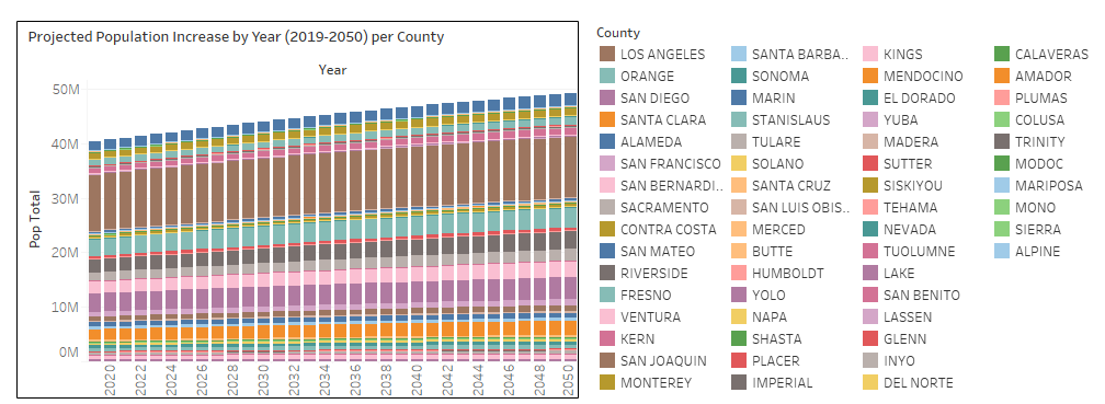
First I wanted to dig deeper and graph total population increase of the counties by year (2019-2050). I visualized this data with a bar graph where each counties were stacked and differentiated by color. This helped visualize the increase of population and easily see the general trend and compare between the counties. You can that over all there is a steady increase in population throughout all the counties. The stacked bar graph helps visualize the difference in population of each county but also clearly shows that the increase rate is generally similar among the counties.
Then I went further into exploring the projected population of each county in 2050. Bar graph was used to compare and contrast between the counties and the graph showed clearly that Los Angeles County population is going to be significantly more than any other counties in California. 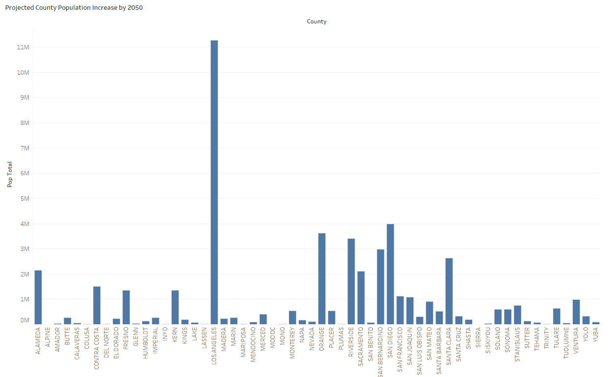
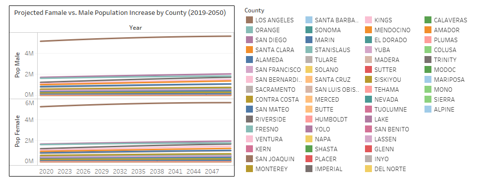
Lastly, I went in further splitting up the population increase by gender. Although the differences between female and male population increase is minimal, seeing it close up showed the incremental differences. The use of color helped differentiate each county and the line graph showed the overall trend of the number of population as the years go by. By interactive and hovering on each of the colored lines, you can see the number of female vs. males by the year. In the most populated county of Los Angeles, the hover shows that there are more females than males but the gap between the genders will decrease as time passes with a continuation of more females than males.
See interactive graphs here.
Reflection
Initially downloading the data set from CA.gov had an overwhelming amount of data. Tableau Public made it significantly easier to synthesize the data and reveal informations that were buried in the rows and numbers of the excel sheet. The user of the Tableau Public software helped analyze and look deeper into the data breaking it down by various elements such as year, gender, and county. Through synthesizing the data, I learned that one data set can show many different things by digging and exploring the best way to visualize (choosing the right graph type and which elements to show in what format). In the future, I would like to mimic the visualizations from my inspirations and utilize the interaction method to show different layers of data by scrolling or inserting information to allow users to get a closer look at the data.
The post Projected Population Increase of California (2019-2050) appeared first on Information Visualization.