Noteworthy Infographic Inventions from the 19th Century
September 14, 2018 - All

Introduction
Infographics, a term created by clipping and compounding the words ‘Information’ and ‘Graphics’, are visual or graphic representations of information which allow clear and swift communication. They leverage human beings’ visual system’s ability to identify patterns and trends.
Creating infographics is not a new technique in any way, as the earliest storytellers were the cavemen that lived on the earth forty thousand years ago. These cave dwellers took up their brushes in the form of cave paintings, which told stories about various events that they thought were noteworthy. This was hence, an act of using graphics to present information so as to communicate with others, which is what we define as ‘Infographics’.
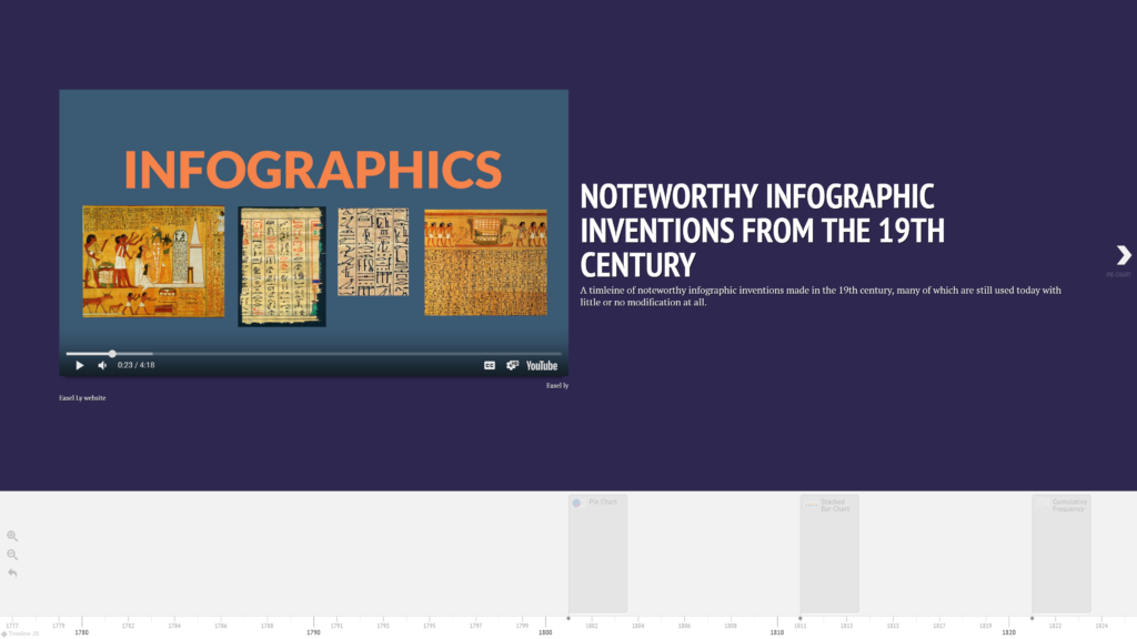
There have been many iconic infographic inventions in the past that were so robust, that they are still widely used today with minimum, or in some cases, no modifications at all. It is very intriguing to learn about the inventors’ creative genius that led to these incredible information visualizations. I, therefore, decided to create a timeline view of some of these spectacular inventions belonging to the 19th century, which I found to be the most relatable due to my background in Engineering and Technology, having used many of these myself in the recent past. My goal is to showcase these fantastic time-tested inventions in a chronological order, using a popular information visualization tool.
Materials
Tools –
- TimelineJS – An open source tool developed by Northwestern University’s Knight Lab that allows users to create interactive timelines by simply filling up a spreadsheet.
- Google Sheets – A web-based application that allows users to create, update and modify spreadsheets and share the data online. This tool also allows collaboration and is a part of the Google’s G-Suite of web applications.
- OneNote – An application that allows users to create notebooks in which they can store, organize, and search resources and notes. It is a part of Microsoft’s Office 365 suite.
Dataset –
Methodology
I began my study by analyzing RJ Andrew’s “History of Infographics”, which was shared by my information visualization professor. It is a wonderful data source to find out about iconic inventions in the world of infographics in an interactive fashion. I started reading blurbs about each of the inventions on the website, while simultaneously making a list of the ones that really piqued my interest. Some of these gave me a huge nostalgia trip as well, as I had used them several years back when I was pursuing my Bachelor’s in Engineering – for instance, Mendeleev’s Periodic Table, which I used to use quite a lot to fetch elements and figure out their atomic number.
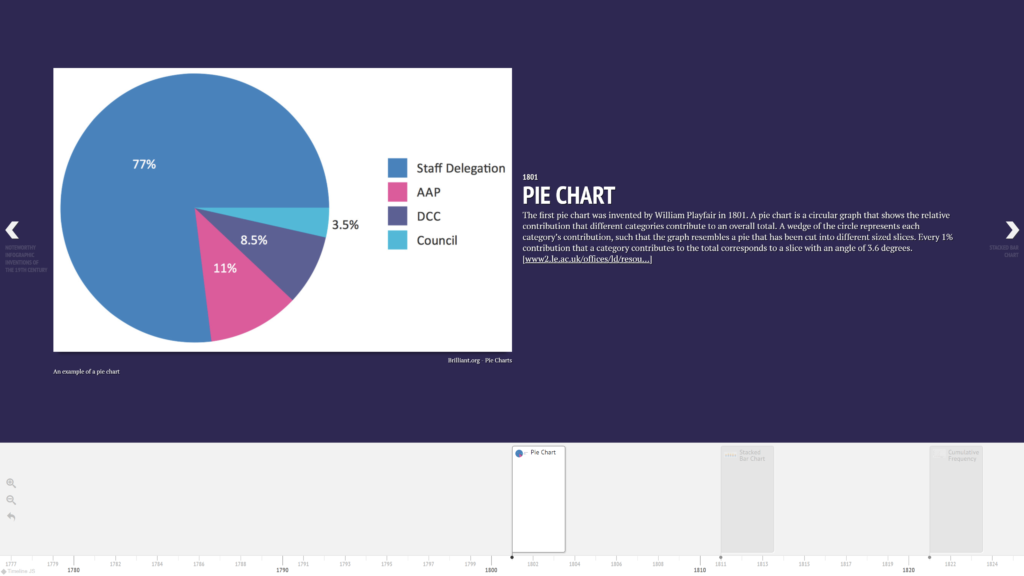
With a lot of Google searching, I was able to find good articles about the visualizations that I had selected to showcase, so as to fetch the clearest definitions I could find to put onto the timeline. This helped me learn more about these visualizations and their variations, for instance, the pie chart has a variant that helps visualize hierarchical data, by using concentric circles. This variant is known as the ‘multilevel pie chart’.
My next step was to choose appropriate sample images for these visualizations in order to effectively communicate their appearance and use. Yet again, I made use of the articles I had previously visited to find good sample images. Google image search also helped me discover good images that I could use.
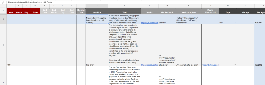
As I was collecting all the aforementioned data points, I was simultaneously entering them into my OneNote app in an organized manner. After this was complete, I transferred the data over to the Timeline JS spreadsheet [Fig 1] and followed the steps on their website to generate the timeline. I made several changes thereafter to modify the look and feel by changing the images used to improve readability and effectiveness.
Results
Please access –
[Fig 2: Gallery of screenshots of my TimlelineJS Project]
From this timeline [Fig 2], I hope to make viewers aware of how far back in time these amazing inventions were made in the field of Infographics. I want them to see how robust these were and how little or nothing has changed about them since their invention. I hope my use of imagery helps them understand the visualizations at first glance and learn how the 19th century contributed to the world of infographics.
Reflection & Future Directions
I always enjoy the feeling of learning a new tool or technique and TimlineJs was no exception. I felt that it is truly a spectacular tool which someone having no technical background can also use. However, my technology background really made me gauge the shortcomings of this tool based on my own experience of HTML and JavaScript. I constantly felt the lack of user interface customizations, which makes the bottom section of the timelines look almost the same for many users. This way anyone who is familiar with the tool can tell at first glance that TimelineJS was used. This brings down the uniqueness factor significantly.
Yet another pain point of mine was that although most of my events were coincidentally evenly spaced to about a decade in between each, one event was almost two decades apart, making it appear as an awkward long jump on my timeline. I believe that a way to show an axis break (or kink) between larger gaps and shortening them a bit could be a good idea, making it look more evenly spaced.
Finally, I invested a lot of time in selecting background images for my timeline. However, I later realized that the images, even though subtle, were huge sources of distraction and also made the text harder to read. I, therefore, decided to remove the background images and use a subtle background color instead. I will definitely avoid this in the future.
References
- RJ Andrews, History of Infographics
https://infowetrust.com/scroll/ - University of Leicester
https://www2.le.ac.uk/offices/ld/resources/numerical-data/pie-charts - Study.com
https://study.com/academy/lesson/what-is-a-stacked-bar-chart.html - Wyzant.com
https://www.wyzant.com/resources/lessons/math/statistics_and_probability/averages/cumulative_frequency_percentiles_and_quartiles - Berkeley
https://evolution.berkeley.edu/evolibrary/article/0_0_0/evotrees_primer_02 - Chegg
https://www.chegg.com/homework-help/definitions/normal-curve-31 - Lucid Chart
https://www.lucidchart.com/pages/organizational-charts
https://www.lucidchart.com/pages/venn-diagram - Live Science
https://www.livescience.com/25300-periodic-table.html - Population Education
https://populationeducation.org/what-population-pyramid/ - Wikipedia – Poverty Map
https://en.wikipedia.org/wiki/Poverty_map
The post Noteworthy Infographic Inventions from the 19th Century appeared first on Information Visualization.