
History of Infographics – An Interactive Timeline Of Most Iconic Infographics From 1630 to 1693
September 12, 2018 - All

Introduction
We live in an age of data visualization where the Internet has been flooded with graphics containing useful information, be it the literacy rate of different countries or websites showcasing the change in the climate. Every single useful information on the web is being converted into images and graphics. But this isn’t the first time that this has been done. Over a hundred years ago, people found themselves struggling with their own flood of data and this is when they invented the idea of creating infographics. In the same manner, my project aims to showcase the most iconic infographics from 1630 to 1693, using TimelineJS.
Materials
- TimelineJS – it is an open-source tool that enables users to build visually rich, interactive timelines
- Google Sheets – Used to update content on the timeline
- Info We Trust. – Used for data and images
- YouTube – Used to link a video related to infographics
- Google Images – Used to find images
Method to Create This Visualization
- Analyzing the Data Set
After going through the data set which was a timeline of the most iconic infographics, I selected the milestones that I wanted to display on my timeline – starting from 1625 to 1693.
2. Collecting the Required Media
After selecting the milestones, I selected the media that I had to link it with the content. I made sure that the media looks visually appealing and meaningful.
3. Compiling the Content and Media to Make an Interactive Timeline
With all the content and media, it was time to fill the Google Sheet template available on TimelineJS. In the Google Sheet template, users can add a background color, image and select the title screen of the timeline.
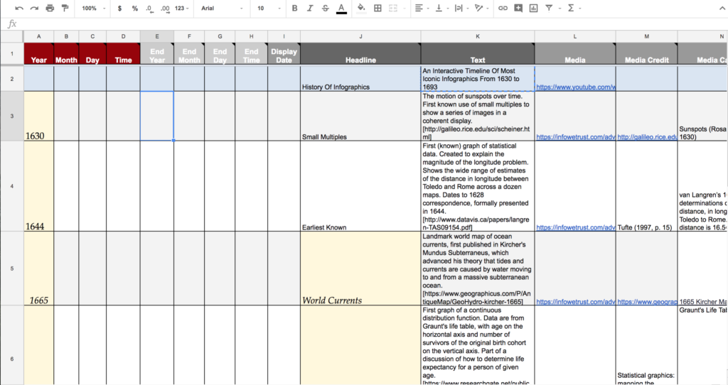
Figure 1: Google Sheets Template
Results
Here is the History of Infographics timeline – History of Infographics
Here is the link to the google sheets template – Link
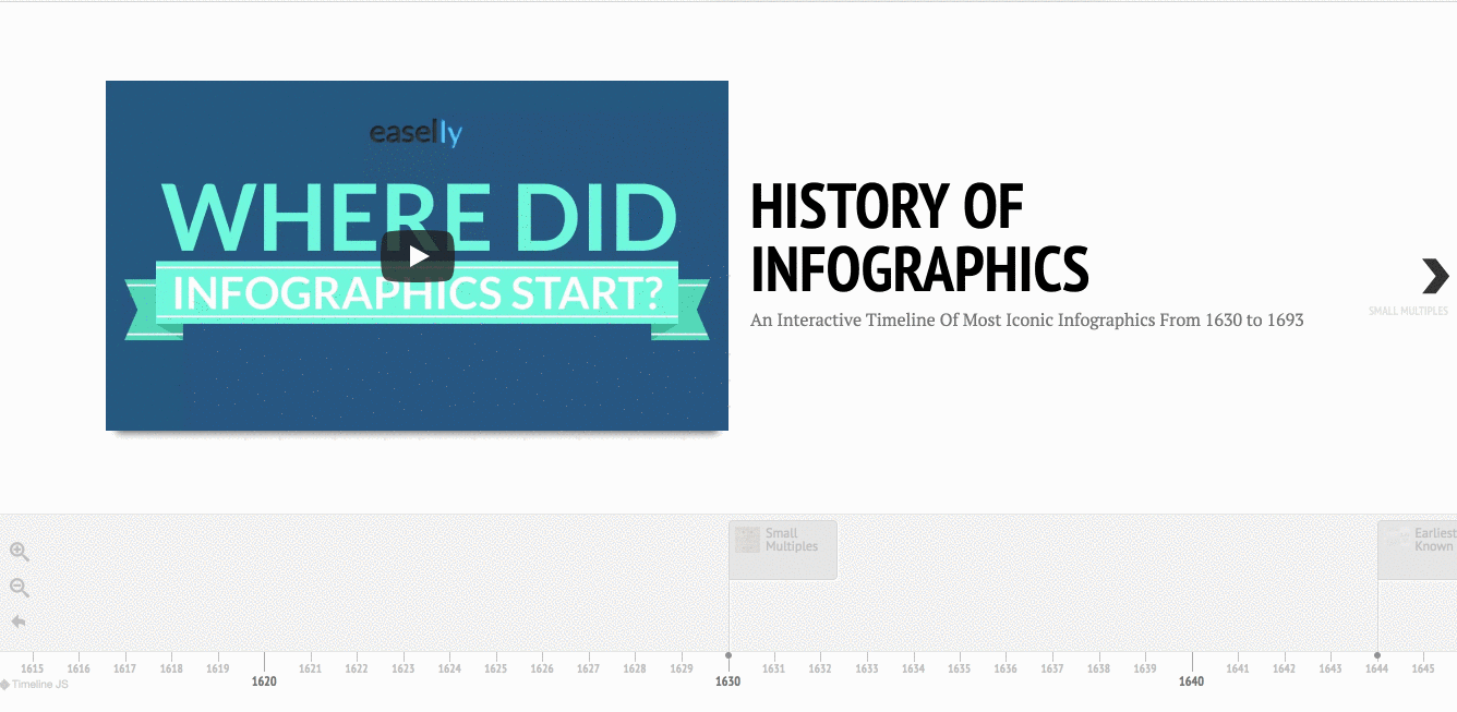
Figure 2: GIF of the timeline
Reflections
I think the Knight Lab – TimelineJS has many advantages and certain disadvantages also. Though it helps in creating an impressive timeline that can highlight various milestones in the history, it restricts the user from applying a lot of design customizations to the timeline. Also, on further introspection of the tooI, I discovered that it has some customization option (like changing to certain pre-defined fonts and setting the zoom level), but they are not easily discoverable to the users.
As far as my learning experience is considered, coming from a design background and someone who makes infographics it was very enlightening for me to learn about the history of infographics and how it began. Overall it was a nice and easy to use tool to use and play around.
The post History of Infographics – An Interactive Timeline Of Most Iconic Infographics From 1630 to 1693 appeared first on Information Visualization.