
Dogs in New York City
July 17, 2018 - All
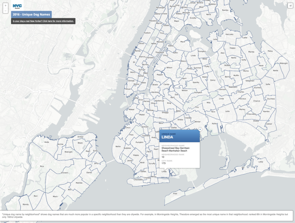
I’m New Yorker who always gets excited when I see a dog on the street, but I can’t have one myself. When I found New York City’s dataset on issued dog licenses I thought it would be fun to take a look at where all the dogs in the city are. I’m not the only one who thought this. WNYC did a similar project back in 2012, and Nate Rattner used the same data to find the distribution of dogs per capita in New York City. The company Rover also did their own exploration into the most popular breeds and most dog friendly neighborhoods in New York. Even the city put together a little map of dog names that were more popular in a specific neighborhood than in the city at large.
The WNYC project looks fun and is interactive, but the map didn’t work for me in the three browsers I tried. Nate Rattner’s visualization is interesting, but seems like it could be skewed–which is a problem that anyone using the city’s data will run into. The data only records dog’s who are licensed with the city, which the city itself estimates is only about 20% of the city’s population of pet dogs (at least as of the 2003 publication of the linked New York Times article). Using the city’s data and tying it to US Census data to find a per capita rate of dog ownership creates inconsistencies on more than one level.
After I first downloaded the data, I had to clean it up in OpenRefine. There were a lot of inconsistencies in boroughs. Most of it was fixed using the automatically generated clusters, but there were a bunch that needed to be manually changed. There are several neighborhoods in Queens that use their own specific neighborhood. I renamed all of those for clarity. I also had to do a little bit of cleaning for breed names, though with so many breeds accounted for, there was no way to efficiently cluster all of them so I only used the OpenRefine cluster suggestions and did a quick scroll through of the facet to see if there was anything else I could obviously spot.
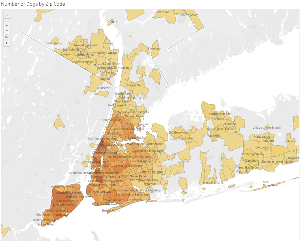
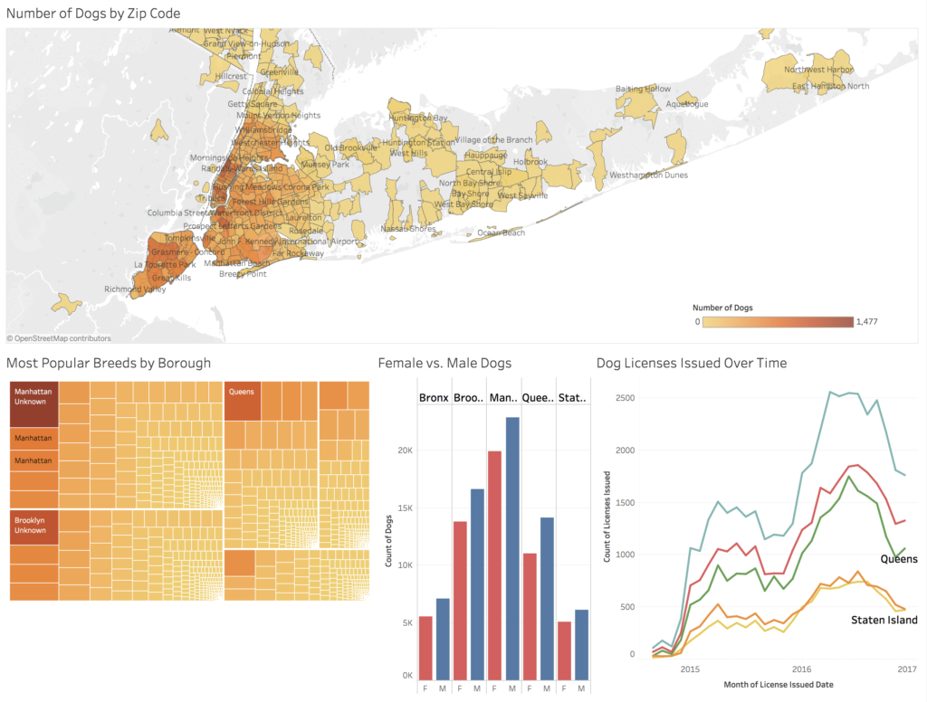
I first made a choropleth map of the distribution of dogs based on zip code. I wanted to find a way to base it on neighborhood, but since the two don’t perfectly align, I had to compromise. The color and division of the areas are based on zip code, but there are neighborhood labels integrated on top. I was able to download a shape file from the Zillow website that provides neighborhood names and boundaries. From there, I found a tutorial the Tableau website that would allow me to overlay the neighborhood names on the choropleth map created from the zip code related data. I’ll admit the neighborhood labels can be distracting, but I wanted to include them for some context as most people will recognize a name but not a zip code. Unfortunately, there’s no way for users to toggle them on and off and via the method I used, I couldn’t find a way to show only select neighborhoods. The labels shown are chosen randomly to fit by Tableau.
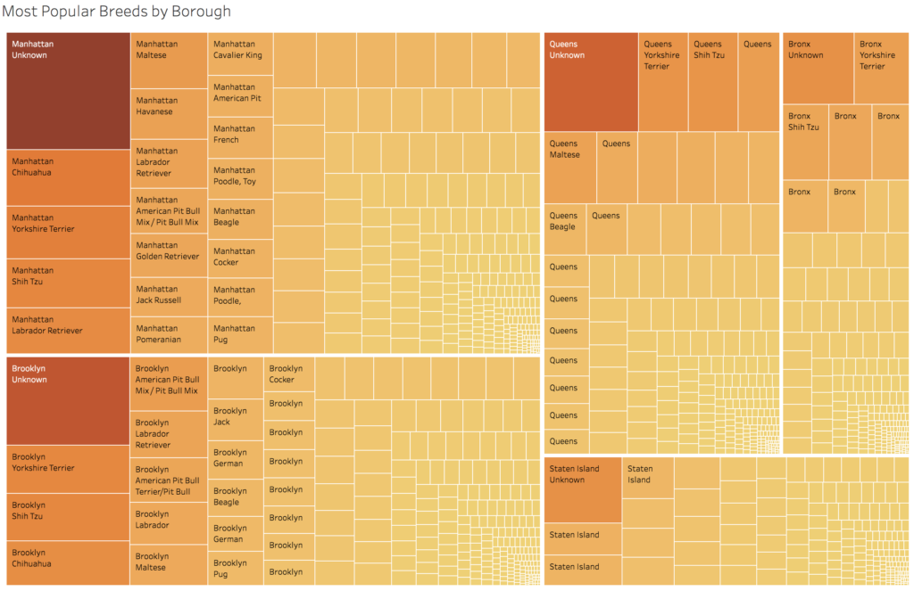
I next made a treemap showing the most popular breeds by borough. By far, the most popular “breed” citywide was “Unknown,” which could mean many things. It could mean that the dog is a mix of multiple breeds, that the owner themselves was unaware of the breed, or that the owner didn’t report the breed, among other reasons. It should also be noted that breed categories included “crossbreeds,” where one breed was named but any secondary breeds were not. Of the dogs whose breeds were known, the city data was consistent with the data gathered by Rover. Small dogs are popular across the city, with Yorkshire terriers, chihuahuas, and shih tzus consistently in the top rankings across all boroughs. In the worksheet for this visualization, users will be able to apply and remove their own filters to the data. They could, for instance, find the most popular types of collie or terriers.
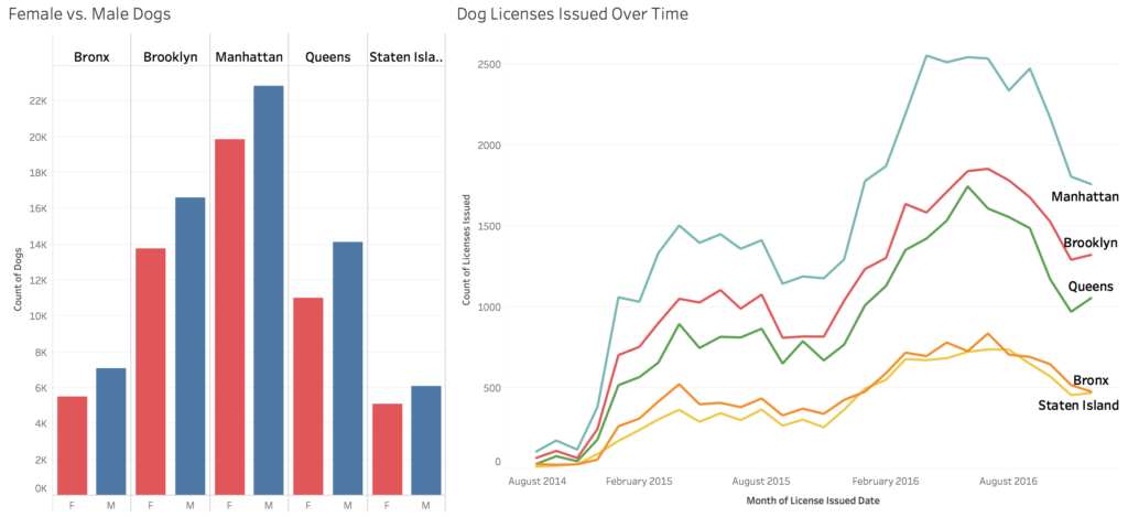
Finally, I made a bar chart showing the amount of female vs male dogs owned in the city as well as a line graph showing amount of licenses issued over time. It looks like male dogs are far more popular across the city, and that dog ownership rises in the warmer months. However, the time data is limited and would be more useful to see a few more years of cycles to really find patterns in the data.
I would’ve liked to do the kind of exploration into dog names that New York City and WNYC did in their data analysis. However, when I tried putting them together, the variations in spelling and the difficulty in filtering the data didn’t provide much information for me. There were about 122,000 records in the data and Tableau reported there were about 16,000 unique entries. On average, each name would appear 5 times in the data.
After looking at the WNYC project, I realized they were using data that went further back in time. I came across it too late, but it would’ve been useful to aggregate the two sources in order to better find patterns over time–though WNYC’s data looks like it doesn’t contain all the same data fields as the one I used.
Overall, I’ve found that if I want to run into the most dogs, I should head toe Park Slope or the Upper West Side and that I should look down and keep my eyes peeled for the small ones.
The post Dogs in New York City appeared first on Information Visualization.