
UNdata – National Feature Films Produced
July 10, 2018 - All
Written by Jamie Raymond
Information Visualization Summer Course at Pratt Institute
In exploration of the public data sets of UNdata, users from around the globe can search by “pooling” the major UN databases, which are browsable by category or keyword search. UNESCO Institute for Statistics, Data for the Sustainable Development, revealed a data set demonstrating the number of national feature films produced by country. The goal was to clean this data set and provide meaningful concepts and insights in visual form.
In order to most accurately represent the data “National Feature Films Produced” Data Visualization utilizes visualizations on a time scale and is best represented by a time series line graph and dotted plot, with a bar chart representing individual value. Inspiration came from visualization representing amounts across time and easily scannable visuals with minimal color palettes.
Inspired
In order to most accurately represent the data “National Feature Films Produced” Data Visualization utilizes visualizations on a time scale and is best represented by a time series line graph and dotted plot, with a bar chart representing individual value. Inspiration came from visualization representing amounts across time and easily scannable visuals with minimal color palettes.
The Data Visualization Bubble Chart
The use of different size circles on a linear graph shows is a easily scannable way for users to quickly gain understanding of the difference between data points.
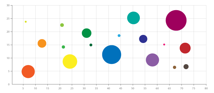
https://datavizcatalogue.com/methods/bubble_chart.html
How Many Gigatons of C02
Bar graph represented in a clean illustrative manner. The bars speak for themselves through width and color palette is minimal. Icons further depict main areas of observation.![]()
https://informationisbeautiful.net/visualizations/how-many-gigatons-of-co2/
What’s Really Warming the World
Interactive line graphic provides a story through time. Each section builds upon the previous with an overly with a background to better differentiate between the lines.
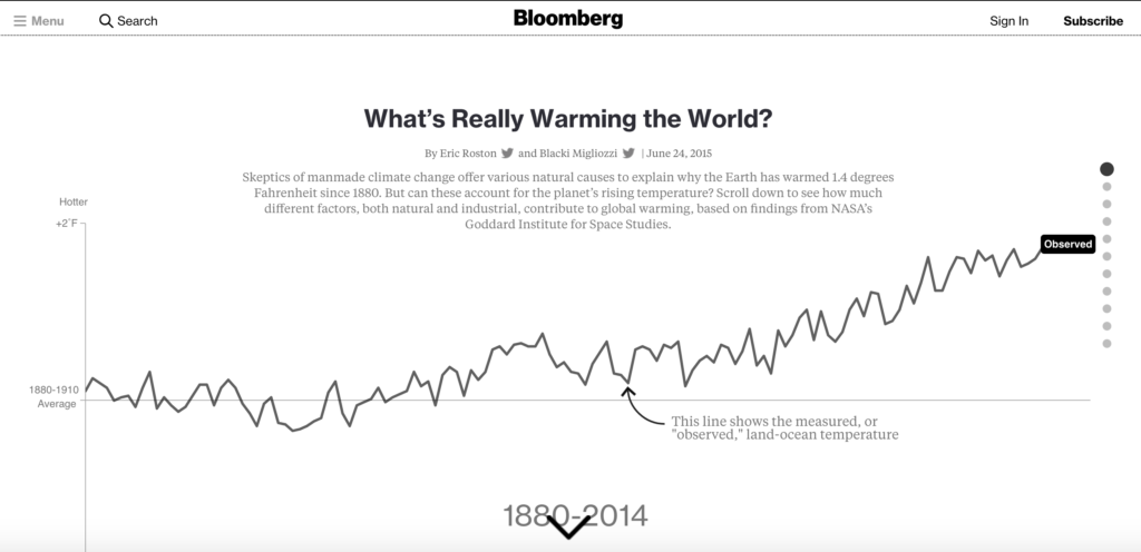
https://www.bloomberg.com/graphics/2015-whats-warming-the-world/
Results
OpenRefine was used to delete irrelevant data and create meaningful categories before being pulled into Tableau to create visuals and find a story. A dashboard was created with a minimal color scheme, which lets the users eye go towards scale between circles and follow the line of time. Results show the top film producing countries with the top two standing out as Indian and the United States. When viewing films produced per year it is seen that some years other countries beat the Indian and the United States in producing films. Overall over time it can be seen how the number of films produced overall across all countries is on an upward trend.
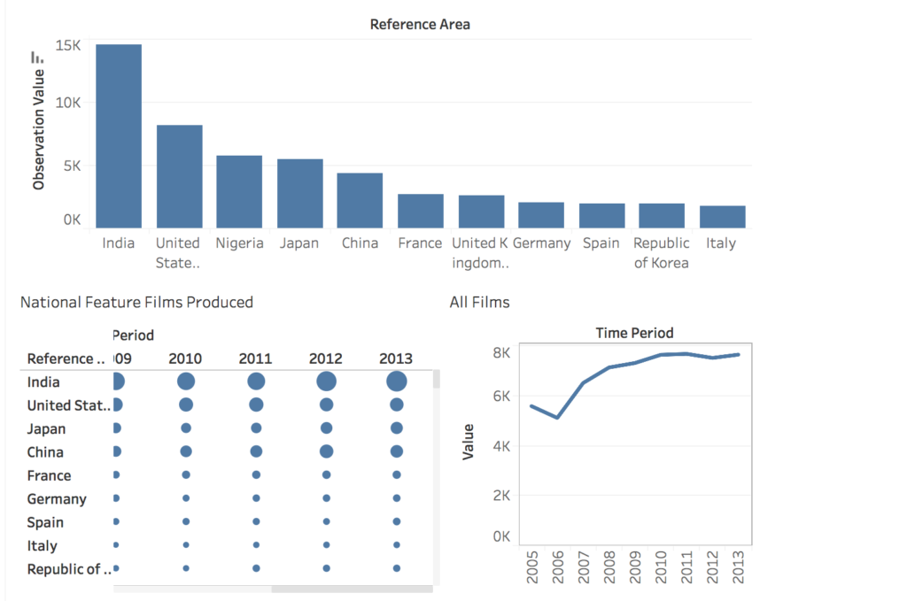
https://public.tableau.com/profile/jamie.raymond#!/vizhome/LAB2_17/Dashboard1?publish=yes
Reflections and Future Directions
Keeping colors same across the dashboard was great for preventing information overload, though highlighting main points in a different pallet could help make important information stand out. Countries that beat the top two in certain years may be called out and researched in a historical context. Next in order to best gauge how films are progressing across time it would be helpful to have context surrounding how the data set years most relate to the subject matter. Future works could build upon this data with comparisons of data from the end of this set to present.
The post UNdata – National Feature Films Produced appeared first on Information Visualization.