Information Visualization & History of Open Data
July 3, 2018 - All
Written by Jamie Raymond
Information Visualization Summer Course at Pratt Institute
![]()
In an era when data drives key decisions, there is importance to present the data and for the visual to tell the audience a story and visual representations can enhance learning and understanding. The Interactive Design Foundation describes Information Visualization as “the process of representing data in a visual and meaningful way so that a user can better understand it”. Graphical representations can be seen in history from the 14th and 15th centuries for mostly map creation, then in the 17th century in mathematics and physics. Beginning with the rise of the internet, visuals are created to convey messages surrounding vast amounts of data.
In the early 20th century the public begun to ask for information to be transparent and accessible, which is now known as Open Data. “Open data is data that can be freely used, re-used and redistributed by anyone – subject only, at most, to the requirement to attribute and sharealike” (Open Knowledge International). The history of open data begins in 1993 when the “Public Data Directory is Published”. To gain a better understanding of how Open Data has progressed since then an interactive timeline was developed using a popular timeline tool called Timeline JS, by Knight Lab.
Content for the History of Open Data timeline was pulled from the web and highlights the five most important events in the history of Open Data. A download spreadsheet from Timeline JS was opened in google drive where the content was input into individual rows and columns. Each entry includes a date, headline, intro paragraph, image, and image credit. After publishing to the web, the hyperlink in browser is inputted into the tool and a fresh link is created to the timeline!
The History of Open Data Timeline
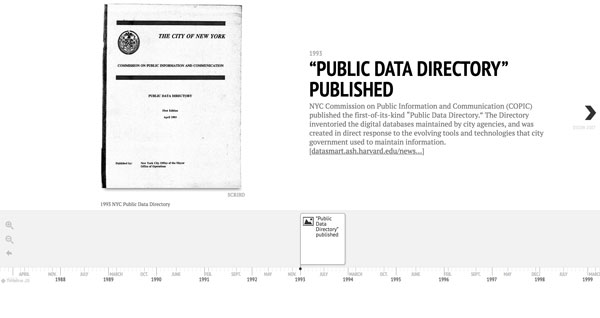
The History of Open Data timeline creates a visual and interactive time lapse map. It shows how Open Data has progressed on a time based visual scale and most importantly, leaves room for one to image the future of Open Data. In order to create a sense of the importance of Open Data and relate to viewer future timeline entries after each main finding may include historical cases of how Open Data impacts society and people on a personal level.
References
http://opendatahandbook.org/guide/en/what-is-open-data/
https://datasmart.ash.harvard.edu/news/article/new-york-city-open-data-a-brief-history-991
https://timeline.knightlab.com/
The post Information Visualization & History of Open Data appeared first on Information Visualization.