Planting Companion?
April 19, 2018 - All
Introduction
After the introduction to networked data left my head spinning, the question of finding a dataset that I would understand became the task at hand. I began the lab with a dataset available on Gephi’s website as a sample datasets; one that looked at the Marvel’s Social Network. Having recently seen Black Panther, I thought the set would look something like a basic network structure, consisting of a few nodes and edges in which the relationships would be very clear and manageable. To my surprise the Marvel social network is incredibly dense, and truly look like a blob. Therefore I settled for a very pleasant dataset on typical plants you’d find in a garden, and if they do or do not grow well together.
Inspiration
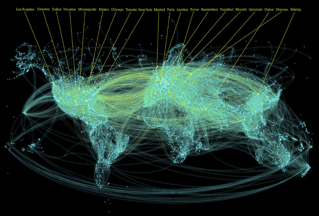
While I can’t say that there’s some networked data out there that truly inspired me to create this visualization, after understanding what networked data is, I had a particular image in mind of ways I’ve seen networked data used. Most recently, I saw a video of mapped air traffic, this network data was mapped using animation and I believe the nodes represent the airports, while the edges would be flights from one node/airport to the next. These animated visualization are a very cool way to show how air traffic moves across the surface of places. There’s a ton of these neat videos on Youtube, and I’m pretty sure I’ve seen these types of visualizations featured on commercials about security, phones, and power.

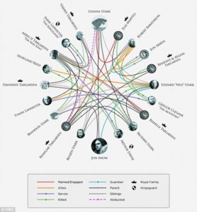
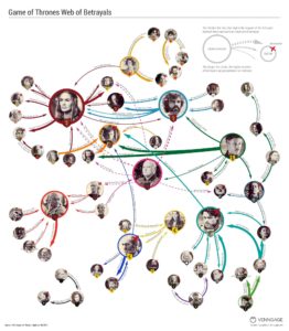
As for a social network networked data, I pictured the Marvel character to look somewhat like this Game of Thrones relationship data. I feel like this dataset has way less information and is easier to read. Having a personal relationship with this data also makes it more comprehendible. I like the variations of how this networked data can be displayed; and even through all the variations I can still pretty clearly make sense of what’s happening.
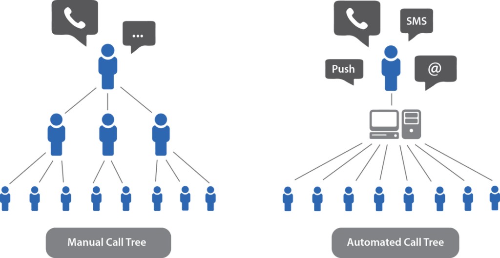
As for a simple networked structure of data, during the Gephi lesson, I immediately thought of the tree network used at one of my previous jobs. The tree was used for calling people if the museum were to close because of inclement weather. This network is pretty much as basic as it gets, especially when it comes down to only 12 employees. The simplicity of this data is very easy to read and follow, and thus why I choose to work with the plant companion data.
Materials
The dataset used I believe was created by Chris Sula, it is called Planting Companion and was in the format of a CSV file. The data records wether or not plants do or do not grow well together. There are four columns in which are titled: Source, Target, Type, Weight, and Label. Plants that do grow well together have a weight of 2, those that you shouldn’t plant together have a weight of -1. The plants that are beneficial to garden in general have a weight of 1, and those that aid in bug control are a weight of 3. To create the visualization, I used Gephi, and then was able add a plugin to my file and host in interactive version of the visualization using my Pratt site.
Methods
After some trial and error with the Marvel dataset, I downloaded the CSV file of the plant data and uploaded it into Gephi. Each node was visible, and this I like about the dataset. It was clearer to see the relationships between each node. I had to have quite a bit of help using Gephi, I don’t think the language is new user friendly.
I did have to do minimal cleaning to this dataset after it was in Gephi. Some of the column information was showing up as nodes and needed to be extracted from the data. Once I was able to get used to saving every other minute; and get the modularity to work my network started acting like one; or at least looking like one. I’m honestly not sure what’s reflected in the modularity, but once it was applied my data grouped into three different colors. I believe the colors reflect the weights that each relationship was assigned. The colors made it easier to see each node and the color follows through to the edges. After that I applied labels so one would know which type of plant they were over and could follow the edge down to its relationship.
I played around with some of the other statistics to see how those effected the visualization though I felt like the most important information to show was the relationships between the plants.
Results
In the end I was able to figure out how to host my dataset so that one can interact with the network. Below are some images of how one can hoover and highlight the different plants.
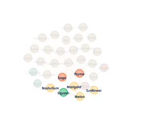
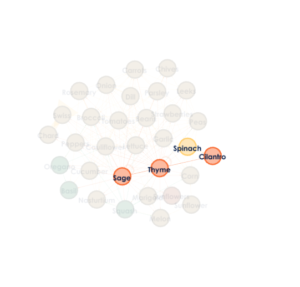
http://mysite.pratt.edu/~rrichar9/network/
Discussion
As an amateur gardener myself I feel the Gephi map is very helpful. I’ve shared it with quite a few people that agree. I think that making this map interactive makes it even more helpful, because the relationships stand out and are easy to trace. Though the lack of a key in determining what the different colors means defeats the purpose.
Overall I need a better understanding of what the weight classes mean so that I can tell a clearer story about my network. The truth of the matter is my map doesn’t work at all! All it’s showing is that there is some sort of relationship. Looking back at the data though some of those relationships are stating that you actually shouldn’t grow certain plants together! Though because they have a relationship it’s mapped on my map and that’s not clear.
There is definitely a future for this dataset, and I could see this map being a very useful tool for a gardener or just a curious mind. I could see this type of dataset being used in garden magazines and websites, full of cute illustrations of fruits and vegetables. A key would be helpful to include, and some clearer markings to show beneficial and non beneficial relations between the plants. I think there’s a lot of potential for the Plant Companion data.
The post Planting Companion? appeared first on Information Visualization.