Visualizing Social Networks of of Schoolboys, Prison Inmates, and Dolphins using Gephi
April 18, 2018 - All
Gephi is a tool for analyzing and visualizing graph data. Using layout algorithms and statistics functions, the user may identify patterns in networks and generate statistical metrics to further understand how individual entities (nodes) are connected (by edges) to one another. I worked with several small data sets to explore Gephi and experiment with network data. The topics of my datasets were:
- 2003 Dolphin network off the coast of New Zealand
- 1960 Prison inmates friendship network in Southeast USA
- 1880/81 German boys’ school friendship network
VISUALIZATIONS FOR DESIGN INSPIRATION

I was interested in datasets for this lab where the viewer can see the points and literally connect the dots. All of the above examples are beautifully visualized with simple color palettes and connections that we can interpret relatively easily without needing interactive tools or multiple screen views. As it turned out, my novice skillset cannot even begin to mimic these samples, but I was more attracted to this style of network graphic, rather than the massive datasets that gave more of a paint-splatter/artwork effect.
MATERIALS
The datasets I selected were in GEXF, GML, and XML formats.
Prison Inmate Friendship Network
German Boys’ School Friendship Network
Gephi for analyzing and visualizing these graph data
METHODS
GEXF and GML are directly supported by Gephi and can be imported through File, Open…
The XML file was brought into Open Refine where it was prepared for export as a CSV. The nodes were collected in a “title” column as one CSV file, then the edges and direction data was collected in a second data file, renaming the columns to: source (node), target (node), and type (direction).
The CSV is imported through File, Import spreadsheet…
The title column must be copied to the “Label” column in the data table view in Gephi.
VISUALIZATION
I practiced with Layout algorithms Force Atlas, Force Atlas 2, and Fruchterman-Reingold. With my small datasets, these created two-dimensional layouts that easily showed all nodes and relationships. The Fruchterman-Reingold spread out the nodes almost equidistantly as the nodes are attracted to the center, whereas Force Atlas grouped the nodes according to attraction and repulsion scales which make the nodes cluster closer together when connections are many, and repel from each other when less connected or unconnected, making those nodes further apart. (The user can control the scaling in the Layout window).
Colors can be chosen in the Appearance window using preset palettes or a color wheel to generate your own color scheme. The nodes and the edges can be colored according to degree once the metrics are run to add the degree to your data. A node’s degree is the sum of its edges. The nodes’ size can be controlled in the ranking using Betweeness Centrality. I set the min/max sizes to 10/50. Also clicking “Adjust by Size” in the Layout window for Force Atlas keeps the nodes from overlapping once they are sized.
Icons along the bottom of the Overview control labels display, font size of labels (including sizing according to node size), and background color of network graph (black or white).
ANALYTICS AND METRICS
I ran the following statistics on my data:
Edge Overview-Average Path Length, to identify how close nodes are to one another
Diameter, to understand the distance between the two furthest nodes in the graph
Betweeness Centrality, to identify which nodes are most centrally connected in the graph
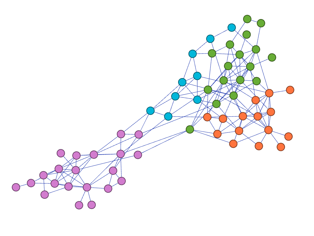
Modularity, to identify “communities” of nodes located close to one another, based on a chosen data metric (Once the “Modularity Class” is constructed the user can apply color by community to visualize the groupings identified). This is done in the Appearance window.
Filtering is available by dragging options from the right side Filters window into the Queries box. By placing Degree Range in the Queries and adjusting the Degree range to begin at “2” I eliminated leaves (nodes with only one degree in the data).
When done with graphing, the Gephi file can be saved and exported as a PDF.
RESULTS AND DISCUSSION
Dolphin Network
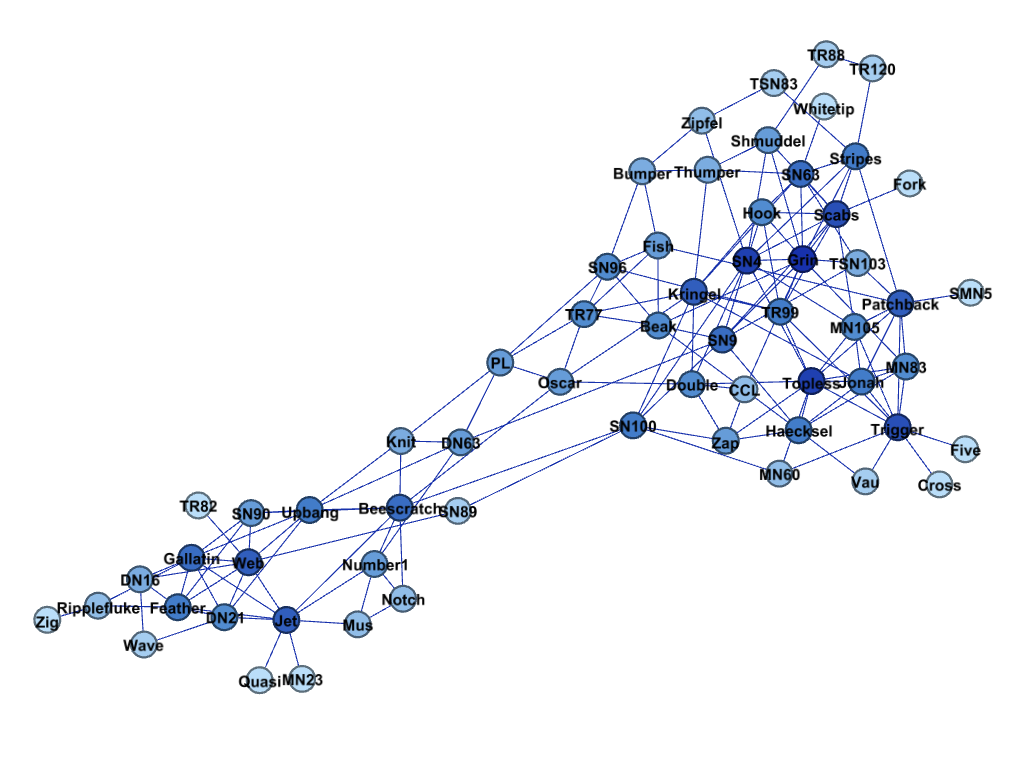
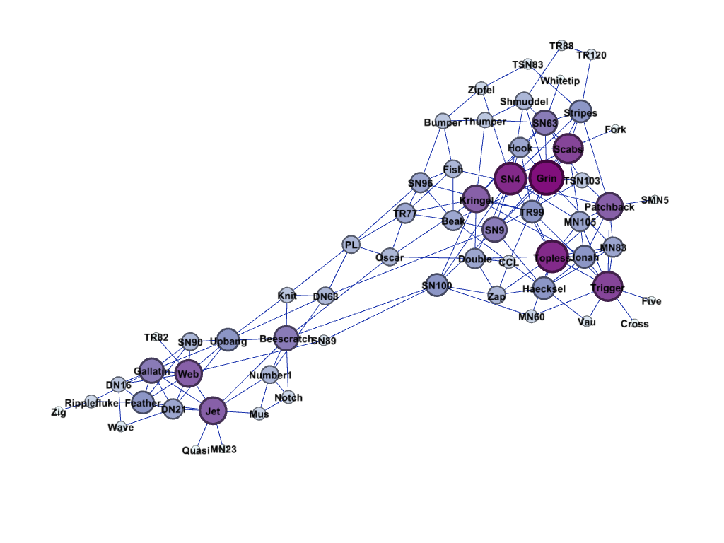
Dolphin data in Force Atlas layout displayed using modularity, displaying names, sizing by degree.
Prison Friendships
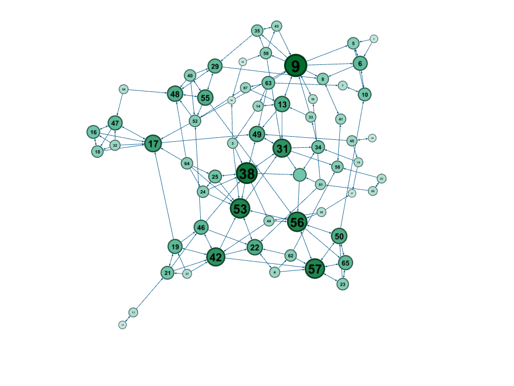
Prison inmate data using Fruchterman-Reingold layout, filtered to exclude leaves with zero or one degree (eliminating isolates), nodes shaded by degree.
German boys’ school friendship network
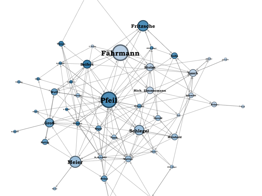
German school boys data using Force Atlas2 layout, nodes sized by betweeness centrality and shaded by degree (including in-degree and out-degree).
There are a number of visualization tools in Gephi offering many options for creating different network graphs. I played with the above datasets to experiment with the tools and I will understand a bit more for the next time I encounter this type of exercise. The statistics modeling requires learning new terminology as it relates to this kind of data. There are powerful metrics that can be calculated with one click and then added to the options for visualization. My particular visualizations did not lead to profound insights regarding the data, but the many ways to manipulate and model through Gephi made the lab quite interesting.
My datasets were small enough that I did not have crashes throughout my experiments. However, many of my classmates experienced issues with data of 1,000 nodes and more. Saving frequently was recommended during the lab.
The PDF export that I created for the German boys’ school did not cover the whole network, even though the network was visible on the screen. Argh.
FUTURE DIRECTIONS
Next steps would include working with larger datasets and reading up much more on network data of all kinds. I did not explore the hyper-graphing option all the way through, though I was able to follow what steps need to be taken to export a table and add the group number to the nodes. Clustering the nodes becomes more important as the datasets become too large to differentiate individual points.
I would also like to experiment with Circular and Radial Axis layouts in Gephi.
Network graphs have gained interest in the age of big data, particularly through the influence of social media. Connected global populations have encouraged us to think about which links (edges) exist and the strength of these ties. Tools such as Gephi are creating the opportunity to explore these types of data using quantitative measures and visualization options to identify patterns that can lead to insights.
References:
Gephi Tutorials:
https://gephi.org/users/quick-start/
https://gephi.org/features/
https://gephi.org/users/tutorial-layouts/
Visualizations for Inspiration:
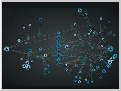
Martino, Mauro, Steven I. Ross, and Timothy M. Stutts (2015). Watson News Explorer, IBM. https://developer.ibm.com/watson/blog/2015/07/20/presenting-watson-news-explorer/ Retrieved on April 13, 2018.
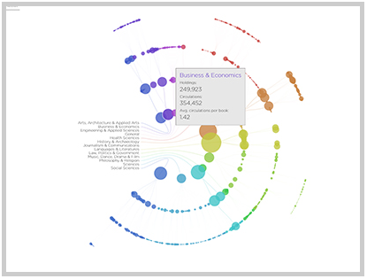
Kurgan, Laura, Annelie Berner, Derek Watkins, and Jen Lowe (2014). The Library Project, Spatial Information Design Lab. http://www.spatialinformationdesignlab.org/projects/library-project Retrieved on April 13, 2018.
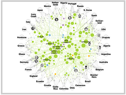
Aisch, Gregor (2014). The Clubs that Connect the World Cup, New York Times. http://goo.gl/ysd8gw Retrieved on April 13, 2018.
Data:
Lusseau, D., K. Schneider, O. J. Boisseau, P. Haase, E. Slooten, and S. M. Dawson, Behavioral Ecology and Sociobiology 54, 396-405 (2003). http://www-personal.umich.edu/~mejn/netdata/ Retrieved on April 12, 2018.
MacRae J. (1960). Direct factor analysis of sociometric data. Sociometry, 23, 360-371. Retrieved from: https://sites.google.com/site/ucinetsoftware/datasets/gagnonmacraeprison. Retrieved on April 12, 2018.
Heidler, R., Gamper, M., Herz, A., Eßer, F. (2014): Relationship patterns in the 19th century: The friendship network in a German boys’ school class from 1880 to 1881 revisited. Social Networks 13: 1-13..http://www.casos.cs.cmu.edu/tools/data.php Retrieved on April 12, 2018.
The post Visualizing Social Networks of of Schoolboys, Prison Inmates, and Dolphins using Gephi appeared first on Information Visualization.