Gephi Lab: 19th Century Social Network
April 18, 2018 - All
Introduction
Visualizing social networks can help to visualize the processes of social life. This includes this formation of communities, the transfer of ideas, the spread of diseases, and the ways in which people connect to places, institutions, and each other. This lab assignment asked students to create a network visualization using Gephi, an open source network and visualization software. My visualization centered around a 2014 paper concerning the long-term ties between German school boys. The paper explores a couple of hypotheses, one of which is the hypothesis that the strength of the ties shown by the amount of contact is determined by the boys’ placement in school, or their “Lokation.” The visualizations ultimately disprove this hypothesis. I was interested in recreating the visualizations within the paper and seeing if I could take what I have learned about design and information visualizations to add clarity to the visualization or to highlight a different variable.
Inspiration
Because my visualization concerns a network of people, I drew inspiration from social network visualizations with an historical focus. I found a website built by Harvard’s Center for History and Economics entitled “Visualizing Historical Networks”
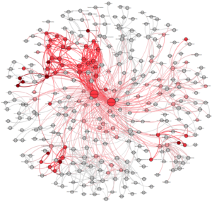
One of the visualizations that I was drawn to was the visualization of the signatories of an 18th century marriage contract in Angoulême, France.
This visualization is  interesting because it uses color gradation on the edges, or connections between people, to represent the likelihood of overseas connection, and color gradation of the nodes, the people, to represent the degree of the connection to overseas areas. The results of this information lends itself to an analysis of multiple perspectives including family structure and mobility.
The next visualization that I chose, illustrated the relationships between famous economists and institutions during the first half of the twentieth century.
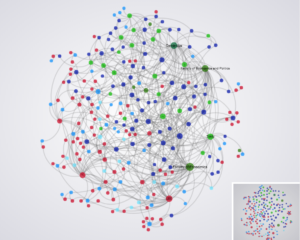
The interactivity of this visualization is crucial here as it enables the user to see the distinct edges which originate from specific nodes. Otherwise, it is very difficult to determine the source and the target. I like that this visualization illustrates how certain institutions contribute the most scholars and that it is possible to see the “spread of ideas” by seeing how the economists are connected to different institutions. The clear legend and color palette make this visualization easy to read and the amount of edges are not overwhelming.
The final visualization that I chose as my inspiration was a network visualization of the privileges granted to individuals by the Spanish monarchy in the 15th century to encourage colonization. 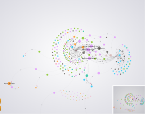
This visualization makes use of arrows to depict a directed network, node size to show the number of privileges received, and node color to show the different areas of intended colonization enabled by the privileges. The clear spiral formation shows the qualities of the Spanish monarchy and its process of distributing privileges to enable colonization. The nodes are well spaced and the color choices are mainly clear except for a peach color which I don’t see described on the color legend. Overall, I think that this visualization is highly readable and informative.
Materials
GEXF file from : https://github.com/gephi/gephi/wiki/Datasets
Gephi desktop application
Paper: Heidler, R., Gamper, M., Herz, A., Eßer, F. (2014): Relationship patterns in the 19th century: The friendship network in a German boys’ school class from 1880 to 1881 revisited. Social Networks 13: 1–13..
Methods
The gephi file was uploaded into gephi and the data laboratory allowed for me to see a wide view of the data within a spreadsheet which helped me to interpret the visualization emitted by the application. Based on the inspiration visualizations, I wanted to make my visualization readable, minimize the messiness of the depiction of the edges, and use a simple, but clear, color scheme.
Node size was used to show the amount of in-degree, or the extent to which a person was being reached out to as opposed to the amount they reached out to others. Because this is a directed network, it shows both people reaching out and people receiving attention from other students. The in-degree shows how much a person receives (attention) and could be equated to a person’s popularity. The larger the node, the more “powerful” that individual is in the social group. The node color showed what the paper called “Lokation” which is the performance ranking system used by the school. In this case, the darker the color, the high the student was on the “Lokation” scale. I chose a burnt red as the basis of my color scale as I felt it created a good color contrast. I also chose to label the nodes with the names of the people within the network.
The layout used was ForceAtlas2 which is an attraction-repulsion model which groups nodes together based on their connectivity and repels nodes if they are not connected. I also chose to dissuade hubs in order to prevent overlap of the nodes in order to increase readability.
Results/Discussion
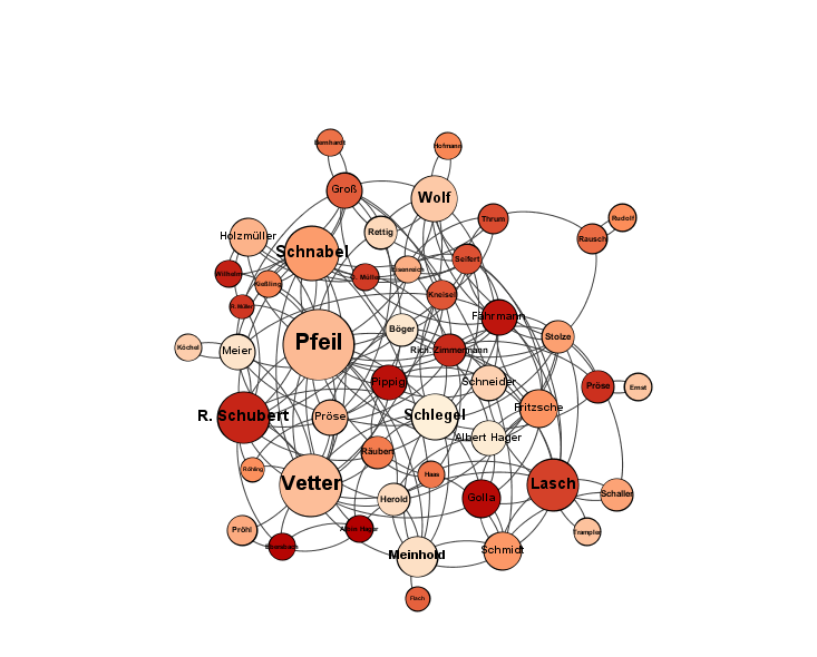
Visualizing the variables of “popularity” and “Lokation” supports the paper’s conclusions that the amount in which a student was contacted or in touch with other students was not dependent on their rank within the class performance hierarchy. I think the element of color makes the visualization easier to understand.
There are isolates, or unconnected nodes, in the network where those particular people do not have maintained contact with the other people within the network. The paper identifies these people as “handicapped pupils.”
Future Directions
A second visualization was created in which the colors represented modularity class.
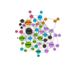
Gephi allows for an analysis of modularity which shows how many distinct communities exist within the data based on a chosen degree of difference and whatever the data has distinguished as the community variable. When a modularity was run on this data, there was twelve distinct communities. It illustrated that certain people were able to “traverse” across different communities while others were more bounded. The paper makes the conclusion that friends of friends tend to be friends, so the communities could be representative of a degree of closeness. It could have also represented groups based on the class ranking system, but when compared to my original network visualization, I doubt that this is the case. Because I couldn’t determine which variable defined the communities, I did not use that visualization. With that information, however, it may have added a different perspective to the one given in the research paper.
The post Gephi Lab: 19th Century Social Network appeared first on Information Visualization.