
Visualizing Homelessness in New York City
April 12, 2018 - All
This semester, I’ve taken an interest in the lives of homeless individuals. I begun learning about their experiences through my Advanced Design Research course, chatting with homeless individuals in New York City and volunteering at shelters. Until a few weeks ago, I relied mostly on ethnographic research such as observations, interviews and diary studies. Although qualitative research is great for learning deep insights relating to a particular situation or community, I decided to employ a hybrid research approach pairing previous ethnographic research with data visualization to uncover deeper knowledge into the lives of the homeless.
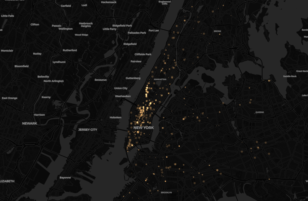
For this visualization, I mapped 311 claims regarding the homeless. I created an animated map that shows where calls reporting homeless people and encampments have been made and how claim patterns have changed since 2013. Although others can learn from exploring this map, I ultimately created it with myself as the audience and it’s purpose to teach me about trends and patterns in homeless claims.
Process
The Dataset
In order to create the map, I first found the dataset through “NYC Open Data”, a New York City database that anyone with a computer can access. Because the dataset currently has 9.24 million rows, I filtered out the “Complaint Type” by searching for complaints that included the word “homeless” in it and then downloaded it. The data came with information regarding the location in which each 311 call was placed, the kind of complaint it was and a descriptor regarding the complaint. Because these complaints are self-reported, it is important to understand that the data does not show a complete picture of where all homeless people are located nor the total number of homeless people in New York City. Instead, it simply shows where calls were placed at certain points in time.
Excel
After downloading the dataset, I opened it in Excel to assess how much I would need to clean it. Overall, the 311 data was fairly clean. It contained some columns that did not apply to this particular data so I removed those to make the file lighter.
Inspiration
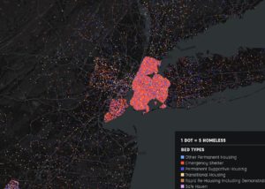
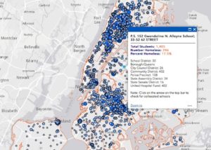
Before working on the map in Carto, I looked for inspiration on homeless data visualizations and how others had previously mapped data regarding homelessness. Two maps I saw showcased point data–one on schools with homeless students and the other on the types of beds in homeless shelters and housing. These maps inspired me to showcase my data utilizing points to tell a story. When evaluating these two map, I noticed that the one showcasing bed data was cramped and hard to understand. This helped me preemptively plan to make my map more readable and avoid an overload of points whenever possible.
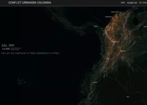
The third map I used for inspiration wasn’t related to homelessness. Instead, through interactions it showed how conflicts in Colombia caused people to become displaced. The interactivity of the displacements on the map inspired me to tell as story through animation and time.
Design Process
Carto
To create the map, I utilized Carto— a web-based drag and drop analysis tool that allows users to discover and predict key insights from location data.
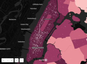
Originally, I wanted to show the proportion of homeless complaints in New York City districts by density as well as the complaint point data. In order to do this, I overlaid the 311 data on top of New York City districts, which I added from a shapefile. I then joined the shapefile and point data utilizing the “Intersect and Aggregate” function. When looking at this map, I missed the interactivity that the Conflict in Colombia map had originally inspired me to feature, so I decided to make it interactive.
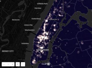
In order to make the map interactive, I added a filter for the type of complaint (Homeless Encampments or Homeless Person Assistance) and made the points animated by the date the complaints were created.
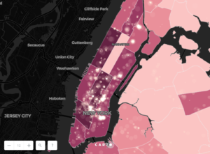
I evaluated the map and decided that the districts weren’t necessary because I had animated the points so I removed the homeless by district density feature. In lieu of showing complaints by density for each district, I made them all dark blue to highlight the animated points.
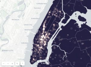
I then considered different backgrounds and decided that the black background would highlight the points better than a light or colored background and that a black background would also be less distracting.
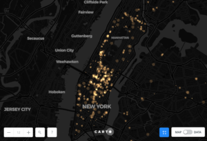
Finally, I removed the blue districts because I noticed they did not add anything relevant to the visualization. Instead, I chose to just use the background map and overlay the points on top. I also changed the point color to a yellow similar to the one used for the filter and date functionalities. Matching colors created an association that the filters are related to the points and create a more cohesive visualization.
Impact
Overall, this map served it’s purpose of helping me observe trends and come up with new questions regarding homelessness. When observing the map, I noticed a defined line created by 311 complaints alongside Broadway. The animation and timeline also allowed me to observe a increase in 311 Homeless Person Assistance complaints in mid-2016, which immediately made me wonder about such a drastic spike in complaints. Although the Homeless Person Assistance data showed a spike, claims for Homeless Encampments displayed a consistent yearly pattern that peaked in the Fall. Although the visualization itself didn’t give me specific answers, it did help me come up with questions that I can now begin to research.
Obstacles and Future Work
During the process of creating the map I ran into two main obstacles. First, I didn’t find a way to undo certain actions or click out of my map without having Carto automatically save my work. This caused some problems when the analysis froze and a cluster analysis I had performed disappeared. When I tried to quit in order to recover the previous version of my map, it was too late and the version without the clusters had overwritten the clustered version.
The second challenge I ran into was Carto’s incapacity to analyze large amounts of data. When trying to employ analyses such as “Aggregate and Intersect”, my map froze and I got a message saying “Analysis failed: analysis cache space limits exceeded”. This probably had to do with the volume of my data and the amount of space free student Carto accounts provide.
Overall, I found Carto somewhat cumbersome, yet at the same time too basic in terms of features. After comparing Carto to QGIS, I noticed that the analysis I could perform in Carto was limited not only by volume of data, but also by the general interface and its functions. Although it wouldn’t be my first choice of mapping software, I will most likely utilize Carto again if I need to create a sleek, interactive and fairly simple map quickly.
Link to map: https://danigallo.carto.com/builder/412b765d-e9df-4bbc-8f0d-003bafee7341/embed
Sources

carto.com/builder/

centerforspatialresearch.github.io/colombia_site/applications/about.html

www.understandhomelessness.com/explore/

icph.maps.arcgis.com/apps/webappviewer/index.html?id=b40652bdf54e4e67a064fadff68dbef3
The post Visualizing Homelessness in New York City appeared first on Information Visualization.